
In the process of writing a post questioning National Geographic Map Policy I was given the name of the Director of Editorial and Research for National Geographic Maps. I emailed him with a few questions on current map policy, specifically related to the Hala'ib triangle, Bir Tawil and Somaliland.
Today I heard back from Juan. As promised, his email is below. It's nothing groundbreaking and if I'm honest, predictable, but it speaks to the map giant's ability to respond to the public. I don't totally buy the fact that the scale of the maps prevents them from displaying Somaliland in grey, then again I only buy large maps and so my view might be a bit skewed. There doesn't seem to be any problem displaying Andorra and it is about the size of a pinhead on my 110" wide world map.
Thanks go out to Juan Valdes and Kevin Lance!
Ryan:
Thank you for your email of August 25, 2010 regarding the National Geographic's portrayal of the Hala'ib Triangle, Bir Tawil trapezoid, and Somaliland in our maps.
The Society’s cartographic policy is one of portraying de facto situations; that is, to portray to the best of our judgment the reality on the ground. We consult with multiple authoritative sources on a frequent basis to determine the current political status of disputed territories and how to best represent them in our maps.
With regard to our cartographic treatment of the Hala'ib Triangle, after several military clashes between Egyptian and Sudanese forces in the 1990's, Sudan ultimately withdrew from this area in January 2000. Their forces were pulled south of the political boundary set by the Anglo-Egyptian Agreement of 1899 - the 22nd parallel. Since then, Egypt has effectively administered the area.
As for the Bir Tawil trapezoid, Egypt does not recognize sovereignty over this area on its maps; here, it claims the 22nd parallel as both its political and administrative boundary. Inversely, Sudan officially recognizes the boundary of Bir Tawil as that set by the British in 1902. However, Sudanese sources contradict this stance by cartographically portraying the Bir Tawil trapezoid as being partially administered by the states of River Nile and Red Sea.
To date, the political and military situation in the Hala'ib Triangle remains unchanged, while Egypt's and Sudan's stance on Bir Tawil has been somewhat cartographically defined. Therefore, the Society's Map Policy Committee has recognized Egypt's de facto administration of the Hala'ib Triangle and Sudan's de facto governance of the Bir Tawil trapezoid. As a point of reference, and where scale permits, the 1902 administrative boundary is delineated in our maps accompanied by a label identifying Sudan's existing claim to the Hala'ib Triangle.
Regarding the color fill treatment of Somaliland in our Africa Wall Map, most political boundaries depicted in our maps and Atlases are stable and uncontested. Those that are disputed receive a special treatment. Depending on the map's scale, such territories or separatist states are shown in a gray fill with their administrative centers depicted by an open bull's eye symbol.
Where scale permits, explanatory notes are added to explain the current political situation of such disputed territories.The difference you have noted between our treatment of Somaliland in our World map to that of our Africa wall map is a reflection of this policy.
Finally, yes, I have been a long standing member of the Society's Map Policy Committee.
Your interest in National Geographic maps is appreciated. Thank you for taking the time to write.
Juan José Valdés
Director of Editorial and Research
National Geographic Maps
Tuesday, August 31, 2010
Monday, August 30, 2010
Is that a Dam typo?
One of things I enjoy most about maps is to immerse myself in thoughts of the physical places I'm peering at through the looking glass. My imagination runs wild thinking about all the locations on a world map. For me, this wanderlust and mapgazing is a daily activity. In doing so, occasionally I'll run into a map feature that is a real head-scratcher.
Last week I was searching in the area around the Okavango Delta in Botswana and Lake Kariba between Zambia and Zimbabwe when I came across what looked to be a phantom "l" on the map.
I was quite pleased with myself as I thought I had discovered an error on the National Geographic 2007 Africa map. I became puzzled when I found a similar "l" to the east at the eastern edge of Lake de Cahora Bassa in Mozambique. While it was hard to believe National Geographic made a mistake, two mistakes right next to each other was a laughable notion.
The image below shows the area in question and both lines. One is to the southwest of the City of Kariba, the second is on the eastern end of Lake Cahora Bassa.

I scoured the legend on all my National Geographic maps but couldn't find anything that matched the symbol. It most closely matched that of passenger railroad but both the size and logic of placement was off. Why would someone build a railroad bridge across a large body of water if it didn't connect to anything on either side?
Time to search Google Earth and put the mystery to bed!
It turns out that the mysterious line represents a dam. With the help of a friend we quickly discovered another dam in Turkey. They are only visible in the continent blow up maps from National Geographic.
Below, in this week's Google image of the week, we see the Cahora Bassa dam in Mozambique.

Remember, clicking on the images will take you to a full sized image.
Last week I was searching in the area around the Okavango Delta in Botswana and Lake Kariba between Zambia and Zimbabwe when I came across what looked to be a phantom "l" on the map.
I was quite pleased with myself as I thought I had discovered an error on the National Geographic 2007 Africa map. I became puzzled when I found a similar "l" to the east at the eastern edge of Lake de Cahora Bassa in Mozambique. While it was hard to believe National Geographic made a mistake, two mistakes right next to each other was a laughable notion.
The image below shows the area in question and both lines. One is to the southwest of the City of Kariba, the second is on the eastern end of Lake Cahora Bassa.

I scoured the legend on all my National Geographic maps but couldn't find anything that matched the symbol. It most closely matched that of passenger railroad but both the size and logic of placement was off. Why would someone build a railroad bridge across a large body of water if it didn't connect to anything on either side?
Time to search Google Earth and put the mystery to bed!
It turns out that the mysterious line represents a dam. With the help of a friend we quickly discovered another dam in Turkey. They are only visible in the continent blow up maps from National Geographic.
Below, in this week's Google image of the week, we see the Cahora Bassa dam in Mozambique.
The image can be found at 15° 35' 7" S 32° 42'18" E

Remember, clicking on the images will take you to a full sized image.
Friday, August 27, 2010
Military Might Map of the World
A personal indulgence of mine is to kick back with a glass of scotch and read about foreign affairs, particularly in Foreign Affairs and Foreign Policy magazines. The article "Africa's North Korea: Inside Eritrea's Open Air Prison" in the July/August Foreign Policy issue, written by Nathaniel Myers, really caught my attention.
I knew Eritrea has its share of political instability. It's also had a tumultuous history with its neighboring States, Ethiopia in particular. I did not, however, know the extent of the Eritrean army. The army is immense for, as Myers puts it, "one of Africa's most enchanting and unpredictable countries."
After some googling inspired by Myers' article, I found an interesting visualization of percentage of GDP spent on military. Cool, yes, but not quite what I was looking for. I wanted a map to compare the rate of active duty troops (per 1000 capita) in the countries of the world. Where does military might exude itself most in the fabric of the world's societies? To find out, I went ahead and made a map myself.
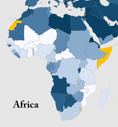
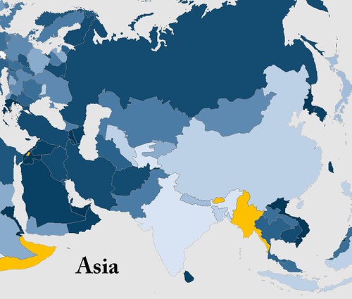
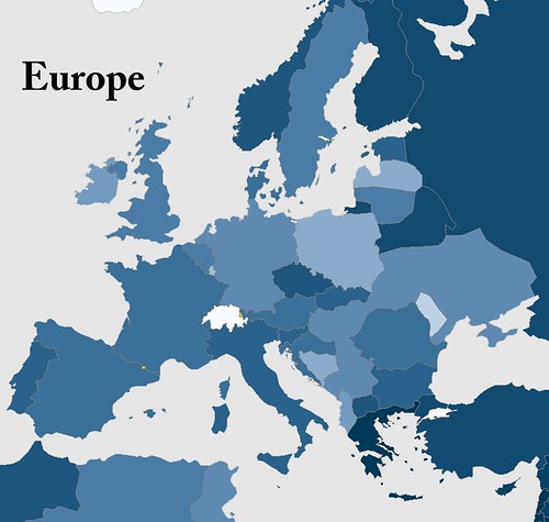
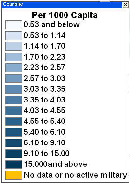
Below is a complete world map, a Robinson projection of course! Five continent maps follow to provide you with more detail on active duty troops per 1000 capita. The population was a 2009 estimate by Caliper Corporation and the military data came from a variety of sources, a list of which can be found here.
I've chosen to put the legend at the bottom of all the maps. I wanted to leave the maps free from clutter and the actual number (per 1000 capita) isn't as important as how a country relates to its neighbors and the rest of the world.
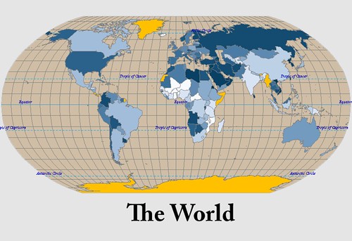
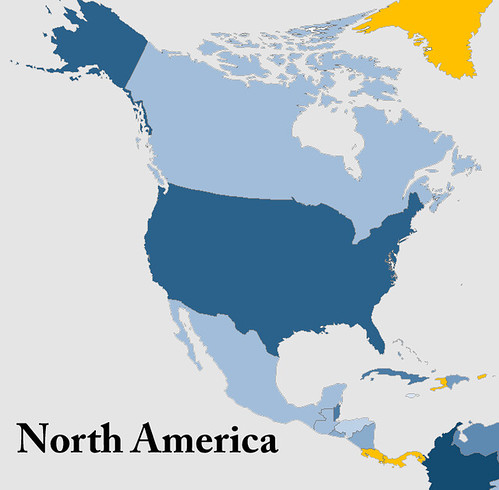
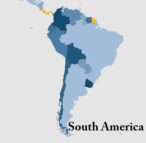
Here is a list of the top ten military countries by active duty troops per 1000 people.
1. Eritrea
2. North Korea
3. Israel
4. Vietnam
5. Singapore
6. United Arab Emirates
7. Lebanon
8. Brunei
9. Djibouti
10. Jordan
Eritrea is the big surprise and unquestionably the real story, but I already knew that thanks to Mr. Myers. I've listed a few notables that stood out for me below. What do you think? Is there a country you expected to have a high per capita military but does not?
Other Notables (out of 161)
29. Russia
50. USA
73. Pakistan
139. India
143. Tajikistan (I expected this to be much higher)
As much as I try to keep an eye on the events occurring across Africa and other developing countries, the information available is barely a trickle compared to the barrage of domestic news thrown at me. I'm always searching for a different side of the story and the lesser-known yet just as important happenings in the world. I ask you to help me find those lesser-known news sources, books and blogs! Your comments are appreciated.
And for those of you who would like another reason to indulge in a drink and a good read, might I suggest Laphroaig scotch whiskey.
I knew Eritrea has its share of political instability. It's also had a tumultuous history with its neighboring States, Ethiopia in particular. I did not, however, know the extent of the Eritrean army. The army is immense for, as Myers puts it, "one of Africa's most enchanting and unpredictable countries."
After some googling inspired by Myers' article, I found an interesting visualization of percentage of GDP spent on military. Cool, yes, but not quite what I was looking for. I wanted a map to compare the rate of active duty troops (per 1000 capita) in the countries of the world. Where does military might exude itself most in the fabric of the world's societies? To find out, I went ahead and made a map myself.
Below is a complete world map, a Robinson projection of course! Five continent maps follow to provide you with more detail on active duty troops per 1000 capita. The population was a 2009 estimate by Caliper Corporation and the military data came from a variety of sources, a list of which can be found here.
I've chosen to put the legend at the bottom of all the maps. I wanted to leave the maps free from clutter and the actual number (per 1000 capita) isn't as important as how a country relates to its neighbors and the rest of the world.
Here is a list of the top ten military countries by active duty troops per 1000 people.
1. Eritrea
2. North Korea
3. Israel
4. Vietnam
5. Singapore
6. United Arab Emirates
7. Lebanon
8. Brunei
9. Djibouti
10. Jordan
Eritrea is the big surprise and unquestionably the real story, but I already knew that thanks to Mr. Myers. I've listed a few notables that stood out for me below. What do you think? Is there a country you expected to have a high per capita military but does not?
Other Notables (out of 161)
29. Russia
50. USA
73. Pakistan
139. India
143. Tajikistan (I expected this to be much higher)
As much as I try to keep an eye on the events occurring across Africa and other developing countries, the information available is barely a trickle compared to the barrage of domestic news thrown at me. I'm always searching for a different side of the story and the lesser-known yet just as important happenings in the world. I ask you to help me find those lesser-known news sources, books and blogs! Your comments are appreciated.
And for those of you who would like another reason to indulge in a drink and a good read, might I suggest Laphroaig scotch whiskey.
Wednesday, August 25, 2010
Update: National Geographic Maps
A few recent posts have called into question the actions of the National Geographic Map Policy Committee.
Thanks to the helpful Kevin Lance of National Geographic Maps, I have the contact info for the Editorial and Research head in the Nat Geo Maps department, Juan Valdes. Yes, the coffee guy does maps too!
So far Nat Geo has been extremely accommodating. A big thumbs up to them! I'm excited to hear back from them.
After playing phone tag with Juan I sent him the following email:
Hi, Juan,
Thank you very much for your prompt response.
Kevin Lance referred me to you to answer a few questions regarding the reasoning/research behind a few areas on the National Geographic political maps.
1. What happened (on the ground) between 2001 (based on the world map) and 2007 (based on the Africa map) that changed ownership of the Hala'ib triangle from Sudan to Egypt? Also, why is Bir Tawil now shown as part of Sudan?
It appears the change now recognizes the 1899 border established by the 22nd parallel in place of the 1902 agreement the British put in place.
I know the Sudanese have pulled troops from the area and that Egypt has invested in the area.
In summary of question 1 - Why is the Hala'ib triangle now shown as part of Egypt and why is Bir Tawil shown as part of Sudan?
Question 2 - Why is Somaliland shown in grey on the continent political maps but not delineated at all on the world map?
National Geographic often discusses its desire to reflect what is on the ground and remain a-political. Somaliland recently elected a new president in a free and fare election as an opposition candidate. It seems the reality on the ground is that Somaliland is very much an autonomous State. The same cannot be said for Somalia. It seems that the only issue for showing Somaliland as part of Somalia is the lack of international recognition. Isn't recognition by other countries a political decision in itself?
In summary of question 2 - What is the research and reasoning for showing Somaliland in grey on Africa political maps and not at all on world maps?
I'll post Juan's response as soon as I get it.
To pass the time, why not take a peak at some of my pictures from Namibia.
Monday, August 23, 2010
Where in the World is the Mosque Near Ground-Zero?
In the last two weeks the "Ground-zero mosque" aka the "cultural center near ground-zero" has grown into one of the most divisive topics on American news shows in recent memory.
Before we get into my commentary, lets get to the point (and the fun part) of this post and take a gander at the area in question in this Google image of the week, the area around ground-zero in New York.
You can navigate to this site by searching the following coordinates 40°42'46"N 74°00'36"W
It's clearly not AT ground zero but it certainly is close and considering the circumstances opposition is certainly understood.
 I, like most, support the first amendment, protecting freedom of religion. I appreciate the argument that a mosque should not be built "at ground zero" but do not approve of the fear-mongering hate speech tactics being used by some.
What has become almost as big a story as the debate on the mosque is the discussion about the naming conventions of this story as highlighted in this NPR blog.
The blogosphere is all over this controvery, here is one example opposed to the mosque. Notice all the American flags plastered across the site - purposefully sending the message that to be for the development is somehow anti-American. There are also several images from 9-11. This does not have anything to do with honor for the site or the tragedy but a deliberate attempt to tie main stream Islam to the atrocities of the extremists. John Wayne Gacy's acts should not represent the beliefs of the Catholic community. Just like the actions of pro-life terrorist bombers should not be representative of all pro-lifers.
I do believe that some of those opposed to the development jumped on the opportunity to trick the public into thinking that this mosque was in the footprint of the WTC and I think it's an attempt to feed the perception of the uneducated that Obama is a Muslim. The same uneducated probably don't understand we're not the United States of Christianity.
Here's an interesting excerpt from the Israpundit blog - "If the ground zero mosque is tied to terror regimes and groups financially or otherwise, and we know that it is..." What a good looking argument "and we know that it is". Geesh.
The inability to separate the world's Muslim community from Muslim extremists is disheartening. However, just as it is their right to practice their religion in the shadow of the worst domestic terrorist attacks, everyone has the right to voice their opposition. Another reason, this country IS so great.
Cracked.com has an fascinating opposition piece to those opposing the mosque/cultural center. Click here to read the article.
It's a fascinating debate and while I fall on the pro side of the argument I do enjoy hearing intelligent points on the other side of the debate. I'd encourage you to leave a comment with your thoughts on the issue - regardless of your opinion!
I'd like to end this somewhat serious post with a little light hearted "news". I see Jon Stewart as the balance to Fox news as Fox sees itself as a balance to the "drive-by media".
Enjoy!
Thanks to the Geography Lady for the inspiration!
Before we get into my commentary, lets get to the point (and the fun part) of this post and take a gander at the area in question in this Google image of the week, the area around ground-zero in New York.
You can navigate to this site by searching the following coordinates 40°42'46"N 74°00'36"W
It's clearly not AT ground zero but it certainly is close and considering the circumstances opposition is certainly understood.
 I, like most, support the first amendment, protecting freedom of religion. I appreciate the argument that a mosque should not be built "at ground zero" but do not approve of the fear-mongering hate speech tactics being used by some.
What has become almost as big a story as the debate on the mosque is the discussion about the naming conventions of this story as highlighted in this NPR blog.
The blogosphere is all over this controvery, here is one example opposed to the mosque. Notice all the American flags plastered across the site - purposefully sending the message that to be for the development is somehow anti-American. There are also several images from 9-11. This does not have anything to do with honor for the site or the tragedy but a deliberate attempt to tie main stream Islam to the atrocities of the extremists. John Wayne Gacy's acts should not represent the beliefs of the Catholic community. Just like the actions of pro-life terrorist bombers should not be representative of all pro-lifers.
I do believe that some of those opposed to the development jumped on the opportunity to trick the public into thinking that this mosque was in the footprint of the WTC and I think it's an attempt to feed the perception of the uneducated that Obama is a Muslim. The same uneducated probably don't understand we're not the United States of Christianity.
Here's an interesting excerpt from the Israpundit blog - "If the ground zero mosque is tied to terror regimes and groups financially or otherwise, and we know that it is..." What a good looking argument "and we know that it is". Geesh.
The inability to separate the world's Muslim community from Muslim extremists is disheartening. However, just as it is their right to practice their religion in the shadow of the worst domestic terrorist attacks, everyone has the right to voice their opposition. Another reason, this country IS so great.
Cracked.com has an fascinating opposition piece to those opposing the mosque/cultural center. Click here to read the article.
It's a fascinating debate and while I fall on the pro side of the argument I do enjoy hearing intelligent points on the other side of the debate. I'd encourage you to leave a comment with your thoughts on the issue - regardless of your opinion!
I'd like to end this somewhat serious post with a little light hearted "news". I see Jon Stewart as the balance to Fox news as Fox sees itself as a balance to the "drive-by media".
Enjoy!
| The Daily Show With Jon Stewart | Mon - Thurs 11p / 10c | |||
| Recap - Week of 8/10/10 | ||||
| ||||
Thanks to the Geography Lady for the inspiration!
Wednesday, August 18, 2010
Changing the Looking Glass: Radical Geography
Shape! Size! Distance!
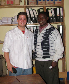
The form 3 students in the tiny village of Pommern, Tanzania outside of Iringa repeated the mantra over and over. Edward, my favorite teacher (pictured with me below right) at the school reminded me that repetition was key to drilling anything new into the kids' heads.
Their exclamation was in response to my question. What are the main types of map distortions?!
Shape! Size! Distance!
Before the class started I found a scuffed up old soccer ball, still smelling of the cow dung it had rolled through the day before on the soccer field- excuse me-pitch!
I've always felt the best demonstration of map distortion was to use a ball and a piece of paper. I folded the paper around the ball to show how the page itself became distorted then highlighted those areas by rubbing pencil lead on the folds.
I straightened the paper to show the distortions when the sphere is projected in two dimensions. Some of the students understood but map projections can be one of the most difficult spatial issues to grasp; But it is paramount to understanding ones place and relative placement on the earth.
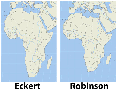 I remember as a child certain world maps making Africa look tall and skinny. Something didn't sit right with me when I saw that particular projection. It turns out that projection was an equal area projection like the Eckert IV shown in contrast with a Robinson projection in the image, left. The Robinson projection is easy on the eyes and just feels right.
Wouldn't you agree?
After a heads up from Matt Rosenberg in his post on the about.com site, I found a great website which uses radical map projections to view data in a new and exciting way.
Projections help us display the spheroid earth on a two dimensional surface. My favorite projection for world maps and the one used by the greats at national geographic is the Winkel tripel projection, a variation on the Robinson projection.
In one post ten projections are layered on each other to show the variations.
Since I mentioned National Geographic I'm excited to tell you that I have received an initial response from the company regarding my inquiries to the map policy committee as well as the Hala'ib triangle. I'll be sure to update you on what I ultimately discover.
I really hope you check out some of the amazing maps at radicalgeography.com.
The form 3 students in the tiny village of Pommern, Tanzania outside of Iringa repeated the mantra over and over. Edward, my favorite teacher (pictured with me below right) at the school reminded me that repetition was key to drilling anything new into the kids' heads.
Their exclamation was in response to my question. What are the main types of map distortions?!
Shape! Size! Distance!

Before the class started I found a scuffed up old soccer ball, still smelling of the cow dung it had rolled through the day before on the soccer field- excuse me-pitch!
I've always felt the best demonstration of map distortion was to use a ball and a piece of paper. I folded the paper around the ball to show how the page itself became distorted then highlighted those areas by rubbing pencil lead on the folds.
I straightened the paper to show the distortions when the sphere is projected in two dimensions. Some of the students understood but map projections can be one of the most difficult spatial issues to grasp; But it is paramount to understanding ones place and relative placement on the earth.
 I remember as a child certain world maps making Africa look tall and skinny. Something didn't sit right with me when I saw that particular projection. It turns out that projection was an equal area projection like the Eckert IV shown in contrast with a Robinson projection in the image, left. The Robinson projection is easy on the eyes and just feels right.
 Wouldn't you agree?
After a heads up from Matt Rosenberg in his post on the about.com site, I found a great website which uses radical map projections to view data in a new and exciting way.
Projections help us display the spheroid earth on a two dimensional surface. My favorite projection for world maps and the one used by the greats at national geographic is the Winkel tripel projection, a variation on the Robinson projection.
In one post ten projections are layered on each other to show the variations.
Since I mentioned National Geographic I'm excited to tell you that I have received an initial response from the company regarding my inquiries to the map policy committee as well as the Hala'ib triangle. I'll be sure to update you on what I ultimately discover.
I really hope you check out some of the amazing maps at radicalgeography.com.
Monday, August 16, 2010
Drawing the Lines Between North and South Sudan
 Following more than two decades of the young nation's second civil war, a yet to be determined group of voters in South Sudan plan to hold a referendum on independence in January 2011. For many in the south, the potential prosperity of an independent South Sudan has been a long time coming. But where will the borders between North and South Sudan lie? The area in question is the subject of this image of the week. While the image is a bit underwhelming, the issues are beyond intriguing.
 Because I am fascinated with cartography, independence and Africa it was natural for me to come across a fascinating article written by Rengo Gyyw Rengo,Jr on the website www.southsudannation.com. While the original link is gone. You can still access his article here. I followed up with Rengo and have since corresponded with him several times.
While the thought of an independent South Sudan is exciting and has been surprisingly accepted in concept by Omar al-Bashir, much work remains before it can become reality. Recent comments from Khartoum hint at the fact that the North will not support a vote by the South if the precise borders have not been drawn.
I've included a map below showing the regions of Sudan from Wikicommons to give you a frame of reference.
 For more info on the regions (such as a legend) check out the Southern Sudan wiki page. It's important to note that the voter pool has not been decided yet and represents another serious challenge before the vote can take place.
After reading al-Bashir's comments on borders I followed up with Rengo and recieved the following:
"Regarding the political atmosphere surrounding the conduct of referendum for South Sudan and those other thorny issues which parties use as preconditions for referendum and lack of political will towards the possible conduct of referendum, its repercussions and so on, are matters to be looked at by all. I have been pondering about the border issue, and I happened to have attended a political rally in Juba on 30th July last month to have a grasp at contentious issues and I can now fairly examine the possibilities ahead in an opinion analysis.
You have given me an honour to now accept to write something about it."
I'm excited that I have a pen pal in south Sudan who attends political rallies in Juba! How cool is that?
I'm looking forward to Rengo's comments and will be sure to post a link when they become available.
Sunday, August 8, 2010
African Renaissance and Intellectual Property
Senegalese President Abdoulaye Wade is an interesting guy. Under his presidency the country has experienced economic expansion and remained an example of a relatively successful democracy in Africa. Interesting men have interesting ideas. Wade's biggest idea (physically) has turned into reality and is shown in this weeks image of the week.  The African Renaissance statue in Dakar, Senegal. It can be seen in the center of the image to the right or at the coordinates 14°43'19" N 17°29'41" W.
Despite an expanding economy, Wade has come under serious fire for the monument. At a cost of more than $27 million, many Senegalese are questioning the investment when many infrastructure and public works projects are needed- and already being heavily subsidized by the USA by the way (the infrastructure projects that is). This has caused many to question Wade's motives, particularly because he is claiming the idea as intellectual property as well as 35% of proceeds related to the statue. You read that correctly. Because he envisioned the statue, had a foreigner design it and North Koreans build it, he thinks he should be entitled to 35% of any future income it generates. The corruption is mind boggling. The fact that Jesse Jackson spoke at the opening speaks to his excellent judgement. This non-sense has become all too common in African politics. Even the design itself has been seriously criticized. It certainly doesn't look like any African family I've seen.
Political considerations aside, the statue is a wonder and while arguably inappropriate, I think, quite beautiful. Near the eastern edge of the continent it certainly exudes a sense of strength and pride. While it may be years before the statue brings an additional 27 million dollars of tourism dollars (especially after Wade's cut of the money), its something I'd really like to see some day. Just a few months ago I was less than a mile away from the statue but it was dark and I was on the wrong side of the plane. Next time! If you've seen the African Renaissance statue in person I'd love to hear your account.
I started thinking about this post after the team at the geographic travels blog did a piece on the twenty tallest statues in the world. Despite being taller than the Statue of Liberty, the African Renaissance is not even in the top twenty. There are certainly some large statues out there. Go check 'em out!
 The African Renaissance statue in Dakar, Senegal. It can be seen in the center of the image to the right or at the coordinates 14°43'19" N 17°29'41" W.
 Despite an expanding economy, Wade has come under serious fire for the monument. At a cost of more than $27 million, many Senegalese are questioning the investment when many infrastructure and public works projects are needed- and already being heavily subsidized by the USA by the way (the infrastructure projects that is). This has caused many to question Wade's motives, particularly because he is claiming the idea as intellectual property as well as 35% of proceeds related to the statue. You read that correctly. Because he envisioned the statue, had a foreigner design it and North Koreans build it, he thinks he should be entitled to 35% of any future income it generates. The corruption is mind boggling. The fact that Jesse Jackson spoke at the opening speaks to his excellent judgement. This non-sense has become all too common in African politics. Even the design itself has been seriously criticized. It certainly doesn't look like any African family I've seen.
Political considerations aside, the statue is a wonder and while arguably inappropriate, I think, quite beautiful. Near the eastern edge of the continent it certainly exudes a sense of strength and pride. While it may be years before the statue brings an additional 27 million dollars of tourism dollars (especially after Wade's cut of the money), its something I'd really like to see some day. Just a few months ago I was less than a mile away from the statue but it was dark and I was on the wrong side of the plane. Next time! If you've seen the African Renaissance statue in person I'd love to hear your account.
I started thinking about this post after the team at the geographic travels blog did a piece on the twenty tallest statues in the world. Despite being taller than the Statue of Liberty, the African Renaissance is not even in the top twenty. There are certainly some large statues out there. Go check 'em out!
Friday, August 6, 2010
The Hala'ib Triangle and why National Geographic has it Wrong
 The Hala'ib triangle is a division of land in northeast Africa. The area is a disputed region, a result of two different borders being set between Sudan and Egypt, both of whom claim the Hala'ib triangle.
 In 1899, Egypt and the United Kingdom agreed on the 22nd parallel as the border between the two countries. Three years later in 1902 the British created a new dividing line, granting administration of the area to Sudan because of its proximity and access from Khartoum. The administrative boundary created the Hala'ib triangle north of the 22nd parallel and a small area, the Bir Tawil south of the parallel. The 1902 agreement ceded administrative control of Bir Tawil to Egypt (which was really the British anyway) Both can be seen on the map above.
While both countries still claim the Hala'ib triangle, neither claims Bir Tawil, the "lonely little triangle" to the south of the 22nd parallel. So what would cause two countries to claim one 20,000 square kilometer piece of land but both reject claims to a 2,000 square kilometer parcel adjacent to it?
If you guessed natural resources, you're probably right! But that is only part of the story.
While Sudan held troops in the area for years it was Sudan granting exlploration rights to the Canadian oil company, Canadian International Petroleum Corporation, that finally made Egypt take note.
In 2000, Sudan pulled troops from the area, ceding de facto control to Egypt. However, Omar al-Bashir remains firm in Sudan's claim to the land, stating earlier this year "Halayeb is Sudanese and will stay Sudanese".
I found a FANTASTIC article on the issue in the Sudan Tribune.
In my daily routine of mapgazing I discovered that National Geographic, who I see as THE authority on political maps, now uses the 22nd parallel as the border. This shows all the land to the north as Egypt and all to the South as Sudan. This is a significant change from the 2000 world map which shows the 1899 Anglo-Egyptian political division - complete with Egpyt control over Bir Tawil. What's not clear is what happened that made them switch how the area is displayed.
I thought that it must have been Sudan removing their armed presence in the area and the desire to show de facto control. But that doesn't explain why they show Bir Tawil as Sudan. If it was the removal of troops that prompted the change, that should only be reflected in the Halai'ib traingle, not Bir Tawil. Until I get a better reason or explanation, I think National Geographic has this one wrong.
I emailed National Geographic for an answer on what prompted the Map Policy Committee change from the 1899 political boundary to the 1902 administrative boundary. I'll probably only receive a generic email but I am going to stick with this, look for individual contact information and see if I can get official word from a spokesperson. Perhaps I should have inquired through their press inquiry e-mail. Whatever I find out I'll let you know.
How do you think the Hala'ib triangle and Bir Tawil should be displayed?
Monday, August 2, 2010
Emirates and the Image of the Week
The Google image of the week comes to us from the emirate of Dubai. I actually have a series of Google Earth Images which highlight the development of The World, a set of man made islands on the Persian Gulf. It's quite fascinating to see the development over the course of the last few years. For reference, these images come from 25°13' 21" N 55°10'9" E. Happy hunting.
December 2004

April 2005

June 2005

October 2006

August 2009

While it's an amazing enginering feat, I can't help but notice the fact that the image of the world could be a bit cleaner. What's up with Europe? Is that really an island to represent the Seychelles and Mauritius? I guess we'll have to wait and see for the project to be completed- which could be a very long time.
What do you think of the islands?
It's still a very interesting feature and a place where almost everyone will be able to say "I can see Russia from my house."
Digging a bit further into the geography of this series of images, let's talk about Dubai's political division, the emirate.
Matt does a good job discussing country, state and nation etc. But as we look to the Middle East we come across another political division of semi-autonomy know as Emirates.
So what's an emirate?
Not surprisingly it is easy to get caught up in semantics and details but simply stated, an Emirate is a political division of land which is either autonomous, such as Qatar and Kuwait, or semi-autonomous such as the emirates which make up the United Arab Emirates. While many people are familiar with Dubai and Abu Dhabi as cities, they are both also emirates, they are part of the United Arab Emirates - a nationally recognized independent State, a federation of emirates. However, it's important to note that the cities of Dubai and Abu Dhabi do not make up the same geographical area of the emirate.
The remaining five emirates of the UAE include Sharjah, Ajman, Umm al-Quwain, Ras al-Khaimah and Fujairah. And yes, even the emirates have their share of territorial disputes, particularly on the east coast.
And I would be remiss if I didn't mention the two other existing emirates, Qatar and Kuwait. Dipping a bit into the historical significance of Kuwait, today marks 20 years since Iraq invaded Kuwait.
Subscribe to:
Posts (Atom)


