Monday, October 29, 2012

Standby

About twenty years ago I learned about "bumping" on airlines, or at least thought I did. I remember hearing that all you had to do to get a free flight was ask to be "bumped", or placed on the next flight. This was the airline's way of fixing overbooked flights. To me it seemed like a big secret for the seasoned flyer, and I was flying pretty much every year to Florida, which, at the time seemed adequate for entry into the club.

Even if that was how "getting bumped" worked, my parents never seemed too keen on it. That always confused me, but after a recent travel experience to the Netherlands I have a greater understanding for my parent's desire to stick to the schedule.

"Buddy passes!" my friend said to me, "400 dollars and you can fly to Amsterdam for a three day weekend".

Sign me up.

While I already rely on Google too much, in hindsight this would have been a good time to review the too-good-to-be-true nature of a 400 dollar round trip transatlantic flight. Now I know.  And if you didn't before, now YOU do.

It wasn't even the not being able to get on the plane I thought I had booked to fly from DTW to AMS thing. It was the fact that, coming back, I wasn't able to get on the flight I had originally booked coming back (AMS-DTW), or the next one for that matter.  Specifically, it was the fact that, no matter what I did, I was never going to be guaranteed a ticket. While this makes for a minor inconvenience, say, coming back from St. Louis. When "trapped" on the other side of the ocean, only mostly joking about whether or not you'll need to start looking for work, it makes for an unsettling time.

In the end it all worked out, and thanks to a nice Delta lady in Amsterdam I was able to get back to Detroit (via Boston) only 7 or so hours later that originally planned. So while I've somewhat soured on the buddy passes for short term international travel, I was able to enjoy a nice few days in the Netherlands seeing Amsterdam, Rotterdam, and a few places in between.   Here's a look at the town of Barendrecht where I stayed for a night with a friend.  Note the iPhone 5 purple lens flare.

Monday, August 13, 2012

Map of Previous Olympic Host Cities

Despite some "disconcerting" signs, the London Olympics were a great success. We've learned that it is much more difficult to plan an Olympiad in a busy city than in the middle of nowhere. We've learned about the remarkable per capita numbers for places like the Bahamas, Trinidad and Tobago and Jamaica, and that there is no such thing as a sure thing at the Olympics, a fact which does not impress Mckayla Maroney. I've looked it up before, but challenged myself to remember as many as Olympic host cities as I could. The results were not pretty. So, I put together a quick little reference map.
I knew it would be, but the cities are awfully Euroasialia-north'mericacentric. Sochi and Rio both represent a significant departure from the traditional areas. Here's hoping for campaigns like Baku 2020(Azerbaijan) and Kenya (2024).  Sadly, Baku has already been dropped.   

Tuesday, July 24, 2012

Mapping 2012 UN Security Council Resolutions

I've always been hesitant to write or highlight things in books, magazines or newspapers. For some reason I feel like it will ruin it for the next time I read it. I consciously do this knowing that the ability to go back through an article in Foreign Affairs or Foreign Policy and see the highlights would be a great time saver. So recently, I grabbed a few index cards. Similar to the dream notes, the thought is I can write down information about new concepts or add to a card with general information on a place, person, policy or historical event.

The ability to quickly access information is something I've grown accustomed to. So much so, that I get frustrated when information isn't a google away. Earlier I read a BBC article on South Sudan's proposal to the north on oil royalties and fees in excess of 8 billion dollars. Noting that Sudan is looking to charge 36 dollars per barrel in refining, transit and tariffs, I thought the major Sudan oil pipelines might make for a creative map to put together.

Now it seems that the geography of a pipeline that in most years is pumping billions of dollars of a commodity through it would be easily accessible. Not so. Through a series of what, at the time seemed like related searches, I found myself looking for a list of US economic sanctions on other countries. While I was able to find an encyclopedic reference, I wasn't able to get the "elevator speech". As I continued to poke around I came across a list of UN Security Council Resolutions by year.

Just in case anyone happens to wonder where UN Security Council Resolutions in the first half of 2012 relate to, I put together a map, along with links to the resolutions themselves.

Monday, July 16, 2012

Google Maps with Some Style

I know, I know, Google Maps API V3 is all I've been talking about, but there really is no end to what one can do using it.  As a mapaholic learning more and more each week, I can't help but want to share the things I discover.

There's no doubt the look of a regular Google Map is clean, classic and easy to read and understand.  Sometimes, that classic look just doesn't cut it.  Fortunately Google offers a great tool to style their maps with any colors you want.  It takes a little bit of trial and error because the feature classes and names are not very intuitive, but in just a few minutes you'll get the hang of it.

Once you get the custom style you like you click a button and are given a javascript object.  You can use that in your code to customize any map you host.  Here's what the code looks like.

Easy peasy lemon squeezy.  The Google Geo Developers Blog posted a few great examples of custom map styles.  I would be remiss if I didn't share this gem with you.

Monday, July 2, 2012

Fusion Table Dead End

I had been planning on posting another fun map created using Google Fusion Tables, but with another week of experimenting under my belt, I've come across too many issues and will instead use this post to complain :)

I like Fusion Tables because of the visualization options, the map feature in particular.   It works very well with your own set of data provided you have a clean set of geographic features to work with.  However, if you're scouring the web for data from something like the World Bank or CIA Factbook, chances are you'll end up with a set of data with no geography tied to it, only a name.   The Fusion Tables tutorial video shows a perfect way to visualize this data by searching publicly shared tables and merging it with an existing set of country borders.  Using the merge function you can link two tables together, much like using a key field in access.

If you have a few minutes, check out the video.


So let's say we have data on the number of cows per square mile by country.  If we were to merge it to an existing table of "world countries" that has geographic bounds we would not find the same success as the tutorial video above because not all of the country names would match.  The "United Republic of Tanzania" and Tanzania will not match.  USA and United States will not match...etc.

This makes sense, but what doesn't is that you cannot edit the fields of a merged table.  The only way to fix this is to edit the names of the countries in your original file and then re-merge with a shared table.  Even this isn't a big deal by itself, but you aren't able to save the shared files to your own fusion tables set.  This makes it so that you must re-search for the table online. This is all complicated by the fact that everything is stored online, slowing everything down.

Fusion Tables is closely tied to Google Drive, in fact, there is no stand alone Fusion Tables page. Instead, when you go to the Fusion Tables "home page" you are actually in Google Drive, Google's free cloud service.

But by far the biggest problem with fusion tables is that from within a table you can not get back to your Google Drive page, or a page with a list of your fusion tables.  ALl of the other issues could be solved if there was simply a "back to my tables" button.  Instead, I quickly end up with 15 tabs open in my web browser and lose all organization.

Here is a screen shot of how you will run in to a no-way-out dead end when you open a fusion table.


If you use fusion tables I'm interested to hear your thoughts.  Yea or nay?

Monday, June 25, 2012

2012 Failed States Index

The Failed States Index is a great mashup of data and maps. This year, the data feels much more accessible. The Fund for Peace website has been redesigned and you can actually download the data easily. I had originally planned to write about the inordinate number of African States high on the list, as well as some surprises like Mali being so low for a country whose democracy seems to be tearing at the seams, but a few days ago, John Campbell pointed out just about everything I wanted to point out, and much more eloquently. As such, I encourage you to go read his brief comments

I also downloaded the data and created a Google Fusion Table. You can click on a country to see how it stacks up in each of the 12 categories used in the index.

Monday, June 18, 2012

Did Google Get Hacked?

While I strive to write about things you might not otherwise read about, I've never had a "breaking news" story.  While preparing for today's post, however, I came across what I believe to be a hack at Google.  If it's not a hack, it's surely a mistake.  If not a mistake, it's at least worth discussing.

Google makes available a series of icons for mapping with Google Fusion tables.  There are about 200 icons that have names like "orange_blank" or "bars".  You can view all the default icons here by clicking visualize ->map.

Cool huh?  I thought so too.

In general the icons are pretty helpful.  I was surprised to discover that the icon for "temple_ip" appears to be a swastika.  Take a look:


I was looking at the symbols just a few days ago and didn't notice this, which leads me to believe it's not supposed to be there.  That and the fact that it's incredibly distasteful - a not-often-employed trait for Google.  I know the swastika is still used a lot to symbolize positive things, but it still seems strange that it is a featured icon image for Google.  I left a comment; we'll see what happens!

So there's that. A bit disturbing, hopefully it will be fixed soon. Or maybe I'm just missing something.  Feel free to let me know in the comment section!

Less "breaking" yet far more "exciting" is the news that the Fund For Peace has released its 2012 failed states index which Foreign Policy distributes.  I've written about the index before but I'm hoping to use their data, along with my new knowledge of Google Fusion Tables and Google Maps to make a cool map or two.  It won't be as cool as this one, but it'll be something I created :)  That will be next week, unless more news breaks on the infamous Google swastika.

Monday, June 11, 2012

Apple Takes a Bite out of Google

If you are just a causal map user, or a map enthusiast who has been hiding under a rock, you might have missed the map spars Google and Apple are taking at each other.  I'll preface this by saying Google Maps was what finally convinced me to buy an iPad (who am I kidding, they had only been out for a week).

Before Steve Jobs threatened to go all global thermonuclear war on Android (War Games style), Google and Apple seemed to have somewhat of a budding partnership.  There's no doubt Apple's core (no pun, well ok, pun) mobile products success is in part due to seamless and beautiful integration of maps...Google Maps.

Well Google and Apple are getting a divorce, and each seems to be trying to piss the other off by upgrading to a hotter wife.

There's no doubt Apple didn't like the idea of being so reliant on Google Maps.  It must have been hard for them to fully realize how far behind they were in the great map race.  Nevertheless, Google was perfect for the iPhone and despite the souring relationship at the top.  Apple continued to be reliant on Google Maps.  There is little doubt Apple has been working on catching up to Google in the Great Map Race for some time.  There's also little doubt that Google beginning to charge developers for every 1,000 map requests over 25,000 per day rubbed Apple the long way. 

Apple is notoriously tight lipped about product changes and development.  The decision to drop Google Maps from the iDevices was not very well hidden.

The race to out-do the other is on. We heard Apple would announce "Google Maps to be sacked" at the June 11 (today) WWDC.   Not to be out done, Google announced they would be making a presentation on June 6th about updates to Google Maps, including some pretty cool 3d stuff.


I'm reminded of the T. Pain and Justin Timberlake song, Dead and Gone with the lyric: "I hit you, you hit me, I shoot you who get locked up? Me".  It sounds much better when sung, but the point is, this is a BIG risk for Apple.  If they don't come out with a product that equals Google Maps, they are in trouble. Because of more and more location based apps impacting the user experience with mobile devices, anything less than Google Maps could see Android picking up ever more market share.

It sounds as though Apple is looking to pick up right where they made Google leave.   I've only seen screen shots from the Apple Maps announcement earlier today.  The jury is still out. Here's a thought, Google. MERGE GOOGLE MAPS AND GOOGLE EARTH.

Tuesday, June 5, 2012

Remember Kony?

A few short months ago the web was all a twitter with Joseph Kony and the #Kony2012 campaign.  I wrote that despite all the misconceptions and misrepresentations, the whole phenomenon was a good thing.  People were talking about Africa (Uganda) and it encouraged many people to dig just a little bit deeper.

The Kony phenomenon has come and gone.  This will long be pointed to as an example of how "powerful" social media can be.  But today, Joseph Kony remains free, and western interest is...well, see for yourself.


I suppose it's sad, but it's not as though anyone thought interest would really last. As Kony interest wains, more conflicts are emerging, particularly in Africa. Keep an eye on Mali. The transition away from the junta is far from over. I'm sure many have pointed out the irony that it was after the military coup that Azawad declared independence and the Tuaregs took over control, but it was anything but ironic. The rest of the world could see that coming the day Amadou Toumani Touré was chased from his residence. Stay informed.

Monday, May 21, 2012

Google Maps API for Dummies

...or at least I wish that's what this post was, or that I could find a Google Maps API for dummies book or website....or anything.  So for those of you who find this post looking for such a thing, I apologize for my inadvertent Search Engine Optimization (SEO) leading you here.

I've spent a lot of time over the last two weeks complaining about Google and then learning more about the amazing things you can do with their products.  This has only gotten worse since I decided to become proficient with the Google Maps API.  You might have noticed the interesting semantics of the previous sentence.  I've decided to become proficient at things before with mixed results, for the most part though I end up with a modest improvement in a particular skill which I can use to, in some way, make things better.  On occasion I've fallen flat on my face, and this Google Maps API decision has me losing to gravity once again.   

This provides me the first opportunity to quote a Disney movie in some time.
Merlin: Don't take gravity too lightly or it'll catch up with you.
Arthur: What's gravity?
Merlin: Gravity is what causes you to fall.
Arthur: Oh, like a stumble or a trip?
Merlin: Yes, it's like a stumble or a- No, no, no, it's the force that pulls you downward, the phenomenon that any two material particles or bodies, if free to move, will be accelerated toward each other.

So, a bit more on this stumble. Meet...www.projectmaplab.com

Before you get excited and click on that, let me explain a bit more. Or did you already click on it?

It's taken me a solid week to get anything working here.  I have had some hosting space, doing nothing but taking up space at the cost of about 70 bucks a year.   Dealing with simple issues like not having your naked domain (projectmaplab.com) redirect to www.projectmaplab.com and a host of requisite website annoyances slow things down but the good news is I've got most of that stuff fixed.  Now I can focus on the laboratory part of things.

When you go to projectmaplab.com you are just as likely to find a page that doesn't load as a map with some strange coloring or just a base map of Ann Arbor.  The point is this is truly my new little map laboratory.  That means,  some experiments will work, and others when mixed incorrectly will blow up like wort remover from Mr. Turkentine.

Ah ha...another movie reference. This isn't the original clip, but it will suffice.


Monday, May 14, 2012

Brushing up on Google Earth Tours

By now I was hoping to have a great selection of pictures from my recent trip to Prague and Paris.  Unfortunately, it looks like those are still a couple of weeks away.  However, this delay seems like a good opportunity to put together a quick tour in Google Earth to show my favorite views of the city as we saw them.  This is, of course, nothing more than an opportunity for me to brush up on some of the more advanced Google Earth tools I bashed last week.  

It's not pretty, but if you open this link to a KMZ file in Google Earth you'll be taken on a quick survey showing you views from the Hunger Wall and Vysehrad.

Surprise, surprise, another compatibility issue has come up.  To view this tour, you must have the Google Earth program.  Wouldn't it be nice if, when playing a tour on your computer you could create a youtube video?  After all, Google does own YouTube.  Oh well.  If you don't have Google Earth, you need to get it.  You can do so here.

Monday, May 7, 2012

Grr Google, Grr Esri

Over the last year or two Google has been moving to give all of its products a more uniform look. From blogger, to ad sense, ad words, Google Maps, Search, Google+, Youtube, everything looks distinctly more Googly than two years ago. When Larry Page took over as CEO he nixed the projects that weren't helping the company or didn't have the potential to be big ticket items and invested the money in developing projects like Google Glass.
I was easily able to embed that youtube video and if you watch it, the Google Ads will pop up and Google will make a few cents. I've come to except this sort of seamless compatibility across Google products (and even outside Google products). However, as Google Maps continues to expand, so grows my frustration with compatibility issues between Google Maps and Google Earth. A while back I made a video questioning why Google has a separate iPad app for Google Maps and Google Earth. While Google Earth the program is becoming more and more obsolete (because it's not browser based), the functionality of beginner level user generated material far exceeds that of Google Maps, the program which is no doubt used by countless more beginner level users. Combining the two programs seems like a no-brainer.

Of all the issues I've come across in the Google Earth vs. Google Maps conundrum, one stands out above the rest. Google's own Keyhole Markup Language does not render the same way in both programs. One can go into great detail and create engaging maps in Google Earth with little to know programming experience, but that same file will not be as rich in Google Maps. Pretty, scaled and colorful labels in GE are rendered as boring red points of interest on Google Maps, where the user has to click on the point of interest to get any info. And the customizations possible in GE pop-ups are not available in Google Maps. You can create excellent maps from scratch in Google Earth but you can only share them with people that use Google Earth. I'd like to think GE is installed on every computer, but its not.

I was hoping that Esri's free arcgis.com would be the answer to these problems. It is not. While it is orders of magnitude better at allowing edits to selected features (like changing all of the dots that represent swimming pools to blue, or all of the states with Republican Governors), it simply lacks full HTML integration, removing an infinite layer of customization. ArcGIS.com does not allow a user to create features, rather you must upload a shapefile. You're really only to create fancy things with subscriptions. Sure extra money for some advanced features are nice but the movement is definitely towards free and ArcGIS.com comes up a bit short. So, now we're stuck with three platforms, all of which excel at a portion of map making or editing but none of which is a consistent go-to solution.

Monday, April 23, 2012

A Few Quick Notes on Prague

Admittedly I knew very little about Prague before traveling there a few weeks ago; Central European styling, new EU membership and 1,000 years of history at every street corner.  That was the extent of my knowledge.

So for those of you reminiscing about a trip, those of you considering Prague as a future destination, or, if like me, you're just curious about everywhere, here are a few notes for you.   I've included links to the wikipedia pages which will provide a far better background than I ever could.

Places you HAVE to see
Charles Bridge.  It can't get much more touristy than the bridge but it's amazing to walk across something 500 years old.

Vyšehrad - Hidden gem

The Hunger wall - this yielded some of our best pictures

Prague Castle - It can be confusing where the castle/palatial outcrops end and the City begins because the Castle is the largest in the world.  You'll know you're there when you have to purchase tickets to go any farther. 


I wish I had the opportunity to sit down with everyone who reads this post to reflect on the city.  It far exceeded my expectations.  The people were friendly, the food good, it's a place I'm looking forward to visiting again.

There is graffiti EVERYWHERE!  While a bit concerning when you first see it, the graffiti is not pervasive and has yielded another awesome place to go, Lennon Wall.

It's Europe, and they have great public transportation but Prague has crazy traffic.  Utilize the metro and the trams!

As for the half-marathon, it could not have gone much better.  The route, for the most part was beautiful, the weather perfect and I came in under two hours.

The more exciting post will come after I'm able to weed through the 700 or so pictures we took and get the best up in a gallery. 


Monday, March 26, 2012

On Holiday

Wednesday is the big day. I'm headed out for seven days in Prague and Paris. I've included a couple maps showing where our hotels are. We'll be running the Hervis half-marathon on Saturday. I've spend a considerable amount of time trying to figure out what electrical attachments I need for the various electronics I'm bringing. I'll spare you the details, which of course I don't actually understand, and instead say that if things go as planned I should be able to post a couple pictures via wifi while across the pond. I'll also end up with a new set of pictures on flickr.


View Hotel in Prague in a larger map

View Hotel in Paris in a larger map

Monday, March 19, 2012

Finding Clarity in Updated Imagery

In February, Google posted on its lat/long blog that they had uploaded new imagery for more than a hundred different countries. Better yet, they released a KML file that showed the locations of updated imagery including, rural Chad, new housing developments in Burkina Faso, N'djili Airport in DRC - all sorts of interesting stuff. In fact, you should check it out by clicking here and downloading and viewing the KML. Better still, this prompted me to take another peek at the Village of Pommern, which I finally found on Google Earth a few months back. It turns out that the imagery has been significantly improved. So much improved that I could clearly see the outline of the cafeteria extension we were working on back in 2009. It is in the center of the map below.


View Larger Map

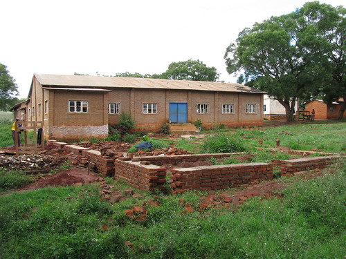
Here's a picture of the area as it looked when we were working on it. Picture 301

So that's fun.

Monday, March 12, 2012

So You Want to Help Ugandans

In 2009 I added the veil of green to my twitter avatar to "support" the Green Movement protests and promote awareness of election fraud in Iran.  It seemed like a nice thing to do.  Realizing, for reasons financial and other, that I wasn't able to attend any rallies in Tehran, I figured by changing my twitter avatar someone might see it and google "What does a green twitter avatar mean?"  That was the goal - promote awareness.

After stumbling around online for more info on what was going on in Tehran (remember this was before the Arab Spring and daily updates of Bashar al-Assad) I came across a new term: slacktivism.  Used in a sentence, it would go something like this:  People who change their twitter avatars to green monochrome are slacktivists.

Slacktivism is a fascinating portmanteau, meaning, more or less, activism that makes you feel good but has no impact, direct or otherwise.  I didn't like the thought of being dubbed a slacktivist.  After thinking about it more, I allowed myself to appreciate the term slacktivism, and also to realize the fact that BEING aware of the situation, just like any other travesty in other parts of the world, is among the more important things one can do.  No matter how small the impact, learning about, talking about and posting about things like the recent murders in Nigeria or who is responsible for the most recent bombings in Nairobi is better than nothing.  So while I understand the pejorative nature of the word slacktivism, in the end it's really not much different than activism.   Awareness of the masses is one of the most powerful tools available.  And that tool can be wielded by nothing more than a bunch of slacktivists. 

And now the masses learn about Joseph Kony and the atrocities "going on in Uganda" and it suddenly became chic to know about the next iteration of the Kony saga or other third world conflict.

Over the last week you've probably heard one of the following:

"I ordered a KONY2012 bracelet"
"You ordered a KONY2012 bracelet? Don't you know about Invisible Children's poor giving record?"
"Central African Republic is a country?"
"But there was never a threat the US would pull it's troops out"
"I'm concerned about human rights violations by the Ugandan army"
"Something something Idi Amin"
"Check out their IRS form 990"
"Something something Milton Obote"
"Nodding disease"


My point being, the only thing "cooler" than being aware of Kony was knowing he isn't in Uganda. The only thing cooler than that was knowing about the things that are affecting Ugandans now. And so on.

As someone who tries to keep up with current events across Africa (and simply by having an interest is probably better informed than 90% of Americans) I almost got pulled into the arrogance black hole of current events one-upsmanship, but somewhere along the line I realized that no matter how uninformed or misinformed we mass of slacktivists are, the conversations occurring across US media and our social networks are actually important and worthwhile.  Awareness is key.

Even if Kony is never found, the social media, slacktivist, fact-checking palooza that is occurring will have more positive impacts than negative.

Thinking you helped when you didn't doesn't make things worse, it's just unfortunate.

Learning where Uganda is on a map helps.

So while we'll see less and less of Kony over the next few months, all is not lost.
 
But if you're looking for something else you can do to help some people in Uganda, here's a thought:


Krochet Kids intl: Meet Betty from Krochet Kids intl. on Vimeo.

And you can go ahead and check out their IRS form 990.

The hat I ordered came last week and everything is as promised, even signed by Anena Irene

So you won't find me criticizing anyone who donates to Invisible Children, and I'm glad that you know who Joseph Kony is.

Monday, March 5, 2012

Keeping TaBs on Southern Africa

I've been reading up on a few sub-Saharan Africa conflicts of the last 50 years.  It's easy to get lost in the alphabet soup of rebel groups.  Most recently I've been working to remember which is which between the MPLA, FNLA and, UNITA (I'll work on the actual acronyms next) in Angola.  For now I treat them as thoughts rather than actual words, much the same way as when I read, or at least tried to read Ringworld (or pretty much anything Larry Niven wrote).  Reading about the relationship between the US and South Africa in the 70's and 80's has been a fascinating, if not disappointing experience.

Seemingly unrelated to the history of South Africa and its neighbors, the unexpected delight of a TaB cola sent me on a separate, web-hunt.   I was pleased to discover that not only was it a Coca-Cola product, but it was a sugar and calorie free pop that tastes much better than Diet Coke, or as they call it elsewhere, Coke Lite.  The tie-in to this discussion is the fact that TaB is only available in a few countries, including the Southern African Customs Union countries, which includes many of the same players as my sub-Saharan Africa conflict reading, namely South Africa and what is now Namibia. 
The real "lesson" out of this, however, is the fact that there is a Southern African Customs Union. Now, despite the SACU's success in acquiring a tasty no-calorie pop, they have not realized a successful long-term trade agreement with the US.  Jumping to yet one more seemingly unrelated lily-pad, thinking of relations between South Africa and the US made me think of one of the hot button issues of today - Syria.  Specifically an article in  If you've been following the situation at all, you've probably been frustrated if not perplexed by the inaction of Russia and China.  Bringing South Africa back in to the discussion, you absolutely must read this article.

One of the interesting lines in the article refers to the foreign policy of developing democractic countries as having "a strong preference for softer tools of international intervention: what they call constructive engagement".  To bring this full circle, "constructive engagement" is the exact same term used by the Reagan Administration over its relationship with South Africa during the end of Apartheid.  Of course, the Reagan Administrations use of the term "constructive" doesn't seem to mean the same thing.

I doubt I'll ever write a post that makes so many jumps between unrelated topics, but sometimes, no matter how illogical the progression, it's worth it to get everything out.

Monday, February 13, 2012

Iringa Update

A little over a year ago I wrote about updating some of the streets in Iringa, to better match existing imagery.  While the individual updates were rewarding, I complained about the inability to perform multiple edits.  As I worked my way outside of the center of the city, I noticed that the streets were all misaligned.  I logged it as an issue in the Google Map Maker forum.

And nothing happened.

Until now.  I received email confirmation that my problem (the misalignments) had been fixed.  To my surprise, throughout the City of Iringa, the images and the roads are now perfectly aligned.  When I logged the issue, the streets were all 25-100 feet off or more.  Take a look at it now!


It's good to know that Google continues its cartographic work in Africa, albeit more slowly than I'd appreciate.  

On a similar front, last week Google announced it would be collecting streetview imagery in Botswana.  We don't know when the data will be live, but I'll keep my eye out for you.  Read the Google press release.

Monday, January 9, 2012

A Hot Maghreb and a Nice Warm Mitten

A couple of weeks off has provided me an opportunity to reflect. While the time was fleeting, the reflection was powerful and important. When it comes to geography, I have a renewed sense of wonder when it comes to all the Places yet to explore. Earlier today, after a Google search for "Maghreb" I ended up on a wiki commons page of a map of northwest Africa by Guilliaume Delisle.
A touch of "research" got me thinking about how cool it would be to visit the Geography and Map Division of the Library of Congress, where the above map "lives".

This ain't a bad Guilliaume!  I wonder what else he has done?  Surely, a map of Michigan. 

Which, I'll be damned doesn't make me think of the dumb Wisconsin adverts claiming mitten status over Michigan! You be the judge. Which looks more like a mitten ? :)
Yay! Michigan beats Wisconsin again!