There are a number of issues that still need to be resolved to fulfill the
Comprehensive Peace Agreement, but the people have called for an independent South Sudan. To help visualize this dramatic change in geography and cartography I've created an... Improvised Political Map or IPM.
A couple weeks ago, I
wrote that this would be the most noticeable change on the world map since the breakup of the Soviet Union. The IPM below clearly shows that to be the case.
The folks at National Geographic asked that I prevent any confusion by including the following:
Map modified by Ryan Buck. Boundaries and names shown do not necessarily reflect the map policy of the National Geographic Society.
The CPA requires that the details of the independence referendum be worked out by July 9 of this year. National Geographic won't be out with a map showing South Sudan until well after the details have been worked out but hopefully this improvisation will hold us Sudan map and geography hobbyists until then! I have emailed Juan Valdes from National Geographic Maps to get some "industry gossip" (if there is such a thing) on portraying South Sudan. I'll let you know what I hear.
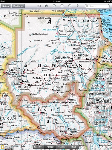
I employed some fairly "rudimentary" tools to do this. It's not perfect but it serves its purpose - to show us how different Sudan will look on a political map. The map is an edited copy of a screenshot from the National Geographic
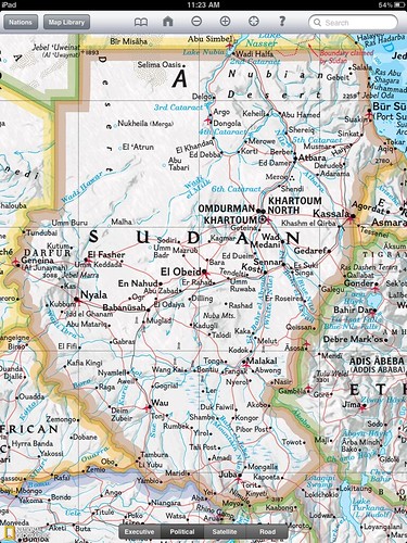
iPad app. In case my map has fooled you, National Geographic currently shows Sudan as below.
Perhaps the greatest challenge was picking a color. South Sudan will border six different countries, Sudan, Central African Republic, DRC, Uganda, Kenya and Ethiopia. National Geographic only uses six colors on their political maps which means I couldn't create a South Sudan border without copying another color. You might notice I sort of blended the border color with Kenya. That's fitting given the
Ilemi Triangle issue.
I was having a hard time figuring out how National Geographic would color seven countries with six colors. It wasn't until a conversation at work that I realized the issue was my inability to change the color of the bordering countries which was the actual limiting factor. Fast fact - a Google search following that realization taught me (haha... "a Google search taught me") China borders more countries than any other.
I think it's time to email my old South Sudanese penpal
Rengo Gyyw Rengo Jr!
It turns out Google is on the move to update and create maps of
South Sudan
If you liked this post don't forget to check out other
nerd projects.