Monday, December 27, 2010

Morogoro

As I mentioned before, making a lot of corrections in Google Map Maker can be a frustrating and tedious process. Despite that I still find myself going in and doing an edit here or there regularly.

I scrolled around the Tanzania base map and came across the City of Morogoro. Morogoro is situated at the base of a small mountain in Eastern Tanzania. I had lunch there a few years ago on the road between Iringa and Dar es Salaam.

I'm not sure when the imagery was updated, but about half the City now has clear imagery in Google Earth. Because the imagery is so clear, I was surprised to see that the only roads that have been added to Morogoro are the major highways. Nobody has worked on the area in Map Maker. For a project a bit more rewarding than realigning intersections in the generally well mapped Iringa, I started adding new roads, local roads, in Morogoro.

I've posted on the Google Map Maker forum my frustration that the majority of roads in Africa are classified incorrectly as paved. I'm using this opportunity to create a city and also try to do it the right way, with local roads classified as unpaved.

If you're interested in trying Google Map Maker out, I encourage you to participate in mapping the City of Morogoro in Tanzania. You can access the area on here on map maker.

There are plenty of roads to add and railroads to correctly align! Here is a snapshot of what I've worked on so far.

Morogoro, Tanzania

If you are working on mapping another area, leave a comment, let me know and I'll drop by and help!

Monday, December 20, 2010

Ten Months Until the 91st Anniversary of the Traffic Signal

A tid-bit came across facebook this morning saying that today was the anniversary of the first traffic light. It turns out that the statement was perhaps a bit of an exaggeration. Apparently there were traffic lights, at least of some form, even if they required a police operator, back in the 1860's. Today, December 20th, is the anniversary of the first, modern traffic signal, one designed for a full intersection and with the familiar green, amber, red tri-color configuration. Since that first modern traffic signal was installed in Detroit, I thought I'd share it with you.

The intersection of Michigan Ave and Woodward is marked by the policeman I added. In the first pic, from 2002, the streets still intersect with four corners.

Detroit 2002

A couple years later, however, the City redesigned the intersection which now circles around Campus Martius park.

Detroit 2010

And now the area where Michigan Ave and Woodward connect is Campus Martius. In the winter months, the City turns a portion of the park into a skating rink. Very New Yorkesque.

Campus Martius Park

Of course, as it turns out, facebook lied. Today is not the anniversary of the first tri-color signal. Apparently it was in October of 1920, not December 1920.

:)

Oh well. It's still cool to look back at pictures of the area before Campus Martius, even if we didn't learn anything new today.

Monday, December 13, 2010

Crowdsourced: Google Map Maker

Google encourages us all to become citizen cartographers and help map our world with Google Map Maker! Count me in! Truth be told, I've come across it several times before but was never able to make it function. Naturally, with a new tool called Map Maker I figured I was best suited to help update and verify information in the area I know most. As a default I would be zoomed in to an area I recognized based on the water features (near my home) but I couldn't add anything to the map. No matter what I tried, I couldn't add a restaurant, a road, a bike path...nothing.

I don't recall exactly what brought me to the Google Map Maker tool most recently but I ended up editing a map of Iringa, Tanzania. If I can't do it for home, Iringa is one of my first "go-tos" for creating things geography and google related, and lets face it, Google map maker is about as close a match for that criteria as I'll ever find.

It might seem that the community maps in Africa as part of Google's effort to map Africa would need a lot of work, particularly outside of capital cities but several efforts by google have extended the accuracy of these user generated maps to much more rural areas. Well, perhaps smaller cities is more accurate. The Google Africa Blog talks about one of these efforts:Official Google Africa Blog: Mapping Korogocho. While there is some educational benefit that comes with trainings like this, in the end, Google is the big winner.

I was impressed by the accuracy of most of the roads in Iringa. All but a few outlying dirt roads were included and for the most part the accuracy matched up well with the satellite imagery.

While not as intuitive and arguably not as simple as Google's Building Maker, Map Maker offers much of the same fun factor. It is rewarding to know that you are contributing to a more completely and accurately mapped world that is more accessible to the masses than ever before.

That's the good.

As I moved away from the center of Iringa I noticed that many of the roads are misaligned by 30-100 feet. Map maker does not let you do multi-editing which prevents you from aligning a segment of road. This means, you can fix the location of an intersection or you can fix the alignment of a road but you can't do both. Since there is no easy way to track a large number of edits in an area it becomes a fools errand (I'm not actually sure I'm using that idiom correctly, but it seems to fit) to try to fix misaligned roads- and there are a lot of them! So here I am complaining that I can't help Google for free, faster.

Here is an example where I fixed two intersections but was not able to fix the road (segment) connecting them because the segment had adjacent edits pending review. The two small red edit points are my approved edits. Noticed I arranged them based on the imagery. I could not edit the segment of road between these two edits at the same time.

map Maker

In order to complete the edit, I need to now fix the two remaining intersections...one at a time.

map maker edit

I have to hand it to Google. Much like building maker, they have crowdsourced some of the most detailed grunt-work to the world for no cost. Those U of M grads are really on to something with this Google thing.

As frustrating as actually making a lot of edits can be, I see myself doing a lot more with map maker, especially in Africa.

Monday, December 6, 2010

Carving Away the Dangerous Mountain

I have a few "go to" search phrases when I'm looking to get a good Youtube.com fix. While my favorite is probably "TV Bloopers", another that gets a frequent search from me is "Crazy Airport Landing". It's a good way to familiarize oneself with some famous, or rather infamous international airports.

This past weekend the History Channel replayed a show they produced called Most Extreme Airports which ranked the top 10 "MOST EXTREME" airports.

It was a fascinating show and I recognized several of the airports from youtube, most notably St. Maarten and Toncontin in Tegucigalpa.

I've included my favorite video from St. Maarten and Toncontin below.

St. Maarten


Toncontin


For reference, here is the list of the ten most extreme airports as ranked by the History Channel.

10. KSAN - San Diego, CA
9. LPMA - Madeira, Portugal
8. KEGE - Vail, CO
7. LFLJ - Courchevel, France
6. VHHH - Hong Kong Kai Tak
5. LXGB - Gibraltar
4. TNCM - St. Maarten
3. TFFJ - St. Barth's
2. MHTG - Tegucigalpa, Honduras
1. VNLK - Lukla, Nepal

I had read that improvements had been made at Toncontin which extended the runway and carved out a piece of the mountain for approaches from the south. I took to Google Earth to look at the change over time. It's pretty cool to see the south west portion of the landing stip before and after the safety improvements.

Toncontin before


Toncontin after


Time to add Tegucigalpa to the ever growing vacation list!

Monday, November 29, 2010

Gone for a Walk to the Supermarket

I was pretty disappointed after downloading the Esri ArcGIS app for the iPad a while back. It didn't seem to offer much of anything. Quite honestly, I haven't opened the app prior to today in a couple months. My big complaint was that the available maps or layers were arranged haphazardly and not easy to surf. Perhaps just by luck, when I searched for popular maps today I came across a layer showing walkable access to fresh food.

This is a topic that interests me personally but also has applications in my job. We've completed a similar analysis but the maps we created look comical compared to this one.

Walking access to supermarkets

At first it looked extremely detailed and like it took a LOT of work to get all the data but on closer inspection it's not all that complicated.

With so many dots it's easy to think that each represents a household. It turns out that the dots actually represent areas. These points are called centroids and contain data for an area or polygon but are displayed as points. In this instance, the centroid represents census blocks. The census is notorious for suppressing all of the interesting information. Also, I don't recall a "can you walk to a supermarket from your house" question on the census form. So we know that none of the data came from the census, only the geography of the blocks, in this case, centroids. Fortunately, a layer of supermarkets is pretty easy to come by. Just like that we can easily account for two-thirds of the equation, census block centroids and the locations of supermarkets. A simple GIS selection will show the census blocks within a mile of a supermarket.

Now it gets tricky, and this is where I've struggled at work. How can you determine if residents of a particular household can walk to a supermarket? You can't. At least not on a large scale, like the entire US, you can't. The biggest factor is whether or not a sidewalk is available but it's impossible to trace a walking path from every house to the nearest supermarket. From a GIS standpoint the easiest layer to add in to this equation is sidewalks. A reasonable corner to cut to estimate walkability is to assume that if a census block has a sidewalk in it, you count it as being walkable. There are lots of exceptions but that is how I would do it.

However, I think this map cuts even more corners. I can tell you that no one has sidewalk data for the entire country...not even Google! It looks like the cartographer has assumed that urban areas, namely cities and villages, all have sidewalks.

So while this map implies amazing detail it is really a huge collection of assumptions and estimations. That's really ok, it gives a great snap shot of "walk access" for an area. The problem is, when you are trying to determine where to fill sidewalk gaps to allow more people walk access to fresh foods, you need to know if they actually have a place to walk, not just whether they live in a city and if there is a sidewalk somewhere near there home.

Still, it's an excellent point of departure for a more detailed analysis and map. I'm definitely a fan of the use of centroids for census blocks.

Kudos to Esri for creating an app that is more than I initially thought. If you have an iPad go get it, it's free!

Monday, November 22, 2010

A Thanksgiving Tradition and a Map to Boot

One of the things that I find relaxing about the holidays is a standard routine. Knowing where and when the family will get together and that I have four days of leftovers coming my way is a great feeling. Even the fact that no matter what happens, the four-day thanksgiving weekend will seem shorter than any other two-day weekend offers an element of comfort along with the frustration it brings.

Despite this desire to do things exactly as they have been done before I am looking for a new tradition to add to the holiday routine. I think I've found one in the Fifth Third (that's the sponsor not numeric description) Detroit Turkey Trot, a 10 kilometer run that starts at the Spirit of Detroit statue in the heart of the city.

I've found that in addition to being a great way to stay in shape and relieve stress, running is also a great way to see an area. Whether it's gaining a new perspective on a place you see frequently or a way to see a new place as you travel, running is a great way to witness the world.

While I've spent lots of time in the City of Detroit I'm looking forward to seeing and experiencing it in a new way, all while starting a new tradition to bolster my routine.

Ive included two pictures below, the first is an image of the Spirit of Detroit as seen in Google Earth, the second is the 10k race route.

Happy running and enjoy that tryptophan.

Spirit of Detroit

2010 detroit turkey trot course map

Friday, November 19, 2010

Little Black Dots on the Other Side of the World

Photo 1 - 2010-11-19
As a kid I was amazed by the multitude of cities and places found on maps or globes.  I wondered what Madagascar looked like and what the people who lived in Novosibirsk were like.  After seeing pictures of a place like Angel Falls on TV, I would go find it on a map and be intrigued that something so mammoth and enigmatic could be displayed by a tiny symbol.  Maps are filled with tiny black dots, each representing a city.   Those dots also represent the stories, history, and experiences of the people who live there.  Thinking of the millions of stories behind each tiny black dot on a map makes the world seem like an endless wonder of culture and geography.

Eventually for me, pictures and stories were not enough, and I found it was time for an adventure to one of these far-away places.  I wanted to have a better understanding of how life was different in one of those little black dots on the other side of the world and needed to go there to really experience it.

My curiosity led me to rural Tanzania, which seemed as far away – both physically and culturally – as I could get. With help from Global Volunteers, I was teamed up with a private school in rural Tanzania in the Village of Pommern, about two hours south of Iringa.  

While there, my assignment at the school entailed teaching computers and geography.  In preparation, I developed some basic lesson plans and even pulled a few things out of my old Computer Science book for class.  When I finally made it to the school after 17 hours worth of flying and nine hours of driving, I realized I was going to have to throw my lesson plans out the window and start from scratch.  

Growing up in a time and place where the computer has emerged as an indispensable tool, I didn’t expect the type of challenges I faced in Tanzania.  The West is a place where electronic technology is ubiquitous.  Even those who aren’t computer-savvy have been exposed to technology and used something like a telephone or a remote control.  This isn’t the case with most people in Tanzania.  We spent several full class periods working on the computer double-click – not the concept, the action.  The mouse was something so foreign that the children didn’t know what to make of it, or how to click it. Edward, my favorite teacher (pictured with me below), reminded me that repetition was key.  Thus rather than working on file management or word processing, I sat with each student and held their hand on the mouse and we double clicked for hours until they developed some muscle memory for the double-click.
Picture 307

For the geography class, in addition to discussing topographic maps required by a national examination – yes, they even teach to the test in rural Tanzania – I wanted to discuss map distortions, a difficult but critical concept in understanding how we display a three-dimensional earth on a two-dimensional map. Trying to be as resourceful as I could, I used an old soccer ball I found, still smelling of the cow dung it had rolled through the day before on the soccer field. I used the soccer ball to help me illustrate map distortions by stretching the paper around the ball, showing how the paper itself became folded and distorted.  I then highlighted these areas of distortion by rubbing pencil graphite on the folds. As I straightened out the piece of paper, I looked around the room and could tell that at least the concept was beginning to click with them.  

While teaching presented unexpected challenges, it made me realize that these types of challenges were exactly the experiences I was seeking to help me develop a deeper understanding of the world.  Now, what appears to be just another small black dot on a world map to others has real meaning to me.  Behind that black dot is a story and an experience much larger than its symbol. Each time I look at the giant world map hung on my wall at home, I get excited looking at these black dots, because I know each represents another great adventure, and this keeps me excited about traveling this wonderful world.

View this post on My Wonderful World
 

Monday, November 15, 2010

Geography Awareness Week or What was Reagan Thinking?

Happy Geography Awareness Week!

If you do any research on Geography Awareness Week you'll quickly discover that it was first observed in 1987 after being signed in to law by President Reagan. What is not so easy to find is additional information on the original Geography Awareness Week legislation. And here is where WorldGeoBlog digs even deeper! The legislation was signed into law by President Reagan on July 24th. On a day that Reagan described as "A kind of hurried & mixed up short day" the President had a staff meeting to talk about the debt ceiling bill, in addition to signing into law Geography Awareness Week with PL 100-78. In his diaries Reagan also discussed difficult decisions on how to handle issues with German Chancellor Helmut Kohl. Later that day the President formally asked Judge Sessions to be Director of the FBI. The life of a President!

Also of note is the fact that this was first introduced on St. Patrick's Day. A day in which we celebrate and study the Irish. ;) I doubt that entered the mind of Bill Bradley, who sponsored the Senate bill.

I've included a complete list of key dates in the approval of the Geography Awareness Week legislation below.

3/17/1987:
Read twice and referred to the Committee on Judiciary.
6/4/1987:
Committee on Judiciary. Ordered to be reported without amendment favorably.
6/4/1987:
Committee on Judiciary. Reported to Senate by Senator Biden without amendment and with a preamble. Without written report.
6/4/1987:
Placed on Senate Legislative Calendar under General Orders. Calendar No. 149.
6/9/1987:
Passed Senate without amendment and with a preamble by Voice Vote.
6/15/1987:
Referred to Subcommittee on Census and Population.
7/14/1987:
Subcommittee on Census and Population Discharged.
6/11/1987:
Message on Senate action sent to the House.
6/11/1987:
Referred to House Committee on Post Office and Civil Service.
7/14/1987:
House Committee on Post Office and Civil Service Discharged by Unanimous Consent.
7/14/1987:
Called up by House by Unanimous Consent.
7/14/1987:
Passed House by Voice Vote.
7/14/1987:
Cleared for White House.
7/15/1987:
Measure Signed in Senate.
7/17/1987:
Presented to President.
7/24/1987:
Signed by President.
7/24/1987:
Became Public Law No: 100-78.


Geographic Travels put together a nice post on the focus for Geography Awareness Week 2010, fresh water.

I should also take this opportunity to announce that WorldGeoBlog will be featured as the blog of the day, on November 19th on National Geographic's mywonderfulworld.org blog. Be sure to check back in on Friday for my featured post.

Also check out the Geography Awareness Week Facebook Page

For more information, Matt Rosenberg put together a great post on the history of GAW earlier this year.

Monday, November 8, 2010

Ailsa Craig's Granite

Yesterday I joined the Detroit Curling Club and I am pumped. I went curling a couple times last year and was quickly hooked. This year I took the initiative to take the required community education class and ultimately participate in a league.

Curling isn't on the radar of many people with the possible exception of the Olympics every four years. Earlier this year we even gained a new verb "Shuster" following a few unfortunate bad shots by the US skip. There were likely more twitter references to Shuster in a week than there have been regarding the entire sport of curling before or since! But for me, curling is now something I'm fortunate enough to play every Sunday.

Curling is a game full of strategy, etiquette and extremely unique tools of the game, the broom and stones. The granite used to make curling stones from only a couple places on earth. A leading supplier of curling stones, the Canadian Curling Company gets its granite from a quarry in Wales, while Kays of Scotland, who has been the exclusive provider of stones for the Olympics, gets their granite from a small island off the Scotland mainland, Ailsa Craig.

Well, tell me something comes exclusively from one place and of course the first thing I do is look that place up!

The image below shows the location of Ailsa Craig relative to the Mainland and relative to the Isle of Islay, which should sound familiar. At only two miles around it's hard to believe that anything on the island is endemic.

ailsa craig

I'm already excited for Sunday!

Monday, November 1, 2010

My Little Plot of Land on the Isle of Islay

I'm a big sucker for creative marketing, especially when it feels as though you are getting something in return. What more tangible thing is there to offer than land ownership? Laphroaig Scotch caught me hook line and sinker when they offered me a lifetime lease on the Isle of Islay, home of the Laphroaig distillery. The fact that I could view the exact location of my plot of land on a map was gravy.

Each new package of Laphroaig comes with instructions on how to claim your lifetime lease. The idea goes, everyone who buys a bottle of Laphroaig is entitled to a square foot of land. All you have to do to claim your spot is to register as a friend of Laphroaig. Of course I know this is volunteering some information, but who cares?!

After I registered I received a certificate with the lease arrangement whereby I can collect "rent" of a dram upon visiting the Islay. A copy of my certificate is below.


laphroaig cert

Pretty cool, I say.

What intrigued me most about his proces was the ability to see my little plot of land. Laphroaig has set up a cool tool which let's you zoom in to the distillery grounds and see your square foot of Islay. Unfortunately it looks like my square foot falls in a bit of a blind spot zone as you can see in the picture below. Look in the lower right corner.

Photo 1 - 2010-11-01

Well, at least I can see ABOUT where it is and when I make it to Islay one day I'll be able to see it, because, don't you see, instructions on how to find your plot are part of the lease agreement too.

Pretty cool indeed!

Monday, October 25, 2010

Recreating the Earth One Building at a Time

One of the things that makes creating maps so much fun is the ability to make something out of nothing, something that resonates with oneself or others. Making something from scratch that others find a use for can be very rewarding.

Google has helped the everyday computer user become a seasoned GIS specialist. What was once done with zipatone, pens and colored pencils can be done in Google maps or Google Earth in a few minutes. Add to that audio recordings, tours, flyovers and you are creating something meaningful. Mix in knowledge of html and suddenly you’re creating things that could be accessed and enjoyed by thousands.

While I don’t create things enjoyed by thousands, I do create things that I can enjoy and share with my friends. I have dabbled in Sketchup and am hoping to hone my skills there, but I recently came across a new Google (of course) feature which, in a way, marries Google Earth and Sketchup, a tool called Building Maker.

You’ve probably noticed a LOT of buildings when you turn on the buildings layer in Google Earth. Most of those buildings were created in Sketchup and the texturing was added on either by user photos or street view photos and then uploaded and approved by Google. Major metropolitan cities have enough Google-geniuses to hammer out a large number of buildings, particularly in the center city. With building maker, Google has brought building creation in Google earth to a new level of mainstreaminessism.

A quick plugin allows a user to pick a building and match up the corners or features of that building with virtual “building blocks” such as cubes and triangles using multiple oblique images as a guide. That sounds rather complex but it’s actually quite simple.

Here is a screen shot of a building I made..

Photo 1 - 2010-10-25

Simple AND cool!

If you’re interested in creating things, give building maker a try, it’s fun and easy to recreate buildings. Here is a good how to video.

Give Building Maker a try and let me know what you think!

Monday, October 18, 2010

Dumb Growth in the Age of New Urbanism

I was very fortunate to be able to participate in a three day class in Detroit put on by the National Transit Institute on Land use and Transportation. My educational background is in Urban Planning, which is generally viewed as land use planning. My professional experience is in transportation planning which is seen as a "specialty" type of planning. While the course didn't really introduce me to any new concepts it has had a profound effect on how I view my profession, and by extension, my job.

I won't bore you with many details of the training because the concepts are fairly well documented, complete streets (designing roads for all users) transit oriented development (concentrating development in areas that are served by transit and provide convenient access to necessities) and the benefits of pedestrian scaled development vs. the long term detriments and unsustainability of auto scaled development, et cetera. It is fascinating stuff. The details, however, are not what this post is about. A simple google search will yield great information on these topics. This post, rather, is a result of my shock that we continue to develop communities in dumb ways despite what we know. In the urban planning profession, these are not new concepts yet we have "progressive" places that continue to develop in ways that turn our communities into eyesores.

I live in a township immediately south of the City of Ann Arbor, perhaps the most progressive township, in the area. The township supervisor has a Doctoral degree in Urban Planning (yes, they do have those) and the community is in the final stages of approving a new Master Plan, the document which is supposed to guide the inevitable growth in the area. I looked online to see the upcoming developments in the community on the Economic Success webpage and was absolutely appalled to see the most recent development approval pictured below.

Auto scaled Development

It's auto-oriented, set far back from a two lane road, and probably has too much parking. Flip the development, put the building in front of the parking and you practically transform the entire area.

What is so frustrating is that this, along with another recently approved development would look totally different, in a good way, if the new Master Plan concepts and the resulting zoning ordinances were used. Instead we are stuck with development that looks terrible and continues the failed policies and concepts of the past as we wait a few short months before our long range plan becomes active.

Time to move back to the city!

More to come...

Monday, October 11, 2010

Starting in Edinburgh

The process of determining which destination marathon to tackle next has been a challenge. I'm looking all over the world, but a few places seem to be rising to the top. Out of them all, the one that seems to make the most sense is the Edinburgh marathon in Scotland.

Beyond being one of a few obvious choices, this marathon gives me the ability to return to London and stay for a few days. That gives me the chance to walk up to my favorite, the Prince of Wales Pub in Chelsea. Add to that a nice train ride between London and Edinburgh and the chance to use my library membership at the Chelsea and Kensington branch and the trip really begins to take shape.

I decided to look up some more detailed race information. The image below is of the starting location of the race. It certainly doesn't look like much now, but add the expected 30,000 participants and fans and you've got quite the event lined up for May in the northern U.K.

Photo 3 - 2010-10-11

Monday, October 4, 2010

Gaining Perspective on Backyard Rivalries

As I was flying somewhere over the South Atlantic, the best thing I found to pass the time was the movie "Ratatouille". Even with the great seat back tv screens and near-decent selection, "Ratatouille" was the only thing that seemed to pass the time. In the movie, Anton Ego famously orders up "some perspective" and a bottle of Cheval Blanc 1947.

Today, as I was driving near Ann Arbor, I noticed a barn with "Go State" on the roof. Michigan State is a bitter University of Michigan rival. Growing up in Ann Arbor, I've always been a Michigan fan.

Somewhat disappointed about the show of Spartan love not far from the University of Michigan, I was reminded of the movie quote on perspective when I found the barn this evening on Google Earth.

go blue beat state.

I gained some perspective and learned it wasn't just a state barn. Instead, it provides some insight to the "backyard brawl" mentality that fuels this rivalry- one that divides houses, both figuratively and even literally for at least one week a year.

Speaking of perspective, either the Michigan Wolverines or the Michigan State Spartans and their fans will get a dose of perspective after the two teams meet on the gridiron this Saturday at 3:30 at the Big House in Ann Arbor.

Friday, September 24, 2010

Popularity of Google in Africa

The World Wide Web resembles its moniker more and more each day. While the Internet has spread quickly in western countries, its roll out has been much slower in other areas of the world, especially Africa. Fortunately, global Internet giants like Google are able to take advantage of some of the expanding African web infrastructure provided by companies like SEACOM.

Each country is assigned a Top Level Domain (TLD) by the Internet Assigned Numbers Authority. You're probably most familiar with TLD country codes like .us for the United States and .uk for the United Kingdom. What you might not know is that your favorite link shortener bit.ly uses the Libyan TLD .ly.

Google, in their infinite wisdom, wealth and power have provided customized Google search pages for almost all the countries in the world. I decided to look at the popularity of the African TLD Google pages. I was able to find pages for almost every African country. Often, the extension includes .co before the country code such as www.google.co.bw for Botswana.

I used Alexa, the Internet traffic reporting site, to get the site rank for each Google country TLD available. I've included the results a few different ways. First, the map below breaks down countries into eight categories based on the Alexa rankings. The African countries rank between the 138th most viewed site on the Internet, Google Egypt, and number 524,835, Google Central African Republic. At last check Worldgeoblog.com was in the 5 millions ;) I've also included links to each of the sites that are ranked below the map. Last, I'm providing the kml file which includes Country Name, Alexa rank and URL.

Africa Google Alexa Ranking

Algeria
Angola
Benin
Botswana
Burkina Faso
Burundi
Cameroon
Cape Verde
Central African Republic
Chad
Comoros
Congo (Brazzaville)
Congo (Kinshasa)
Côte d'Ivoire
Djibouti
Egypt
Equatorial Guinea
Eritrea
Ethiopia
Gabon
Gambia
Ghana
Guinea
Guinea-Bissau
Kenya
Lesotho
Liberia
Libya
Madagascar
Malawi
Mali
Mauritania
Mauritius
Morocco
Mozambique
Namibia
Niger
Nigeria
Rwanda
Sao Tome and Principe
Senegal
Seychelles
Sierra Leone
Somalia
Somaliland
South Africa
Sudan
Swaziland
Tanzania
Togo
Tunisia
Uganda
Western Sahara
Zambia
Zimbabwe

Wednesday, September 22, 2010

The Old Man in the Prince of Wales Pub

I had been in London for about 5 hours, intentionally trying to get lost and had more or less succeeded when I happened upon a little old pub in Chelsea. Satisfied that it was time for a pint, I walked up the steps of the Prince of Wales pub at the corner of Old Brompton Road and Empress Place. I tried to open both of the entryway doors to no avail. Just as I turned around to find another pub, and old man, whom I hadn't yet noticed told me that it would only be a moment or so before the pub opened. I'm sure he used a much more whimsical and creative phrase but it has since escaped me.

Shortly after, the doors were opened and the old man and I walked in. I found a seat at a table by myself and ordered from the bartender who was doubling as my waiter. After a few minutes and half of my first pint I wandered over to the old man who was sitting a few tables over. Eager to engage in a conversation with a Brit, I told him how impressed I was with the little bar and we engaged in some great chit chat.

The man had some serious health issues. Probably in his 70's, he had difficulty walking and spoke with a soft voice. I was still trying to get a sense of Londoners and wondering what they thought of me. After speaking a little bit about our respective countries' interest in "football" the man provided me with some insight into his existence. He said that his doctor had told him that if he didn't quit drinking and smoking he would die. To that, he told me. "This, this fag I can live with out but I'll be damned if I don't die with a pint in my hand". It was a simple quote but one that was more endearing than you can imagine.

For me this little anecdote sort of encapsulated my London experience, especially because all of my pictures were deleted. While most trips have pictures, this one is only memories. My adventure in London is now all in my head. I'll never forget that bar, nor the old man who sat outside with me waiting for it to open.

Because all of my pictures were deleted it was important to me to find the pub where I had such a fond memory. When I returned home I took it upon myself to find my favorite London pub. Despite walking around the city, lost, for just shy of 11 hours, I had a fairly good idea of where I had gone and I didn't think it would be hard to find. This goes to show that with a good sense of an areas geography and direction it's hard to ever really be lost. I recognized many of the places I went while I looked around London in Google Earth. I knew the pub was near Brompton Cemetery which, despite forgetting the name (as was the case with the pub) was easy to find. I looked everywhere to the north and the east but couldn't find my pub!

It was more than a year later before I happened upon the Prince of Wales pub in Chelsea in Google Earth just to the southwest of the cemetery. I've included a picture from Google Earth Street View below.

Prince of Wales Pub

It's a very special place, very far away. I hope you get the opportunity to go there someday.

I enjoy hearing other peoples stories about travels. The personal side to trips are usually the most interesting to read about. I encourage you to write stories of your own travels on your blog. Be sure to let me know by leaving a comment. Check out some great take aways of Catholicgauze's trip to Saudi Arabia.

Tuesday, September 21, 2010

The Failed States Index 2006 to 2010

Each year the Fund for Peace and Foreign Policy provide us with a fascinating look at the state of the States using the Failed States Index (FSI). The index is created from scores of 12 categories divided into social, economic and political indicators. The worst possible score on the index is 120, a truly failed State. The best score possible, 12, is some sort of unimaginable paradise. States are given a score and based on that score, given a status of either sustainable, moderate, warning or alert.

While surfing the internet looking for discussion of the FSI rankings I found that much more attention is given to the rank of States on the index rather than their score. This is unfortunate because the real power in the failed states index is the in-depth analysis and score. It's also a great way to examine the overall direction of a State. These are not arbitrary numbers assigned to each category based on minimal research. Each category for each State is researched as extensively as possible. As such, the score is much more important than the rank.

I took scores from the 2006 Failed States Index and 2010 Failed States Index to look at the change over that 4 year period. While the index dates back to 2005, the scores were not as extensive and a lot of data was unavailable. The 2006 data (and select data from 2007) provides a much better point of comparison to the 2010 data. Realisitcally, four years isn't enough time to fairly evaluate an administration or regime with this deep an analysis. Fixing a failed state takes time. Still, examining the failed states index over even a short period of time provides insight into a country and even the state of the world.

Below is the map I made showing the change in score from 2006 to 2010. Note that the negative values reflect a better score, this is to say green represents those States which have improved the most while red shows those who are moving away from order.

Change in Failed States Index with legend

If you're interested I've made the KML file available here.

I've listed 161 States in rank order of FSI score change from 2006 to 2010. South Africa has had the greatest change in the wrong direction from 55.7 in 2006 to 67.9 in 2010. The last, Montenegro improved its score from 83.8 in 2006 to 57.3 in 2010 however it should be noted that the 2006 ranking is for both Serbia and Montenegro. The FSI score of Serbia improved to 77.8 in 2010.

1 South Africa
2 Kenya
3 Guinea-Bissau
4 Niger
5 Italy
6 Lebanon
7 Afghanistan
8 Eritrea
9 Central African Republic
10 India
11 Iceland
12 Senegal
13 Somalia
14 Iran
15 Georgia
16 Belgium
17 Philippines
18 Chad
19 Cameroon
20 Mozambique
21 Ethiopia
22 Ghana
23 Gambia
24 Spain
25 Madagascar
26 Guinea
27 Chile
28 Benin
29 Nigeria
30 Australia
31 Israel
32 Argentina
33 Oman
34 Greece
35 Canada
36 Mali
37 Equatorial Guinea
38 New Zealand
39 Zambia
40 Brazil
41 Singapore
42 Thailand
43 Malawi
44 Namibia
45 Ireland
46 Cambodia
47 Algeria
48 Yemen
49 Hungary
50 Japan
51 Sri Lanka
52 Honduras
53 Malaysia
54 Switzerland
55 Uganda
56 Mexico
57 Burma
58 Tanzania
59 Sweden
60 Turkey
61 Armenia
62 Azerbaijan
63 Mauritius
64 Costa Rica
65 Tunisia
66 Bolivia
67 El Salvador
68 Norway
69 Bahrain
70 Gabon
71 Mongolia
72 Botswana
73 Djibouti
74 Tajikistan
75 Swaziland
76 South Korea
77 Zimbabwe
78 Mauritania
79 Moldova
80 Poland
81 Finland
82 Austria
83 Burkina Faso
84 Lesotho
85 Laos
86 Kazakhstan
87 United Arab Emirates
88 United States
89 Kuwait
90 Jamaica
91 France
92 Libya
93 North Korea
94 China
95 Ecuador
96 Morocco
97 Portugal
98 Saudi Arabia
99 Nicaragua
100 Paraguay
101 Uruguay
102 Burundi
103 Nepal
104 Jordan
105 Congo (Kinshasa)
106 Bangladesh
107 Togo
108 Netherlands
109 Guyana
110 Estonia
111 Malta
112 Czech Republic
113 Panama
114 United Kingdom
115 Sudan
116 Congo (Brazzaville)
117 Pakistan
118 Bhutan
119 Syria
120 Papua New Guinea
121 Slovenia
122 Luxembourg
123 Latvia
124 Bulgaria
125 Belize
126 Slovakia
127 Suriname
128 Albania
129 Iraq
130 Qatar
131 Kyrgyzstan
132 Denmark
133 Egypt
134 Lithuania
135 Vietnam
136 Peru
137 Macedonia
138 Romania
139 Cuba
140 Venezuela
141 Cyprus
142 Croatia
143 Haiti
144 Sierra Leone
145 Guatemala
146 Ukraine
147 Colombia
148 Turkmenistan
149 Uzbekistan
150 Rwanda
151 Germany
152 Angola
153 Bosnia and Herzegovina
154 Belarus
155 Serbia and Montenegro
156 Indonesia
157 Liberia
158 Côte d'Ivoire
159 Russia
160 Dominican Republic
161 Montenegro

Monday, September 20, 2010

Urban Transport: Detroit and Nouakchott

Vast amounts of developable land, capitalism and access to fast moving personal transportation is a potent mix for sprawl, a phenomenon as American as baseball, apple pie or high fructose corn syrup.

While the invention of the automobile was a huge factor in fostering an emerging middle class, it greatly increased the ability of people to travel farther on a daily basis. Living within walking distance of a grocery store or work was no longer a necessity. Eventually people moved farther out from the cores of older cities until suburbs became "town" for many.

As Americans became increasingly reliant on their automobiles, more roads were built to support more traffic. The cost of maintaining a quickly expanding infrastructure was dwarfed by the economic power and expansion afforded by the middle class, by now by far the largest class and arguably the most powerful. The enormous investment by the federal government in the interstate system continued to expand the infrastructure at an astonishing rate while at the same time hiding the true cost of a system which provided so much freedom.

The cycle more or less repeated itself until one of the first true realizations of non-sustainable development occurred. Building new road infrastructure induced vehicle travel. As the interstate system continued to gouge at the countryside it was apparent that change was needed.

Most large communities saw mass transit as a way to, if nothing else, hedge their bet on road investment. Today we see that investment has largely paid off as the successful metropolitan areas have fully funded and well utilized public transit systems.

These investments have encouraged reurbanization and densification by allowing people to live near the places they eat, work and recreate without the burden of a car. It takes time for this paradigm regression to happen. So long that many systems fail because they are not given ample opportunity to grow and perform the functions for which they were designed.

Far be it from the majority of Americans, myself included, to give up their personal, climate controlled transport pods. Even if a switch occurs towards increased funding of mass transit systems, the majority of the tens of billions of federal transportation dollars each year will continue to go to roads. The difference now is that relatively few dollars are being spent on expansion of the road system. Instead, urban and transportation planners are choosing to invest in maintenance of the existing system and creative solutions to the problems that plague it such as safety and congestion.

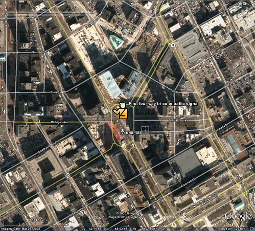
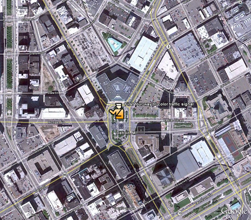
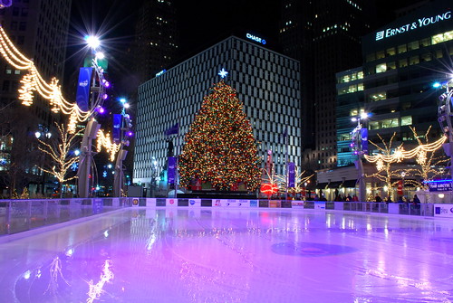
A two-birds-with-one-stone approach is the modern roundabout. A far cry from the high speed traffic circles of old, modern roundabouts allow greater flow of traffic through an intersection while reducing the frequency and severity of crashes. When put in that context they sound too good to be true. One area that has been slow to the roundabout party is Detroit. Yes, the same metropolis that gave us the car, suffered from central city flight and has chronically underfunded it's public transit system.

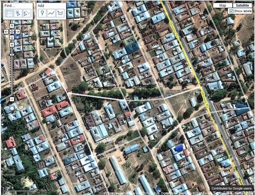
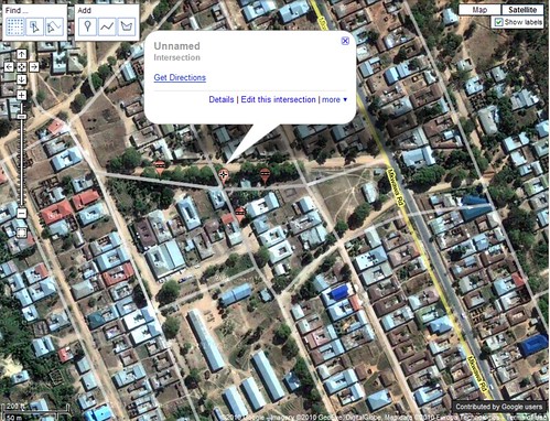
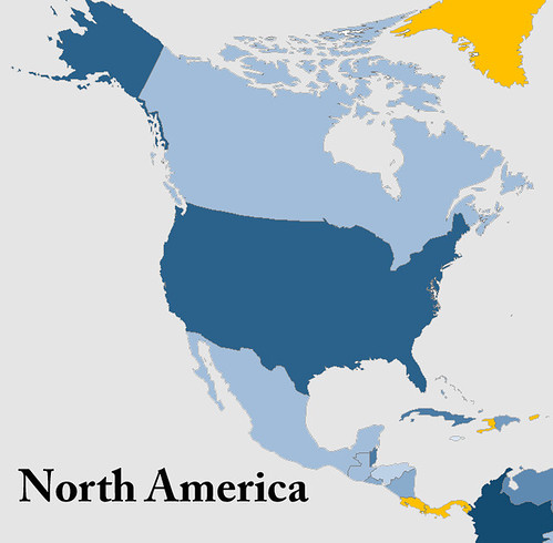
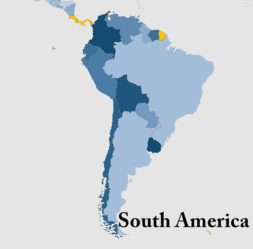
Perhaps one of the most unexpected discoveries of my travels is that some of the poorest and most undeveloped countries in the world fully invest in their road infrastructure and provide extensive subsidies for public transit, a true necessity.

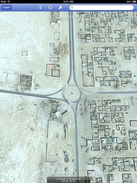
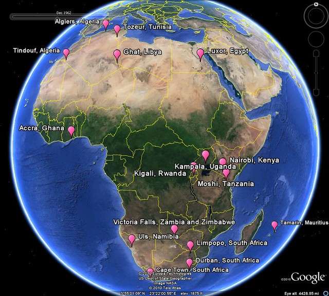
In that spirit, I've included an image I found of a roundabout in Nouakchott, Mauritania. The reasons for installing a roundabout at this intersection are different from the issues affecting a city like Detroit but the irony is very real, and for geography lovers, fascinating.

Mauritania roundabout

Wednesday, September 15, 2010

16 Marathons in Africa to Get Your Heart Pumping

Destination marathons are a great way to travel. Instead of simply counting down the days until your vacation, run and cross-train the time away. You'll end up in great shape just in time to enjoy some amazing places. With its deserts, jungles, mountains and beaches, Africa is a great place to consider for your own destination marathon.

To help you decide where to go I've assembled a list, map, and information on 16 marathons in Africa. If one of them catches your interest or you'd like more information click on the appropriate link below the map.

If you know of other marathons in Africa, leave a comment. If you've completed a destination marathon, or are planning one, let me know your story. Leave a comment here or better yet, write a post on your own blog. I'd love to hear about it!

Happy running!

africa marathon

Accra, Ghana
Luxor, Egypt
Tozeur, Tunisia
Tindouf, Algeria
Kigali, Rwanda
Moshi, Tanzania
Limpopo Province, South Africa
Durban, South Africa
Algiers, Algeria
Cape Town, South Africa
Tamarin, Mauritius
Namibia
Nairobi, Kenya
Zambia and Zimbabwe
Kampala, Uganda
Ghat, Libya


The lead up to my marathon:

In 2009 I decided to start training for a marathon. I had tossed around the idea of a destination marathon for some time and realized the time to act was now. A few years earlier I had come across the Christmas Island marathon, and this was where I started my internet searches. I was immediately intrigued at the thought of running around a small island in the Indian Ocean and the prospect of flying through Sydney or perhaps Kuala Lumpur.

Unfortunately, I couldn't find any information on a 2010 Christmas Island marathon. A few more searches revealed the Namibia marathon through Across the Divide. I've already written a post about my experience in Namibia.

Two things have happened since I returned from Namibia:

1. The marathon bug bit me again
2. My last treatment failed to remove the Africa bug

Time for more research!

Monday, September 13, 2010

Socotra and Thoughts of Island Paradises

"Island paradise" evokes different images for different people. For me, it's the intriguing, intertwined landscapes of the islands of Seychelles. For others it's the cascading mountains and lush greens of Hawaii. There is something romantic about the thought of being stranded on a desert island, focusing on oneself and ones survival instead of the every day hustle and bustle of modern life. Robinson Crusoe, who had well documented issues on his own island paradise said "...I looked back upon my desolate, solitary island as the most pleasant place in the world and all the happiness my heart could wish for was to be but there again." Remarkably, our wonderful world is dotted with a plethora of these "pleasant places".

Socotra is a lesser-known island paradise. Near the intersection of the Gulf of Aden, the Arabian Sea and the Indian Ocean, the archipelago offers a host of endemic species. Socotra offers an ecosystem arguably more unique than the Galapagos due to it's multi-million year move away from its Gondwanaland roots.

The beautiful Yemeni archipelago has a young and budding tourism industry. Much of the areas allure is because it remains relatively untouched and unique, not an overbuilt tourist trap. However, to emerge as a legitimate and significant industry, certain amenities and investment need to occur. The government of Yemen faces the challenge of finding the delicate balance between development and preservation. Before a clear path is taken, Socotra struggles with a bit of an identity crisis. Although, with as varied a cultural history as it has, perhaps its ability to evolve while maintaining its natural wonder is the true identity of the archipelago.

Not surprisingly a debate continues as to how Yemen should administer the area. Should it remain largely a preserve or should the government promote tourism on its tropical gem? I found an editorial which argues Socotra is more beautiful than Hawaii and should be developed. I'm not so sure. I'm in the camp that believes the real draw is the relatively pristine and unique ecosystem. At the very least it's an interesting take.

And here is your image of the week, the main island of Socotra. What do you think? Should it be developed, preserved, or a little of both.

socotra

With the recent addition of daily air service from the Yemeni mainland, Socotra has what it takes to be a real player in the eco-tourism market. It's far away, beautiful, safe, accessibly and exotic.

So where is YOUR island paradise?

The basement geographer beat me to the punch on this post. He includes a lot more information on his post on Socotra and some of its native species. Be sure to check him out.

Friday, September 10, 2010

Australia and the 24th Parallel

Being the WORLD Geo Blog, I reckon it's high time we have a post involving Australia, mate. Growing up, my thoughts of Australia most often involved kangaroos, Paul Hogan and the Coriolis effect, although not all at once. The latter was mostly because I realized how very far from down under I existed. Beginning with the miracle of the World Book Encyclopedia and culminating with panoramio photos in Google Earth, my views of Australia have expanded and matured, like a Laphroaig 30. ;)

While this doesn't qualify as a full blown nerd project like my last post on Twitter, inspired by Catholicgauze, it's still a fun way to visualize data!

My experience to this point with the Google Earth terrain profile was limited to testing running paths, cities or perhaps small mountains or lakes. Always looking for extremes, I went ahead and drew a much longer path today, 2,400 miles, in across Australia. I chose the 24th parallel because, well, that's where my mouse pointer first clicked. My thought was to find something significant about the parallel. Unfortunately, the southern 24th parallel is the Cooper Manning of parallels- never gaining the notoriety of its bigger brothers, the Tropics of Cancer and Capricorn and dabbling on the edge of forgotten-paralleldom.

Below is a screen shot which shows the 24th parallel drawn across the Australian continent as well as its terrain. Never reaching more than 2600 ft with an average slope of about .2% Australia is the flattest continent. A fascinating continent, though, and one which will be the subject of posts to come on World Geo Blog.

Australia 24th parallel
For more detail, click on the image above.

In case you were wondering, yes, that is Membata marked by the blue anchor. :)

16 Marathons in Africa to Get Your Heart Pumping

Destination marathons are a great way to travel. Instead of simply counting down the days, run and cross-train the time away. You'll end up in great shape just in time to enjoy some amazing places on your trip. With its deserts, jungles, mountains and beaches, Africa is a great place to consider for your own destination marathon.

To help you decide where to go for your destination marathon I've assembled a list, map, and information on 16 marathons in Africa. If one of them catches your interest or you'd like more information click on the appropriate link below the map.

If you know of other marathons in Africa, leave a comment. And if you've completed a destination marathon, or are planning one, let me know your story, either with a comment or a post on your own blog. I'd love to hear about it!

Enjoy!

africa marathon

Accra, Ghana
Luxor, Egypt
Tozeur, Tunisia
Tindouf, Algeria
Kigali, Rwanda
Moshi, Tanzania
Limpopo Province, South Africa
Durban, South Africa
Algiers, Algeria
Cape Town, South Africa
Tamarin, Mauritius
Namibia
Nairobi, Kenya
Zambia and Zimbabwe
Kampala, Uganda
Ghat, Libya


The lead up to my marathon:

In 2009 I decided to start training for a marathon. I had tossed around the idea of a destination marathon for some time and realized the time to act was now. A few years earlier I had come across the Christmas Island marathon, and this was where I started my internet searches. I was immediately intrigued at the thought of running around a small island in the Indian Ocean and the prospect of flying through Sydney or perhaps Kuala Lumpur.

Unfortunately, I couldn't find any information on a 2010 Christmas Island marathon. A few more searches revealed the Namibia marathon through Across the Divide. I've already written a post about my experience in Namibia.

Two things have happened since I returned from Namibia:

1. The marathon bug bit me again
2. My last treatment failed to remove the Africa bug

Time for more research!

Wednesday, September 8, 2010

Twitter Followers of World Leaders Mapped

A few days ago, Geographic Travels made a post about world leaders on twitter. I have a real love-hate relationship with twitter. Twitter offers a world of possibilities but those are only realized by a small few, myself excluded. I end up bouncing between a world of spam and one of inactivity.

So while the post on world leaders using twitter is great by itself, my geo-eye saw data - raw data that craved to be mapped! I searched how many followers each account had to see if the data held anything of particular interest. I've tried before to measure twitter popularity in an interesting yet 100% non-scientific way in a previous nerd project!

For the map below, I created a new point GIS layer and added info about how many followers each account listed. Now, don't take the scaled symbols too literally. I had to do some scaling when you have Obama at more than 5 million followers and others with barely 1,000. We can't learn much from this map- but it's still cool! I've included the data at the bottom of this post.

The unexpected outlier in this data set is Jordan and Queen Rania Al Abdullah. Although, it doesn't take much to figure out why ;) To find out for yourself, simply do a google search and follower her on twitter @QueenRania.

Twitter Followers
I mention Geographic Travels in part because they are one of the best geography blogs out there. Good blogs are hard to find and finding a good GEOGRAPHY blog is an even greater challenge.

Along with Geographic Travels, I was fortunate to be listed on the recently named 50 Best Geography Blogs for Geography Geeks. The fact that Samantha Rhodes was able to assemble this list of blogs is an accomplishment by itself. What impresses me most is that the listing actually provides a reasonable description of each blog. When I found out I was on the list I was sure that the description of my blog would be straight from my meta tags. It certainly wasn't.

Samantha provided this snippet to describe World Geo Blog "Read World Geography Blog for global news and views about the immensely intimate relationship between people and places." Its a better description than I could ever come up with and I'm thankful for the recommendation.

Go check out the 50 Best Geography Blogs and let me know what else you find!

Also check out another great geography blog I found - The Basement Geographer.

As promised...The Data!

Canada - 64,600
Chile - 195,000
Costa Rica - 1,100
Denmark - 6,100
Ecuador - 5,700
France - 5,200
Israel - 8,500
Jordan - 1,350,000
Latvia - 3,900
Malaysia - 32,500
Mexico - 110,200
New Zealand - 12,600
Norway - 33,200
Russia - 42,900
South Korea - 23,900
Thailand - 126,000
Turkey - 86,800
UAE - 349,000
UK - 1,750,000
USA - 5,300,000

Monday, September 6, 2010

Controversy Over the New Malawian Flag

A flag says a lot about a country. I challenge you to find a color, shape or image placed haphazardly on one. Flags tell a story, and ofter a glimpse of a country's history. But while flags are a source of pride to many, they can symbolize hatred for others.

This was the case in the state of South Carolina, the scene of a row (this is an attempt to use a British idiom - how'd I do?) in 2000 between supporters of the Confederate flag, who saw it as a symbol of state pride and those who opposed it, citing it as an embodiment of racism at the highest level of state government. More recently the old Gadsden flag (shown below) has been take up by the tea party in its infancy as a symbol of conservative ideologies. Whatever your political views, what a flag represents evokes strong feelings for those who fly it.

GadsdenFlag

While in the scheme of history, flags change frequently. The flags of the world carry a certain sense of permanence with them. For this reason it's important we, as geographers and students of the world, take notice when a flag, and therefore a country, undergoes a major change.

Malawian President Bingu wa Mutharika "successfully" implemented a new national flag at the end of July. Mutharika claims that the fully exposed sun "reflect(s) the modern Malawi" and adds that Malawians should be happy about the changes implemented because "Malawi is developed and it is still developing compared to the colonial era". The new flag is shown on the left below, the old flag on the right.


While this seems noble and positive on the surface, its implementation has been extremely controversial. Comments written in English on the Nyasa Times articles about the new flag show a strong stance against the new flag.

Despite Mutharika's claims, Malawi still has a long way to go to attain true economic competitiveness. Malawi ranks 28th on Foreign Policy's failed States index, two higher than Eritrea. The costs of replacing flags is high and it is even illegal to display the country's old flag. The government should be focusing resources towards economic growth and the well-being of it's citizens. Instead, they are wasting money to make unsubstantiated claims about development that cannot be backed up. They are in fact spending money to cover up where their policies have failed.

Sunday, September 5, 2010

South American Economic Gem: Chile and its Mines

With the juxtaposition of deep water trenches to the west and the Andes mountains on the east, Chile is one of the most geographically and geologically enigmatic places in South America. Spanning nearly 40 degrees of latitude, the country is ten times longer than its widest east to west point. What really makes it shine is its rare display of economic prowess outside of North America and Europe, oil powers like Equatorial Guinea excepted. Chile has forged strong foreign ties all over the earth strengthening its status as a South American economic gem. I myself contribute to its economy through frequent purchases of Chilean wine!

This success is related to its natural resources and ability to mine, process export and responsibly trade. Chile is truly the copper capital of the world, producing about a third of the earth's copper. Just more than a month ago, the world saw some of the forgotten costs of mining when a mine collapsed in Copiapó trapping 33 miners. Those miners remain trapped and it could be months before they are rescued. Today I learned that the mining company that owns the San Jose gold and copper mine is filing papers for bankruptcy. Let's hope the actions of the owners are not as sinister as they appear.

US news agencies widely reports the location of the San Jose mine as "north of Copiapó" or in "northern Chile". I wanted to see what a large gold and copper mine looked like from above. My first search on Google Earth was fruitless but falling back on the good old Google search engine I was able to find the location of the mine at GoGeometry.

The first image is a close up of the San Jose mine. The second shows its location relative to the City of Copiapó.


I find it interesting that the mine, which extracts tons of resources from inside the earth, resembles a scar on the earth's crust.


This isn't Chile's first experience with a long-term rescue. The Associated Press published a great story on survivors of the 1972 plane crash in the Andes carrying the Uruguay rugby team speaking to the trapped miners. While the circumstances are quite different, I think that hearing from someone who has been through such a strenuous ordeal will help.

Tuesday, August 31, 2010

National Geographic Responds

In the process of writing a post questioning National Geographic Map Policy I was given the name of the Director of Editorial and Research for National Geographic Maps. I emailed him with a few questions on current map policy, specifically related to the Hala'ib triangle, Bir Tawil and Somaliland.

Today I heard back from Juan. As promised, his email is below. It's nothing groundbreaking and if I'm honest, predictable, but it speaks to the map giant's ability to respond to the public. I don't totally buy the fact that the scale of the maps prevents them from displaying Somaliland in grey, then again I only buy large maps and so my view might be a bit skewed. There doesn't seem to be any problem displaying Andorra and it is about the size of a pinhead on my 110" wide world map.

Thanks go out to Juan Valdes and Kevin Lance!

Ryan:

Thank you for your email of August 25, 2010 regarding the National Geographic's portrayal of the Hala'ib Triangle, Bir Tawil trapezoid, and Somaliland in our maps.

The Society’s cartographic policy is one of portraying de facto situations; that is, to portray to the best of our judgment the reality on the ground. We consult with multiple authoritative sources on a frequent basis to determine the current political status of disputed territories and how to best represent them in our maps.

With regard to our cartographic treatment of the Hala'ib Triangle, after several military clashes between Egyptian and Sudanese forces in the 1990's, Sudan ultimately withdrew from this area in January 2000. Their forces were pulled south of the political boundary set by the Anglo-Egyptian Agreement of 1899 - the 22nd parallel. Since then, Egypt has effectively administered the area.

As for the Bir Tawil trapezoid, Egypt does not recognize sovereignty over this area on its maps; here, it claims the 22nd parallel as both its political and administrative boundary. Inversely, Sudan officially recognizes the boundary of Bir Tawil as that set by the British in 1902. However, Sudanese sources contradict this stance by cartographically portraying the Bir Tawil trapezoid as being partially administered by the states of River Nile and Red Sea.

To date, the political and military situation in the Hala'ib Triangle remains unchanged, while Egypt's and Sudan's stance on Bir Tawil has been somewhat cartographically defined. Therefore, the Society's Map Policy Committee has recognized Egypt's de facto administration of the Hala'ib Triangle and Sudan's de facto governance of the Bir Tawil trapezoid. As a point of reference, and where scale permits, the 1902 administrative boundary is delineated in our maps accompanied by a label identifying Sudan's existing claim to the Hala'ib Triangle.

Regarding the color fill treatment of Somaliland in our Africa Wall Map, most political boundaries depicted in our maps and Atlases are stable and uncontested. Those that are disputed receive a special treatment. Depending on the map's scale, such territories or separatist states are shown in a gray fill with their administrative centers depicted by an open bull's eye symbol.
Where scale permits, explanatory notes are added to explain the current political situation of such disputed territories.The difference you have noted between our treatment of Somaliland in our World map to that of our Africa wall map is a reflection of this policy.


Finally, yes, I have been a long standing member of the Society's Map Policy Committee.


Your interest in National Geographic maps is appreciated. Thank you for taking the time to write.


Juan José Valdés
Director of Editorial and Research
National Geographic Maps

Monday, August 30, 2010

Is that a Dam typo?

One of things I enjoy most about maps is to immerse myself in thoughts of the physical places I'm peering at through the looking glass. My imagination runs wild thinking about all the locations on a world map. For me, this wanderlust and mapgazing is a daily activity. In doing so, occasionally I'll run into a map feature that is a real head-scratcher.

Last week I was searching in the area around the Okavango Delta in Botswana and Lake Kariba between Zambia and Zimbabwe when I came across what looked to be a phantom "l" on the map.

I was quite pleased with myself as I thought I had discovered an error on the National Geographic 2007 Africa map. I became puzzled when I found a similar "l" to the east at the eastern edge of Lake de Cahora Bassa in Mozambique. While it was hard to believe National Geographic made a mistake, two mistakes right next to each other was a laughable notion.

The image below shows the area in question and both lines. One is to the southwest of the City of Kariba, the second is on the eastern end of Lake Cahora Bassa.


I scoured the legend on all my National Geographic maps but couldn't find anything that matched the symbol. It most closely matched that of passenger railroad but both the size and logic of placement was off. Why would someone build a railroad bridge across a large body of water if it didn't connect to anything on either side?

Time to search Google Earth and put the mystery to bed!

It turns out that the mysterious line represents a dam. With the help of a friend we quickly discovered another dam in Turkey. They are only visible in the continent blow up maps from National Geographic.

Below, in this week's Google image of the week, we see the Cahora Bassa dam in Mozambique.

The image can be found at 15° 35' 7" S 32° 42'18" E


Remember, clicking on the images will take you to a full sized image.

Friday, August 27, 2010

Military Might Map of the World

A personal indulgence of mine is to kick back with a glass of scotch and read about foreign affairs, particularly in Foreign Affairs and Foreign Policy magazines. The article "Africa's North Korea: Inside Eritrea's Open Air Prison" in the July/August Foreign Policy issue, written by Nathaniel Myers, really caught my attention.

I knew Eritrea has its share of political instability. It's also had a tumultuous history with its neighboring States, Ethiopia in particular. I did not, however, know the extent of the Eritrean army. The army is immense for, as Myers puts it, "one of Africa's most enchanting and unpredictable countries."

After some googling inspired by Myers' article, I found an interesting visualization of percentage of GDP spent on military. Cool, yes, but not quite what I was looking for. I wanted a map to compare the rate of active duty troops (per 1000 capita) in the countries of the world. Where does military might exude itself most in the fabric of the world's societies? To find out, I went ahead and made a map myself.

Below is a complete world map, a Robinson projection of course! Five continent maps follow to provide you with more detail on active duty troops per 1000 capita. The population was a 2009 estimate by Caliper Corporation and the military data came from a variety of sources, a list of which can be found here.

I've chosen to put the legend at the bottom of all the maps. I wanted to leave the maps free from clutter and the actual number (per 1000 capita) isn't as important as how a country relates to its neighbors and the rest of the world.

The world military map

Africa Military map

Asia military

Europe military

North America Military

South America military

World Military legend

Here is a list of the top ten military countries by active duty troops per 1000 people.

1. Eritrea
2. North Korea
3. Israel
4. Vietnam
5. Singapore
6. United Arab Emirates
7. Lebanon
8. Brunei
9. Djibouti
10. Jordan

Eritrea is the big surprise and unquestionably the real story, but I already knew that thanks to Mr. Myers. I've listed a few notables that stood out for me below. What do you think? Is there a country you expected to have a high per capita military but does not?

Other Notables (out of 161)

29. Russia
50. USA
73. Pakistan
139. India
143. Tajikistan (I expected this to be much higher)

As much as I try to keep an eye on the events occurring across Africa and other developing countries, the information available is barely a trickle compared to the barrage of domestic news thrown at me. I'm always searching for a different side of the story and the lesser-known yet just as important happenings in the world. I ask you to help me find those lesser-known news sources, books and blogs! Your comments are appreciated.

And for those of you who would like another reason to indulge in a drink and a good read, might I suggest Laphroaig scotch whiskey.

Wednesday, August 25, 2010

Update: National Geographic Maps

A few recent posts have called into question the actions of the National Geographic Map Policy Committee.

Thanks to the helpful Kevin Lance of National Geographic Maps, I have the contact info for the Editorial and Research head in the Nat Geo Maps department, Juan Valdes. Yes, the coffee guy does maps too!

So far Nat Geo has been extremely accommodating. A big thumbs up to them! I'm excited to hear back from them.

After playing phone tag with Juan I sent him the following email:

Hi, Juan,

Thank you very much for your prompt response.

Kevin Lance referred me to you to answer a few questions regarding the reasoning/research behind a few areas on the National Geographic political maps.

1. What happened (on the ground) between 2001 (based on the world map) and 2007 (based on the Africa map) that changed ownership of the Hala'ib triangle from Sudan to Egypt? Also, why is Bir Tawil now shown as part of Sudan?

It appears the change now recognizes the 1899 border established by the 22nd parallel in place of the 1902 agreement the British put in place.

I know the Sudanese have pulled troops from the area and that Egypt has invested in the area.

In summary of question 1 - Why is the Hala'ib triangle now shown as part of Egypt and why is Bir Tawil shown as part of Sudan?

Question 2 - Why is Somaliland shown in grey on the continent political maps but not delineated at all on the world map?

National Geographic often discusses its desire to reflect what is on the ground and remain a-political. Somaliland recently elected a new president in a free and fare election as an opposition candidate. It seems the reality on the ground is that Somaliland is very much an autonomous State. The same cannot be said for Somalia. It seems that the only issue for showing Somaliland as part of Somalia is the lack of international recognition. Isn't recognition by other countries a political decision in itself?

In summary of question 2 - What is the research and reasoning for showing Somaliland in grey on Africa political maps and not at all on world maps?


I'll post Juan's response as soon as I get it.

To pass the time, why not take a peak at some of my pictures from Namibia.

Monday, August 23, 2010

Where in the World is the Mosque Near Ground-Zero?

In the last two weeks the "Ground-zero mosque" aka the "cultural center near ground-zero" has grown into one of the most divisive topics on American news shows in recent memory.

Before we get into my commentary, lets get to the point (and the fun part) of this post and take a gander at the area in question in this Google image of the week, the area around ground-zero in New York.

You can navigate to this site by searching the following coordinates 40°42'46"N 74°00'36"W

It's clearly not AT ground zero but it certainly is close and considering the circumstances opposition is certainly understood.

I, like most, support the first amendment, protecting freedom of religion. I appreciate the argument that a mosque should not be built "at ground zero" but do not approve of the fear-mongering hate speech tactics being used by some.

What has become almost as big a story as the debate on the mosque is the discussion about the naming conventions of this story as highlighted in this NPR blog.

The blogosphere is all over this controvery, here is one example opposed to the mosque. Notice all the American flags plastered across the site - purposefully sending the message that to be for the development is somehow anti-American. There are also several images from 9-11. This does not have anything to do with honor for the site or the tragedy but a deliberate attempt to tie main stream Islam to the atrocities of the extremists. John Wayne Gacy's acts should not represent the beliefs of the Catholic community. Just like the actions of pro-life terrorist bombers should not be representative of all pro-lifers.

I do believe that some of those opposed to the development jumped on the opportunity to trick the public into thinking that this mosque was in the footprint of the WTC and I think it's an attempt to feed the perception of the uneducated that Obama is a Muslim. The same uneducated probably don't understand we're not the United States of Christianity.

Here's an interesting excerpt from the Israpundit blog - "If the ground zero mosque is tied to terror regimes and groups financially or otherwise, and we know that it is..." What a good looking argument "and we know that it is". Geesh.

The inability to separate the world's Muslim community from Muslim extremists is disheartening. However, just as it is their right to practice their religion in the shadow of the worst domestic terrorist attacks, everyone has the right to voice their opposition. Another reason, this country IS so great.

Cracked.com has an fascinating opposition piece to those opposing the mosque/cultural center. Click here to read the article.

It's a fascinating debate and while I fall on the pro side of the argument I do enjoy hearing intelligent points on the other side of the debate. I'd encourage you to leave a comment with your thoughts on the issue - regardless of your opinion!

I'd like to end this somewhat serious post with a little light hearted "news". I see Jon Stewart as the balance to Fox news as Fox sees itself as a balance to the "drive-by media".

Enjoy!


The Daily Show With Jon StewartMon - Thurs 11p / 10c
Recap - Week of 8/10/10
http://www.thedailyshow.com/
Daily Show Full EpisodesPolitical HumorTea Party


Thanks to the Geography Lady for the inspiration!