
I've always been hesitant to write or highlight things in books, magazines or newspapers. For some reason I feel like it will ruin it for the next time I read it. I consciously do this knowing that the ability to go back through an article in Foreign Affairs or Foreign Policy and see the highlights would be a great time saver. So recently, I grabbed a few index cards. Similar to the dream notes, the thought is I can write down information about new concepts or add to a card with general information on a place, person, policy or historical event.
The ability to quickly access information is something I've grown accustomed to. So much so, that I get frustrated when information isn't a google away. Earlier I read a BBC article on South Sudan's proposal to the north on oil royalties and fees in excess of 8 billion dollars. Noting that Sudan is looking to charge 36 dollars per barrel in refining, transit and tariffs, I thought the major Sudan oil pipelines might make for a creative map to put together.
Now it seems that the geography of a pipeline that in most years is pumping billions of dollars of a commodity through it would be easily accessible. Not so. Through a series of what, at the time seemed like related searches, I found myself looking for a list of US economic sanctions on other countries. While I was able to find an encyclopedic reference, I wasn't able to get the "elevator speech". As I continued to poke around I came across a list of UN Security Council Resolutions by year.
Just in case anyone happens to wonder where UN Security Council Resolutions in the first half of 2012 relate to, I put together a map, along with links to the resolutions themselves.
Showing posts with label map. Show all posts
Showing posts with label map. Show all posts
Tuesday, July 24, 2012
Monday, May 2, 2011
The Little Black Dot that Proved to be Very Important
One of the things I like about cable news is the "breaking news" aspect. Because they are on 24/7 they are better equipped to take on special news situations than network TV. It was very exciting to watch as the news rolled in last night. I was fascinated that while Geraldo was speculating that the Obama announcement involved Libya, CNN was taking great care not to speculate, all the while George Stephanopolous was zooming his way to ABC news headquarters and NBC was trying to figure out how to activate Brian Williams. Looks like Katie Couric missed out on her best opportunity to have a sound byte live on.
While it took all the energy I could muster to stay awake, I was excited about finding out where he has been hiding. Many times I've thought as I scan a map or google earth that I might be looking at the hiding place.
I never would have guessed it to be right in the burbs of Abbottabad (once I learned where it was). Most conspiracy theories drive me nuts (this morning on the radio someone said that Obama made the announcement when he did to interrupt "The Apprentice") but Pakistan looks pretty bad in this situation. The compound is too close to the central Pakistan Government area for comfort. It's as if we were looking for a DC area celebrity and couldn't find him for ten years, only to discover he was hiding in the luxury suites at Camden Yards in Baltimore. Add to this the proximity of the residence to a Pakistani military compound and the Google Earth imagery (and of course the fact that nobody thought this giant high security compound wasn't worth investigating) and, like I said, Pakistan looks bad.
The little black dot of Abbottabad just north of Islamabad seems awfully important today.

I have been spending some time over the last two weeks attempting to become more proficient at Google Sketchup. After familiarizing myself with how not to do things, I went back and watched a couple dozen videos on youtube. I found Aiden to be particularly helpful, in addition to the Google tutorials.
So I went and grabbed an image of the reported compound and through together a quick sketch model in about a minute.
 And just like that - a recreation of a place which has proved to be much more important than anyone could have imagined.
While it took all the energy I could muster to stay awake, I was excited about finding out where he has been hiding. Many times I've thought as I scan a map or google earth that I might be looking at the hiding place.
I never would have guessed it to be right in the burbs of Abbottabad (once I learned where it was). Most conspiracy theories drive me nuts (this morning on the radio someone said that Obama made the announcement when he did to interrupt "The Apprentice") but Pakistan looks pretty bad in this situation. The compound is too close to the central Pakistan Government area for comfort. It's as if we were looking for a DC area celebrity and couldn't find him for ten years, only to discover he was hiding in the luxury suites at Camden Yards in Baltimore. Add to this the proximity of the residence to a Pakistani military compound and the Google Earth imagery (and of course the fact that nobody thought this giant high security compound wasn't worth investigating) and, like I said, Pakistan looks bad.
The little black dot of Abbottabad just north of Islamabad seems awfully important today.

I have been spending some time over the last two weeks attempting to become more proficient at Google Sketchup. After familiarizing myself with how not to do things, I went back and watched a couple dozen videos on youtube. I found Aiden to be particularly helpful, in addition to the Google tutorials.
So I went and grabbed an image of the reported compound and through together a quick sketch model in about a minute.

Tuesday, April 26, 2011
Three Hours and a Sunburn Later...
With my marathon only four weeks away, the amount of time required for training is peaking. You'll have to forgive me but because of the time spent training it ends up being pretty much the only thing I talk about. This past Saturday was a 19 miler. A little over three hours of straight running. About the time my runs passed ten miles, the straight line urban runs turned extremely monotonous. I had become too accustomed to my route, both for my sanity and for my ability to grow as a runner. I knew exactly the places I could cheat, knew how to time the traffic lights if I was feeling tired, and barely ever had to deal with a hill.
Someone at work tipped me off to the >8 mile loop at Kensington Metropark. Last week I did the loop twice. This week I did two loops plus a spur out on a horse track.
When you're out there, on your own for that long, running, it really shapes the experience of your weekend. So much so that, when the question is asked, what I did this weekend, the default answer is simply "I ran".
Comedy break---
As I said to myself "Iran". I realized I must share this MAD TV classic.
The point is, runs this long become an experience and get you in touch with a certain Place.
The Kensington run exposes me to hills, unknowns, extreme winds and a challenge I can't find in my own back yard. Google says that there is only about an 80ft vertical range to the run but with all the hills throughout the course, it really begins to add up.
It doesn't look like much as a Google track, but it sure takes some effort!

Monday, February 28, 2011
Map of Oil Production by Country and my OPEC Misconception
With all this "Mess O' The Whole Potamia" stuff gong on (not to mention $3.50 per gallon gas) I decided to look up information on oil production by country. While the data was easily accessible (thank you Central Intelligence Agency), I couldn't find a good map showing oil production levels. Since my inquiring mind wanted to know, I put together a monochormatic map showing daily oil production by country for countries that produce at least 100,000 barrels per day.
I'm sure the data on oil production has a lot of caveats that come with it, but I'm not interested in those details. I'm interested in how far off my perception of oil production is from reality.
A few things really jumped out at me. I knew the US produced a lot of oil but had no idea it produced 9 million barrels per day. I've always thought OPEC were THE big ones. However, that doesn't seem to be the case - or at least to a lesser extent than I thought.
The map of oil production by country is below. I haven't included a legend but I have included the list (ranking) of countries at the bottom of this post. The darker the color the more oil the country produces. I've highlighted the 12 OPEC countries with a gold line and a shadow. In this map, OPEC countries don't appear all that special, just a random group of countries that produce significant amounts of oil.
But gas is still $3.50 a gallon. That's a lot of Ethiopian Birr.
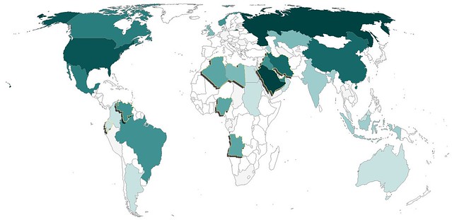
Oil Production and Rank (2009)
1 Russia 9,932,000
2 Saudi Arabia 9,764,000
3 United States 9,056,000
4 Iran 4,172,000
5 China 3,991,000
6 Canada 3,289,000
7 Mexico 3,001,000
8 United Arab Emirates 2,798,000
9 Brazil 2,572,000
10 Kuwait 2,494,000
11 Venezuela 2,472,000
12 Iraq 2,399,000
13 Norway 2,350,000
14 Nigeria 2,211,000
15 Algeria 2,125,000
16 Angola 1,948,000
17 Libya 1,790,000
18 Kazakhstan 1,540,000
19 United Kingdom 1,502,000
20 Qatar 1,213,000
21 Indonesia 1,023,000
22 Azerbaijan 1,011,000
23 India 878,700
24 Oman 816,000
25 Argentina 796,300
26 Malaysia 693,700
27 Colombia 686,600
28 Egypt 680,500
29 Australia 589,200
30 Sudan 486,700
31 Ecuador 485,700
32 Syria 400,400
33 Equatorial Guinea 346,000
34 Thailand 340,900
35 Vietnam 338,400
36 Yemen 288,400
37 Taiwan 276,800
38 Republic of the Congo 274,400
39 Denmark 262,100
40 Gabon 241,700
41 Turkmenistan 197,700
42 South Africa 191,000
43 Germany 156,800
44 Trinidad and Tobago 151,600
45 Peru 148,000
46 Italy 146,500
47 Brunei 146,000
48 Japan 132,700
49 Romania 117,000
50 Chad 115,000
I'm sure the data on oil production has a lot of caveats that come with it, but I'm not interested in those details. I'm interested in how far off my perception of oil production is from reality.
A few things really jumped out at me. I knew the US produced a lot of oil but had no idea it produced 9 million barrels per day. I've always thought OPEC were THE big ones. However, that doesn't seem to be the case - or at least to a lesser extent than I thought.
The map of oil production by country is below. I haven't included a legend but I have included the list (ranking) of countries at the bottom of this post. The darker the color the more oil the country produces. I've highlighted the 12 OPEC countries with a gold line and a shadow. In this map, OPEC countries don't appear all that special, just a random group of countries that produce significant amounts of oil.
But gas is still $3.50 a gallon. That's a lot of Ethiopian Birr.
Oil Production and Rank (2009)
1 Russia 9,932,000
2 Saudi Arabia 9,764,000
3 United States 9,056,000
4 Iran 4,172,000
5 China 3,991,000
6 Canada 3,289,000
7 Mexico 3,001,000
8 United Arab Emirates 2,798,000
9 Brazil 2,572,000
10 Kuwait 2,494,000
11 Venezuela 2,472,000
12 Iraq 2,399,000
13 Norway 2,350,000
14 Nigeria 2,211,000
15 Algeria 2,125,000
16 Angola 1,948,000
17 Libya 1,790,000
18 Kazakhstan 1,540,000
19 United Kingdom 1,502,000
20 Qatar 1,213,000
21 Indonesia 1,023,000
22 Azerbaijan 1,011,000
23 India 878,700
24 Oman 816,000
25 Argentina 796,300
26 Malaysia 693,700
27 Colombia 686,600
28 Egypt 680,500
29 Australia 589,200
30 Sudan 486,700
31 Ecuador 485,700
32 Syria 400,400
33 Equatorial Guinea 346,000
34 Thailand 340,900
35 Vietnam 338,400
36 Yemen 288,400
37 Taiwan 276,800
38 Republic of the Congo 274,400
39 Denmark 262,100
40 Gabon 241,700
41 Turkmenistan 197,700
42 South Africa 191,000
43 Germany 156,800
44 Trinidad and Tobago 151,600
45 Peru 148,000
46 Italy 146,500
47 Brunei 146,000
48 Japan 132,700
49 Romania 117,000
50 Chad 115,000
Monday, January 31, 2011
Africa in an Instant
Inspired by the Very Small Array map, the United States of Autocorrect, I set out to create a similar map for other locations in the world using Google Instant Search.
Naturally, I started with Africa.
After eliminating the insipid instant results, something even better began to materialize. The continent took shape as a collection of history, strife and misconception - but in words. The words appeared powerful and descriptive enough on their own that I decided to remove the borders. What resulted surprised me, a map I call Africa in an Instant.
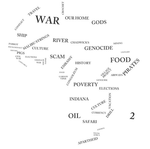
Click on the image above for the original large, high quality image.
Pretty cool!
Naturally, I started with Africa.
After eliminating the insipid instant results, something even better began to materialize. The continent took shape as a collection of history, strife and misconception - but in words. The words appeared powerful and descriptive enough on their own that I decided to remove the borders. What resulted surprised me, a map I call Africa in an Instant.
Click on the image above for the original large, high quality image.
Pretty cool!
Monday, January 24, 2011
Nerd Project: Political Map of South Sudan
There are a number of issues that still need to be resolved to fulfill the Comprehensive Peace Agreement, but the people have called for an independent South Sudan. To help visualize this dramatic change in geography and cartography I've created an... Improvised Political Map or IPM.
A couple weeks ago, I wrote that this would be the most noticeable change on the world map since the breakup of the Soviet Union. The IPM below clearly shows that to be the case.
The folks at National Geographic asked that I prevent any confusion by including the following:
Map modified by Ryan Buck. Boundaries and names shown do not necessarily reflect the map policy of the National Geographic Society.
The CPA requires that the details of the independence referendum be worked out by July 9 of this year. National Geographic won't be out with a map showing South Sudan until well after the details have been worked out but hopefully this improvisation will hold us Sudan map and geography hobbyists until then! I have emailed Juan Valdes from National Geographic Maps to get some "industry gossip" (if there is such a thing) on portraying South Sudan. I'll let you know what I hear.
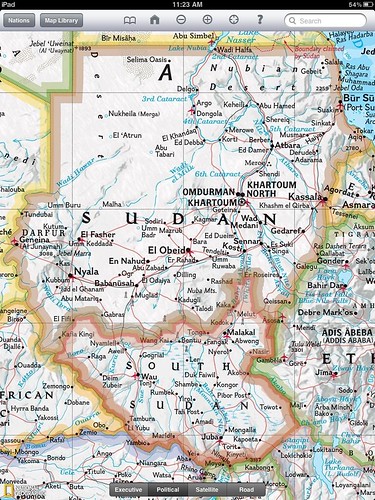
I employed some fairly "rudimentary" tools to do this. It's not perfect but it serves its purpose - to show us how different Sudan will look on a political map. The map is an edited copy of a screenshot from the National Geographic iPad app. In case my map has fooled you, National Geographic currently shows Sudan as below.
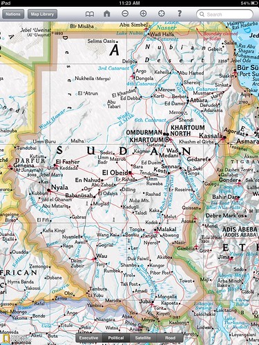
Perhaps the greatest challenge was picking a color. South Sudan will border six different countries, Sudan, Central African Republic, DRC, Uganda, Kenya and Ethiopia. National Geographic only uses six colors on their political maps which means I couldn't create a South Sudan border without copying another color. You might notice I sort of blended the border color with Kenya. That's fitting given the Ilemi Triangle issue.
I was having a hard time figuring out how National Geographic would color seven countries with six colors. It wasn't until a conversation at work that I realized the issue was my inability to change the color of the bordering countries which was the actual limiting factor. Fast fact - a Google search following that realization taught me (haha... "a Google search taught me") China borders more countries than any other.
I think it's time to email my old South Sudanese penpal Rengo Gyyw Rengo Jr!
It turns out Google is on the move to update and create maps of South Sudan
If you liked this post don't forget to check out other nerd projects.
A couple weeks ago, I wrote that this would be the most noticeable change on the world map since the breakup of the Soviet Union. The IPM below clearly shows that to be the case.
The folks at National Geographic asked that I prevent any confusion by including the following:
Map modified by Ryan Buck. Boundaries and names shown do not necessarily reflect the map policy of the National Geographic Society.
The CPA requires that the details of the independence referendum be worked out by July 9 of this year. National Geographic won't be out with a map showing South Sudan until well after the details have been worked out but hopefully this improvisation will hold us Sudan map and geography hobbyists until then! I have emailed Juan Valdes from National Geographic Maps to get some "industry gossip" (if there is such a thing) on portraying South Sudan. I'll let you know what I hear.
I employed some fairly "rudimentary" tools to do this. It's not perfect but it serves its purpose - to show us how different Sudan will look on a political map. The map is an edited copy of a screenshot from the National Geographic iPad app. In case my map has fooled you, National Geographic currently shows Sudan as below.
Perhaps the greatest challenge was picking a color. South Sudan will border six different countries, Sudan, Central African Republic, DRC, Uganda, Kenya and Ethiopia. National Geographic only uses six colors on their political maps which means I couldn't create a South Sudan border without copying another color. You might notice I sort of blended the border color with Kenya. That's fitting given the Ilemi Triangle issue.
I was having a hard time figuring out how National Geographic would color seven countries with six colors. It wasn't until a conversation at work that I realized the issue was my inability to change the color of the bordering countries which was the actual limiting factor. Fast fact - a Google search following that realization taught me (haha... "a Google search taught me") China borders more countries than any other.
I think it's time to email my old South Sudanese penpal Rengo Gyyw Rengo Jr!
It turns out Google is on the move to update and create maps of South Sudan
If you liked this post don't forget to check out other nerd projects.
Monday, November 1, 2010
My Little Plot of Land on the Isle of Islay
I'm a big sucker for creative marketing, especially when it feels as though you are getting something in return. What more tangible thing is there to offer than land ownership? Laphroaig Scotch caught me hook line and sinker when they offered me a lifetime lease on the Isle of Islay, home of the Laphroaig distillery. The fact that I could view the exact location of my plot of land on a map was gravy.
Each new package of Laphroaig comes with instructions on how to claim your lifetime lease. The idea goes, everyone who buys a bottle of Laphroaig is entitled to a square foot of land. All you have to do to claim your spot is to register as a friend of Laphroaig. Of course I know this is volunteering some information, but who cares?!
After I registered I received a certificate with the lease arrangement whereby I can collect "rent" of a dram upon visiting the Islay. A copy of my certificate is below.
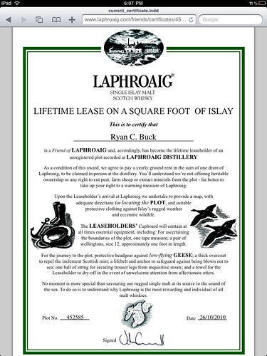
Pretty cool, I say.
What intrigued me most about his proces was the ability to see my little plot of land. Laphroaig has set up a cool tool which let's you zoom in to the distillery grounds and see your square foot of Islay. Unfortunately it looks like my square foot falls in a bit of a blind spot zone as you can see in the picture below. Look in the lower right corner.
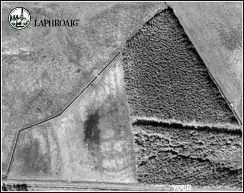
Well, at least I can see ABOUT where it is and when I make it to Islay one day I'll be able to see it, because, don't you see, instructions on how to find your plot are part of the lease agreement too.
Pretty cool indeed!
Each new package of Laphroaig comes with instructions on how to claim your lifetime lease. The idea goes, everyone who buys a bottle of Laphroaig is entitled to a square foot of land. All you have to do to claim your spot is to register as a friend of Laphroaig. Of course I know this is volunteering some information, but who cares?!
After I registered I received a certificate with the lease arrangement whereby I can collect "rent" of a dram upon visiting the Islay. A copy of my certificate is below.
Pretty cool, I say.
What intrigued me most about his proces was the ability to see my little plot of land. Laphroaig has set up a cool tool which let's you zoom in to the distillery grounds and see your square foot of Islay. Unfortunately it looks like my square foot falls in a bit of a blind spot zone as you can see in the picture below. Look in the lower right corner.
Well, at least I can see ABOUT where it is and when I make it to Islay one day I'll be able to see it, because, don't you see, instructions on how to find your plot are part of the lease agreement too.
Pretty cool indeed!
Friday, September 24, 2010
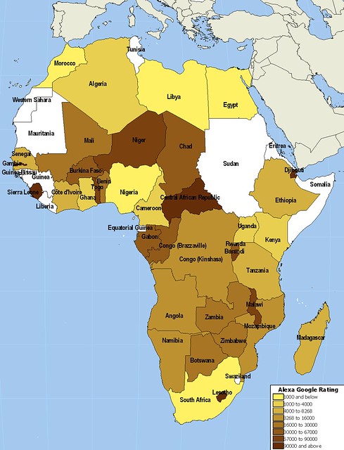
Popularity of Google in Africa
The World Wide Web resembles its moniker more and more each day. While the Internet has spread quickly in western countries, its roll out has been much slower in other areas of the world, especially Africa. Fortunately, global Internet giants like Google are able to take advantage of some of the expanding African web infrastructure provided by companies like SEACOM.
Each country is assigned a Top Level Domain (TLD) by the Internet Assigned Numbers Authority. You're probably most familiar with TLD country codes like .us for the United States and .uk for the United Kingdom. What you might not know is that your favorite link shortener bit.ly uses the Libyan TLD .ly.
Google, in their infinite wisdom, wealth and power have provided customized Google search pages for almost all the countries in the world. I decided to look at the popularity of the African TLD Google pages. I was able to find pages for almost every African country. Often, the extension includes .co before the country code such as www.google.co.bw for Botswana.
I used Alexa, the Internet traffic reporting site, to get the site rank for each Google country TLD available. I've included the results a few different ways. First, the map below breaks down countries into eight categories based on the Alexa rankings. The African countries rank between the 138th most viewed site on the Internet, Google Egypt, and number 524,835, Google Central African Republic. At last check Worldgeoblog.com was in the 5 millions ;) I've also included links to each of the sites that are ranked below the map. Last, I'm providing the kml file which includes Country Name, Alexa rank and URL.
Algeria
Angola
Benin
Botswana
Burkina Faso
Burundi
Cameroon
Cape Verde
Central African Republic
Chad
Comoros
Congo (Brazzaville)
Congo (Kinshasa)
Côte d'Ivoire
Djibouti
Egypt
Equatorial Guinea
Eritrea
Ethiopia
Gabon
Gambia
Ghana
Guinea
Guinea-Bissau
Kenya
Lesotho
Liberia
Libya
Madagascar
Malawi
Mali
Mauritania
Mauritius
Morocco
Mozambique
Namibia
Niger
Nigeria
Rwanda
Sao Tome and Principe
Senegal
Seychelles
Sierra Leone
Somalia
Somaliland
South Africa
Sudan
Swaziland
Tanzania
Togo
Tunisia
Uganda
Western Sahara
Zambia
Zimbabwe
Friday, September 10, 2010
Australia and the 24th Parallel
Being the WORLD Geo Blog, I reckon it's high time we have a post involving Australia, mate. Growing up, my thoughts of Australia most often involved kangaroos, Paul Hogan and the Coriolis effect, although not all at once. The latter was mostly because I realized how very far from down under I existed. Beginning with the miracle of the World Book Encyclopedia and culminating with panoramio photos in Google Earth, my views of Australia have expanded and matured, like a Laphroaig 30. ;)
While this doesn't qualify as a full blown nerd project like my last post on Twitter, inspired by Catholicgauze, it's still a fun way to visualize data!
My experience to this point with the Google Earth terrain profile was limited to testing running paths, cities or perhaps small mountains or lakes. Always looking for extremes, I went ahead and drew a much longer path today, 2,400 miles, in across Australia. I chose the 24th parallel because, well, that's where my mouse pointer first clicked. My thought was to find something significant about the parallel. Unfortunately, the southern 24th parallel is the Cooper Manning of parallels- never gaining the notoriety of its bigger brothers, the Tropics of Cancer and Capricorn and dabbling on the edge of forgotten-paralleldom.
Below is a screen shot which shows the 24th parallel drawn across the Australian continent as well as its terrain. Never reaching more than 2600 ft with an average slope of about .2% Australia is the flattest continent. A fascinating continent, though, and one which will be the subject of posts to come on World Geo Blog.
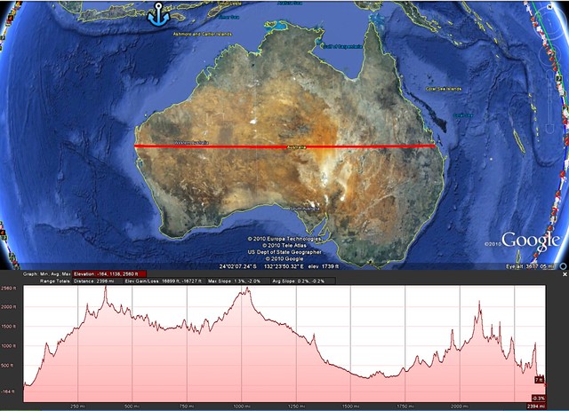
For more detail, click on the image above.
In case you were wondering, yes, that is Membata marked by the blue anchor. :)
While this doesn't qualify as a full blown nerd project like my last post on Twitter, inspired by Catholicgauze, it's still a fun way to visualize data!
My experience to this point with the Google Earth terrain profile was limited to testing running paths, cities or perhaps small mountains or lakes. Always looking for extremes, I went ahead and drew a much longer path today, 2,400 miles, in across Australia. I chose the 24th parallel because, well, that's where my mouse pointer first clicked. My thought was to find something significant about the parallel. Unfortunately, the southern 24th parallel is the Cooper Manning of parallels- never gaining the notoriety of its bigger brothers, the Tropics of Cancer and Capricorn and dabbling on the edge of forgotten-paralleldom.
Below is a screen shot which shows the 24th parallel drawn across the Australian continent as well as its terrain. Never reaching more than 2600 ft with an average slope of about .2% Australia is the flattest continent. A fascinating continent, though, and one which will be the subject of posts to come on World Geo Blog.
For more detail, click on the image above.
In case you were wondering, yes, that is Membata marked by the blue anchor. :)
Wednesday, September 8, 2010
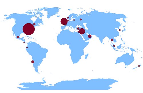
Twitter Followers of World Leaders Mapped
A few days ago, Geographic Travels made a post about world leaders on twitter. I have a real love-hate relationship with twitter. Twitter offers a world of possibilities but those are only realized by a small few, myself excluded. I end up bouncing between a world of spam and one of inactivity.
So while the post on world leaders using twitter is great by itself, my geo-eye saw data - raw data that craved to be mapped! I searched how many followers each account had to see if the data held anything of particular interest. I've tried before to measure twitter popularity in an interesting yet 100% non-scientific way in a previous nerd project!
For the map below, I created a new point GIS layer and added info about how many followers each account listed. Now, don't take the scaled symbols too literally. I had to do some scaling when you have Obama at more than 5 million followers and others with barely 1,000. We can't learn much from this map- but it's still cool! I've included the data at the bottom of this post.
The unexpected outlier in this data set is Jordan and Queen Rania Al Abdullah. Although, it doesn't take much to figure out why ;) To find out for yourself, simply do a google search and follower her on twitter @QueenRania.
I mention Geographic Travels in part because they are one of the best geography blogs out there. Good blogs are hard to find and finding a good GEOGRAPHY blog is an even greater challenge.
Along with Geographic Travels, I was fortunate to be listed on the recently named 50 Best Geography Blogs for Geography Geeks. The fact that Samantha Rhodes was able to assemble this list of blogs is an accomplishment by itself. What impresses me most is that the listing actually provides a reasonable description of each blog. When I found out I was on the list I was sure that the description of my blog would be straight from my meta tags. It certainly wasn't.
Samantha provided this snippet to describe World Geo Blog "Read World Geography Blog for global news and views about the immensely intimate relationship between people and places." Its a better description than I could ever come up with and I'm thankful for the recommendation.
Go check out the 50 Best Geography Blogs and let me know what else you find!
Also check out another great geography blog I found - The Basement Geographer.
As promised...The Data!
Canada - 64,600
Chile - 195,000
Costa Rica - 1,100
Denmark - 6,100
Ecuador - 5,700
France - 5,200
Israel - 8,500
Jordan - 1,350,000
Latvia - 3,900
Malaysia - 32,500
Mexico - 110,200
New Zealand - 12,600
Norway - 33,200
Russia - 42,900
South Korea - 23,900
Thailand - 126,000
Turkey - 86,800
UAE - 349,000
UK - 1,750,000
USA - 5,300,000
Friday, August 27, 2010
Military Might Map of the World
A personal indulgence of mine is to kick back with a glass of scotch and read about foreign affairs, particularly in Foreign Affairs and Foreign Policy magazines. The article "Africa's North Korea: Inside Eritrea's Open Air Prison" in the July/August Foreign Policy issue, written by Nathaniel Myers, really caught my attention.
I knew Eritrea has its share of political instability. It's also had a tumultuous history with its neighboring States, Ethiopia in particular. I did not, however, know the extent of the Eritrean army. The army is immense for, as Myers puts it, "one of Africa's most enchanting and unpredictable countries."
After some googling inspired by Myers' article, I found an interesting visualization of percentage of GDP spent on military. Cool, yes, but not quite what I was looking for. I wanted a map to compare the rate of active duty troops (per 1000 capita) in the countries of the world. Where does military might exude itself most in the fabric of the world's societies? To find out, I went ahead and made a map myself.
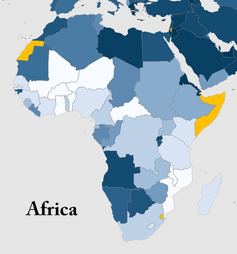
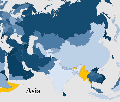
Below is a complete world map, a Robinson projection of course! Five continent maps follow to provide you with more detail on active duty troops per 1000 capita. The population was a 2009 estimate by Caliper Corporation and the military data came from a variety of sources, a list of which can be found here.
I've chosen to put the legend at the bottom of all the maps. I wanted to leave the maps free from clutter and the actual number (per 1000 capita) isn't as important as how a country relates to its neighbors and the rest of the world.
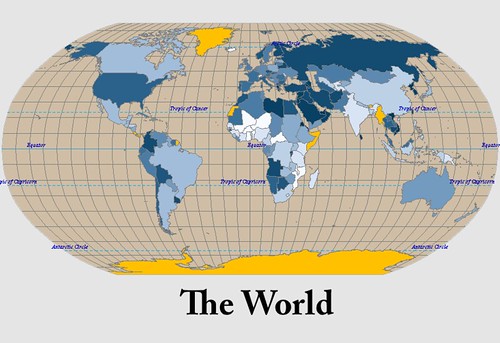
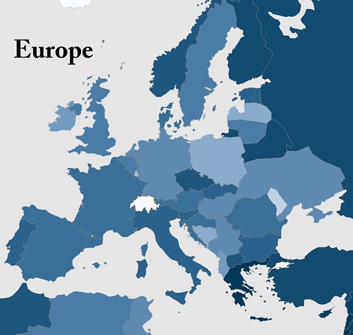
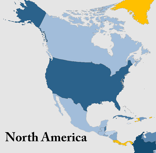
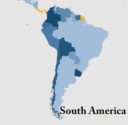
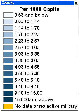
Here is a list of the top ten military countries by active duty troops per 1000 people.
1. Eritrea
2. North Korea
3. Israel
4. Vietnam
5. Singapore
6. United Arab Emirates
7. Lebanon
8. Brunei
9. Djibouti
10. Jordan
Eritrea is the big surprise and unquestionably the real story, but I already knew that thanks to Mr. Myers. I've listed a few notables that stood out for me below. What do you think? Is there a country you expected to have a high per capita military but does not?
Other Notables (out of 161)
29. Russia
50. USA
73. Pakistan
139. India
143. Tajikistan (I expected this to be much higher)
As much as I try to keep an eye on the events occurring across Africa and other developing countries, the information available is barely a trickle compared to the barrage of domestic news thrown at me. I'm always searching for a different side of the story and the lesser-known yet just as important happenings in the world. I ask you to help me find those lesser-known news sources, books and blogs! Your comments are appreciated.
And for those of you who would like another reason to indulge in a drink and a good read, might I suggest Laphroaig scotch whiskey.
I knew Eritrea has its share of political instability. It's also had a tumultuous history with its neighboring States, Ethiopia in particular. I did not, however, know the extent of the Eritrean army. The army is immense for, as Myers puts it, "one of Africa's most enchanting and unpredictable countries."
After some googling inspired by Myers' article, I found an interesting visualization of percentage of GDP spent on military. Cool, yes, but not quite what I was looking for. I wanted a map to compare the rate of active duty troops (per 1000 capita) in the countries of the world. Where does military might exude itself most in the fabric of the world's societies? To find out, I went ahead and made a map myself.
Below is a complete world map, a Robinson projection of course! Five continent maps follow to provide you with more detail on active duty troops per 1000 capita. The population was a 2009 estimate by Caliper Corporation and the military data came from a variety of sources, a list of which can be found here.
I've chosen to put the legend at the bottom of all the maps. I wanted to leave the maps free from clutter and the actual number (per 1000 capita) isn't as important as how a country relates to its neighbors and the rest of the world.
Here is a list of the top ten military countries by active duty troops per 1000 people.
1. Eritrea
2. North Korea
3. Israel
4. Vietnam
5. Singapore
6. United Arab Emirates
7. Lebanon
8. Brunei
9. Djibouti
10. Jordan
Eritrea is the big surprise and unquestionably the real story, but I already knew that thanks to Mr. Myers. I've listed a few notables that stood out for me below. What do you think? Is there a country you expected to have a high per capita military but does not?
Other Notables (out of 161)
29. Russia
50. USA
73. Pakistan
139. India
143. Tajikistan (I expected this to be much higher)
As much as I try to keep an eye on the events occurring across Africa and other developing countries, the information available is barely a trickle compared to the barrage of domestic news thrown at me. I'm always searching for a different side of the story and the lesser-known yet just as important happenings in the world. I ask you to help me find those lesser-known news sources, books and blogs! Your comments are appreciated.
And for those of you who would like another reason to indulge in a drink and a good read, might I suggest Laphroaig scotch whiskey.
Monday, June 21, 2010
Choose Your Own African Adventure
Flying to Africa is expensive. But where are the least expensive places to fly in the continent?
As I search for the location of my next adventure I decided to check on the cost of flights in a given week from Detroit to all the African capitals to see if there was anything fascinating and worth mentioning. There certainly are some surprises; It also provides some information for people looking at the relative cost of travel to various African states.
Ever since I discovered kayak.com I've been doing numerous searches for deals on flights to Africa. (I use the term "deal" very loosely). After hundreds of searches I've learned a few things I thought I'd share with you.
1. Prices to Africa fluctuate significantly. I've seen prices go up and down well over $1,000 per week.
2. In general, buying tickets around 5 months in advance provides the lowest average price.
3. Thursday departures from the US seem to result in the lowest fares. My default, first search is a Thursday US departure and a following Saturday departure from my destination. In my Kayak account I use the three days before and after for both, but that never seems to make it much cheaper.
4. If you're comfortable with the price don't wait too long for nickel and diming. This is especially true if you are 4 months or less from departure. There is often a dramatic increase around this time that I wouldn't want to be caught in. (Last minute flights can easily get to 7,000 dollars.)
5. Set alerts from kayak.com on your travel dates to keep track of the price movement. Also, use their calendar to see fluctuations in best price fares at different times of the upcoming year and in months past. Keep in mind this isn't always possible since there aren't a whole lot of inquiries into flight pairings such as Detroit to Luanda.
For this project I picked November 4 and November 11 as travel dates from and to Detroit Metro Airport (DTW). I used kayak's flexible schedule with three days before and after, but as I said, this doesn't seem to alter prices noticeably.
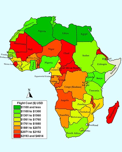
I find it fascinating that the most inexpensive countries to travel to border the most expensive. Further, the fact that Libya's Tripoli was the lowest at $1,059 is interesting in itself.
The surprise on the expensive side has to be Mauritania. With the exception of Rabat in Morocco and Laayoune (which I used in place of a Capital for Western Sahara) Nouakchott is the closest destination for most of the US. However, Mauritania comes in at 6th highest with round trip airfare costing 2,337. Notably, Mauritania comes in right in front of Madagascar (2371) despite the nearly 5,000 additional miles needed to fly to Antananarivo. I've included all the results at the bottom of this post. Does anything unexpected jump out at you? Have you had any great flight deals?
Like this map? Check out previous nerd projects on:
Twitter and Africa
Google and Africa
Perceived US-African Relationship This one may need an update! :)
Here is a list of the actual results:
Sierra Leone 4,614
Eritrea 3,085
Chad 2,449
Central Africa Republic 2,424
Madagascar 2,371
Mauritania 2,337
Mali 2,195
Congo (Brazzaville) 2,190
Angola 2,178
Equatorial Guinea 2,124
Niger 2,109
Benin 2,087
Malawi 2,071
Togo 2,069
Burkina Faso 2,012
Djibouti 2,004
Gabon 2,000
DRC 1,972
Namibia 1,899
Rwanda 1,845
Zimbabwe 1,838
Burundi 1,838
Mozambique 1,823
Guinea 1,798
Cameroon 1,771
Gambia 1,759
Lesotho 1,745
Botswana 1,713
Liberia 1,694
Ivory Coast 1,627
Zambia 1,573
Western Sahara (Laayoune) 1,534
Tanzania 1,376
Ethiopia 1,363
Senegal 1,339
South Africa 1,322
Sudan 1,308
Ghana 1,255
Kenya 1,248
Uganda 1,201
Tunisia 1,139
Morocco 1,137
Nigeria 1,101
Algeria 1,089
Egypt 1,075
Libya 1,059
No flights to:
Swaziland
Somalia
Guinea Bissau
As I search for the location of my next adventure I decided to check on the cost of flights in a given week from Detroit to all the African capitals to see if there was anything fascinating and worth mentioning. There certainly are some surprises; It also provides some information for people looking at the relative cost of travel to various African states.
Ever since I discovered kayak.com I've been doing numerous searches for deals on flights to Africa. (I use the term "deal" very loosely). After hundreds of searches I've learned a few things I thought I'd share with you.
1. Prices to Africa fluctuate significantly. I've seen prices go up and down well over $1,000 per week.
2. In general, buying tickets around 5 months in advance provides the lowest average price.
3. Thursday departures from the US seem to result in the lowest fares. My default, first search is a Thursday US departure and a following Saturday departure from my destination. In my Kayak account I use the three days before and after for both, but that never seems to make it much cheaper.
4. If you're comfortable with the price don't wait too long for nickel and diming. This is especially true if you are 4 months or less from departure. There is often a dramatic increase around this time that I wouldn't want to be caught in. (Last minute flights can easily get to 7,000 dollars.)
5. Set alerts from kayak.com on your travel dates to keep track of the price movement. Also, use their calendar to see fluctuations in best price fares at different times of the upcoming year and in months past. Keep in mind this isn't always possible since there aren't a whole lot of inquiries into flight pairings such as Detroit to Luanda.
For this project I picked November 4 and November 11 as travel dates from and to Detroit Metro Airport (DTW). I used kayak's flexible schedule with three days before and after, but as I said, this doesn't seem to alter prices noticeably.
I find it fascinating that the most inexpensive countries to travel to border the most expensive. Further, the fact that Libya's Tripoli was the lowest at $1,059 is interesting in itself.
The surprise on the expensive side has to be Mauritania. With the exception of Rabat in Morocco and Laayoune (which I used in place of a Capital for Western Sahara) Nouakchott is the closest destination for most of the US. However, Mauritania comes in at 6th highest with round trip airfare costing 2,337. Notably, Mauritania comes in right in front of Madagascar (2371) despite the nearly 5,000 additional miles needed to fly to Antananarivo. I've included all the results at the bottom of this post. Does anything unexpected jump out at you? Have you had any great flight deals?
Like this map? Check out previous nerd projects on:
Twitter and Africa
Google and Africa
Perceived US-African Relationship This one may need an update! :)
Here is a list of the actual results:
Sierra Leone 4,614
Eritrea 3,085
Chad 2,449
Central Africa Republic 2,424
Madagascar 2,371
Mauritania 2,337
Mali 2,195
Congo (Brazzaville) 2,190
Angola 2,178
Equatorial Guinea 2,124
Niger 2,109
Benin 2,087
Malawi 2,071
Togo 2,069
Burkina Faso 2,012
Djibouti 2,004
Gabon 2,000
DRC 1,972
Namibia 1,899
Rwanda 1,845
Zimbabwe 1,838
Burundi 1,838
Mozambique 1,823
Guinea 1,798
Cameroon 1,771
Gambia 1,759
Lesotho 1,745
Botswana 1,713
Liberia 1,694
Ivory Coast 1,627
Zambia 1,573
Western Sahara (Laayoune) 1,534
Tanzania 1,376
Ethiopia 1,363
Senegal 1,339
South Africa 1,322
Sudan 1,308
Ghana 1,255
Kenya 1,248
Uganda 1,201
Tunisia 1,139
Morocco 1,137
Nigeria 1,101
Algeria 1,089
Egypt 1,075
Libya 1,059
No flights to:
Swaziland
Somalia
Guinea Bissau
Subscribe to:
Posts (Atom)


