I generally avoid simple geo-news regurgitating on this blog. I want this to be a component of the interweb that explores things and their impact on people and place rather than something you can find in a thousand different places. On occasion, the poignant issues to me and the things you can find in a thousand places cross, and today's post is an example of that. Having said that, if you haven't heard about the attack at a bar in Bujumbura, google it. So few of us ever hear about stuff like this and that's a travesty. I feel it's incumbent upon me to encourage people to learn more on their own. It makes me wish I was back in seventh grade discussing current events.
It's official, South Sudan has come to Google Earth. Gone are the days of a red line border. In the eyes of Google Earth it's a bona fide yellow border country. I was quite pleased by this news. We've all been following the quest for independence and as trivial as gaining full recognition on Google Earth may seem, to me it's an awfully big deal.
Here is a picture as it appears today
And here is the article as posted on the Google lat long Blog.
Google continues to excel in Africa, both in bringing information in and working to educate people on Google's products. How cool would it be to be invited to one of these?
Showing posts with label google. Show all posts
Monday, September 19, 2011
Monday, March 28, 2011
Window on the World
I'm certain I've mentioned this before, but my early fascination with political maps stemmed from an unquenchable curiosity about far away lands. My early thoughts taught me many things.
Although I think that was because of the song my dad sang "Way down among Brazilians Coffee beans grow by the billions". Interestingly enough, I thought the word was "Brazilia". There was also a time where I thought the word was "Vermilion", as in, Ohio.
And due to a presentation in 4th grade, I learned that China, for the most part, looked like this:
I imagined that most of Africa looked like this:
Although I think that was because of the song my dad sang "Way down among Brazilians Coffee beans grow by the billions". Interestingly enough, I thought the word was "Brazilia". There was also a time where I thought the word was "Vermilion", as in, Ohio.
And due to a presentation in 4th grade, I learned that China, for the most part, looked like this:
This was my "Window on the World" version 0.5
Version 1.0 of the Window on the World, Google Earth, wouldn't come for another 15 years.
I must give credit where credit is due. My dad was the one who coined (at least in my mind) the Window on the World concept. He first mentioned it in this 15 year gap. The original idea was live video feeds from all over the world which could be viewed like channels. While it has been implemented in several ways, I can't think of a good, inclusive site, app or anything that does what he described.
Google Earth was so great because it made it possible to actually see these places, through a shiny new digital lens. Perhaps not the Window on the World my dad described but something that allowed me to replace my imaginary or outdated images with real imagery. With the addition of the Control+alt+a flight simulator, I could fly anywhere in the world in an SR22 prop place. That would be version 1.0.1
Street view brought us up to Window on the World version 2.0. Truth be told, what pushed me over the early-adopter-versus-buyers-remorse teeter-totter on the iPad was the ability to zoom around the street view images of far away lands (read select European cities). Straight out of the ad to my local apple store, I'm pretty sure the first place I looked at was the Eiffel Tower - that doesn't make sense for me though, I must have seen the commercial too many times. It's a good thing the iPad 2 commercials don't include some minor advancement in streetview functionality or I probably would have been waiting in line on March 11th. My reality is becoming Apple commercials. Also of note, I've looked up Apple's stock symbol (AAPL) so many times that it takes me a couple seconds to remember how to actually spell apple...the Newtonian spelling.
With the iPad (version 1.0 for those who pay attention to such trivial things), I'm left with a good streetview portal that forces me to put up with this screen more often than I'd like.
For any iPad Google map users out there, you probably find the above image hilarious, and you should. For those that don't, well, go get an iPad...or an iPad2.
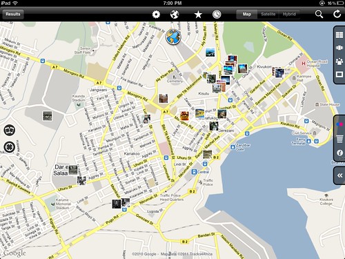
The version upgrade to 2.0 made the earth more accessible than every before...well, half of it (the map below shows the coverage area). That is still an issue (another being that I told myself I wouldn't use parenthetical humor or sarcasm more than twice in this post). Perhaps this is more like Window on the World 2.0 beta. Or version 1.9, the one that everyone is scared to download to their phone.
That brings us to the topic of today's post, something you've probably been wondering about since you started reading! After feeling guilty (guilty isn't the right word but I can't think of anything better) about my mildly scathing review of National Geographic's World Atlas update, I think it's important I throw out an iPad app for you to enjoy, or at least one you can enjoy vicariously through your techy counterparts.
What this app can do dwarfs the fact that it is one of the most unintuitive things I've used on the iPad. That, of course, can be remedied through practice. I'm willing to take time and learn with an app that truly merges photography and geography. A few more minutes went a long way this evening.
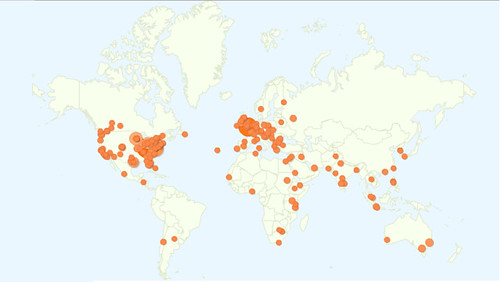
The fact is, this app is not a new concept but a fantastic implementation. Panoramio is a great website to go to and they actually have an iPhone app, but the fact that they DON'T have an iPad app tells you that it is much more about user contributions than searching the database. While the ability to contribute is great, my focus is the window on the world version 3.0.
This app adds the flickr library to geo searches. Its fluid, responsive, and not very buggy. They really tried to Apple-up the concept and even have cover flow functionality to look through selected pictures. While many have tried, no one, including this app has been able to really replicate the cover flow motion of the iPhone.
Being able to search the globe, and this quite literally is the ENTIRE globe, for pictures from other geo explorers is something that gets me excited about the next version of my Window on the World, whatever it may be.
Monday, March 14, 2011
Corktown and My Tracks
You know how I love Google. Google and Apple. While I was disappointed in some respects when I switched from an iPhone to an EVO 4G running Android, the Google "My Tracks" app has been a great tool. I immediately thought of recording runs when my coworker introduced me to the app. This past Sunday was the Corktown 5k run in Detroit- a perfect opportunity. I used the "My Tracks" app to record the low-key run. Despite being a battery hog, the likes of which I’ve never seen, I managed to record the whole run on as little as 25 % of my battery (note the sarcasm). Corktown is a fascinating neighborhood with a rich history- so check out the link. Its roots make for a perfect celebration of St. Patrick’s Day while the Corktown run and parade provide a great opportunity for EVERYONE to pretend they are Irish, if only for a day.
I uploaded the recorded run track from my phone and emailed it to myself as a kml file with a few quick commands. As I reviewed the track for accuracy, or at least consistency of the altitude, I was amazed at how closely the hills matched up, especially since this is only dealing with about ten feet of variation.
While I foolishly allowed myself to think this was a sign my phone's GPS was amazingly accurate, I quickly figured out it was, in fact, just another clever use of other Google data, the terrain model data from Google Earth.
Notice the terrain map of the out-n-back race format is almost a mirror image. My GPS might not be state of the art, but the Google terrain data fills in with a great dataset that will suffice for almost any project!

It's just another example of how easy Google is making things for us by making their products interact seamlessly.
Monday, February 14, 2011
Mapping Readers Around The World
I love maps, I love data and I love blogging. Perhaps the most rewarding part of blogging is when maps and data come together with Google Analytics enabling me to see all the different places from which people access my blog.
Using Google Analytics to track new blog readership starts out very slowly, with a few visits from your own area, probably because you forgot to block your IP address. After a few days and a few posts you might add a couple extra page views, this time it's usually a relative or friend. In time, you might even get someone to subscribe after you send out a tweet with a link to your blog. At some point, your blog becomes well indexed by Google and you start getting readers from all over the world, resulting from all sorts of strange search terms. This is when the blog begins to grow organically, and it is at this point where the readership maps become interesting.
Perhaps due to the world focus of this blog, I've been able to attract readers from all over the world.
I've included a map showing the location of World Geo Blog readers over the last several weeks. I've also added a new page called 'Who reads WGB?" (because I couldn't think of anything clever) up top. I'll be updating that page with various maps and metrics furnished by Google Analytics.

Sweet!
Fun fact: This blog is accessed more in London than any other place in the world. That leads me to believe that I have some loyal Londoners (had to Google that demonym) as readers. To be completely honest, with regard to "demonym", I had to use Google to figure out which word I was looking for in the first place. Fun fact number two, you get some unexpected results when you google "what do you call people from a particular place". :)
So, where are YOU? I encourage you to leave a comment and let me know which city or country you are writing from. How's the weather in your neck of the woods?
Monday, January 31, 2011
Africa in an Instant
Inspired by the Very Small Array map, the United States of Autocorrect, I set out to create a similar map for other locations in the world using Google Instant Search.
Naturally, I started with Africa.
After eliminating the insipid instant results, something even better began to materialize. The continent took shape as a collection of history, strife and misconception - but in words. The words appeared powerful and descriptive enough on their own that I decided to remove the borders. What resulted surprised me, a map I call Africa in an Instant.

Click on the image above for the original large, high quality image.
Pretty cool!
Monday, December 13, 2010
Crowdsourced: Google Map Maker
Google encourages us all to become citizen cartographers and help map our world with Google Map Maker! Count me in! Truth be told, I've come across it several times before but was never able to make it function. Naturally, with a new tool called Map Maker I figured I was best suited to help update and verify information in the area I know most. As a default I would be zoomed in to an area I recognized based on the water features (near my home) but I couldn't add anything to the map. No matter what I tried, I couldn't add a restaurant, a road, a bike path...nothing.
I don't recall exactly what brought me to the Google Map Maker tool most recently but I ended up editing a map of Iringa, Tanzania. If I can't do it for home, Iringa is one of my first "go-tos" for creating things geography and google related, and lets face it, Google map maker is about as close a match for that criteria as I'll ever find.
It might seem that the community maps in Africa as part of Google's effort to map Africa would need a lot of work, particularly outside of capital cities but several efforts by google have extended the accuracy of these user generated maps to much more rural areas. Well, perhaps smaller cities is more accurate. The Google Africa Blog talks about one of these efforts:Official Google Africa Blog: Mapping Korogocho. While there is some educational benefit that comes with trainings like this, in the end, Google is the big winner.
I was impressed by the accuracy of most of the roads in Iringa. All but a few outlying dirt roads were included and for the most part the accuracy matched up well with the satellite imagery.
While not as intuitive and arguably not as simple as Google's Building Maker, Map Maker offers much of the same fun factor. It is rewarding to know that you are contributing to a more completely and accurately mapped world that is more accessible to the masses than ever before.
That's the good.
As I moved away from the center of Iringa I noticed that many of the roads are misaligned by 30-100 feet. Map maker does not let you do multi-editing which prevents you from aligning a segment of road. This means, you can fix the location of an intersection or you can fix the alignment of a road but you can't do both. Since there is no easy way to track a large number of edits in an area it becomes a fools errand (I'm not actually sure I'm using that idiom correctly, but it seems to fit) to try to fix misaligned roads- and there are a lot of them! So here I am complaining that I can't help Google for free, faster.
Here is an example where I fixed two intersections but was not able to fix the road (segment) connecting them because the segment had adjacent edits pending review. The two small red edit points are my approved edits. Noticed I arranged them based on the imagery. I could not edit the segment of road between these two edits at the same time.

In order to complete the edit, I need to now fix the two remaining intersections...one at a time.

I have to hand it to Google. Much like building maker, they have crowdsourced some of the most detailed grunt-work to the world for no cost. Those U of M grads are really on to something with this Google thing.
As frustrating as actually making a lot of edits can be, I see myself doing a lot more with map maker, especially in Africa.
Monday, October 25, 2010
Recreating the Earth One Building at a Time
One of the things that makes creating maps so much fun is the ability to make something out of nothing, something that resonates with oneself or others. Making something from scratch that others find a use for can be very rewarding.
Google has helped the everyday computer user become a seasoned GIS specialist. What was once done with zipatone, pens and colored pencils can be done in Google maps or Google Earth in a few minutes. Add to that audio recordings, tours, flyovers and you are creating something meaningful. Mix in knowledge of html and suddenly you’re creating things that could be accessed and enjoyed by thousands.
While I don’t create things enjoyed by thousands, I do create things that I can enjoy and share with my friends. I have dabbled in Sketchup and am hoping to hone my skills there, but I recently came across a new Google (of course) feature which, in a way, marries Google Earth and Sketchup, a tool called Building Maker.
You’ve probably noticed a LOT of buildings when you turn on the buildings layer in Google Earth. Most of those buildings were created in Sketchup and the texturing was added on either by user photos or street view photos and then uploaded and approved by Google. Major metropolitan cities have enough Google-geniuses to hammer out a large number of buildings, particularly in the center city. With building maker, Google has brought building creation in Google earth to a new level of mainstreaminessism.
A quick plugin allows a user to pick a building and match up the corners or features of that building with virtual “building blocks” such as cubes and triangles using multiple oblique images as a guide. That sounds rather complex but it’s actually quite simple.
Here is a screen shot of a building I made..

Simple AND cool!
If you’re interested in creating things, give building maker a try, it’s fun and easy to recreate buildings. Here is a good how to video.
Give Building Maker a try and let me know what you think!
Friday, September 24, 2010
Popularity of Google in Africa
The World Wide Web resembles its moniker more and more each day. While the Internet has spread quickly in western countries, its roll out has been much slower in other areas of the world, especially Africa. Fortunately, global Internet giants like Google are able to take advantage of some of the expanding African web infrastructure provided by companies like SEACOM.
Each country is assigned a Top Level Domain (TLD) by the Internet Assigned Numbers Authority. You're probably most familiar with TLD country codes like .us for the United States and .uk for the United Kingdom. What you might not know is that your favorite link shortener bit.ly uses the Libyan TLD .ly.
Google, in their infinite wisdom, wealth and power have provided customized Google search pages for almost all the countries in the world. I decided to look at the popularity of the African TLD Google pages. I was able to find pages for almost every African country. Often, the extension includes .co before the country code such as www.google.co.bw for Botswana.
I used Alexa, the Internet traffic reporting site, to get the site rank for each Google country TLD available. I've included the results a few different ways. First, the map below breaks down countries into eight categories based on the Alexa rankings. The African countries rank between the 138th most viewed site on the Internet, Google Egypt, and number 524,835, Google Central African Republic. At last check Worldgeoblog.com was in the 5 millions ;) I've also included links to each of the sites that are ranked below the map. Last, I'm providing the kml file which includes Country Name, Alexa rank and URL.

Algeria
Angola
Benin
Botswana
Burkina Faso
Burundi
Cameroon
Cape Verde
Central African Republic
Chad
Comoros
Congo (Brazzaville)
Congo (Kinshasa)
Côte d'Ivoire
Djibouti
Egypt
Equatorial Guinea
Eritrea
Ethiopia
Gabon
Gambia
Ghana
Guinea
Guinea-Bissau
Kenya
Lesotho
Liberia
Libya
Madagascar
Malawi
Mali
Mauritania
Mauritius
Morocco
Mozambique
Namibia
Niger
Nigeria
Rwanda
Sao Tome and Principe
Senegal
Seychelles
Sierra Leone
Somalia
Somaliland
South Africa
Sudan
Swaziland
Tanzania
Togo
Tunisia
Uganda
Western Sahara
Zambia
Zimbabwe
Wednesday, July 28, 2010
Online Interest in Geography Declines
Google Trends is a great way to gauge the worlds relative interest in a topic. Why not check out where geography really ranks among the priorities of the world? While Google Trends does not provide the actual or estimated number of searches, it allows you to compare relative popularity over time and between search terms. The Trends data I used is ranked by Geography which means the various numbers relate to the frequency of geography searches as 1. So, if Batman had twice as many searches as Geography, Geography would rate a 1 and Batman a 2. Get it? Good!
Before comparing geography to other topics I looked at the five and a half year history of searches for "geography". I was surprised to see that between 2004 and 2010 there have been fewer and fewer searches for geography. The relative decline can be seen in the chart below.
Geography Trends

So "the world" is searching for geography about one-quarter as often as in 2004.
Lets compare search frequency to that of a successful company with geographic right in their name, National Geographic.
National Geographic

I was a bit surprised to see a magazine have more searches than a core academic discipline. The next chart shows the highs and lows for searches throughout the course of the year in the US alone. It is clear that searches lull in the summer months and peak dramatically in the fall-no doubt related to the traditional academic year.
USA Geography

The Philippines rank as the country with the highest search frequency relative to all other content. Interestingly enough, the peaks in the Philippines are inverted from the US and we see the peaks in the summer months.
Philippines Geography

A quick check of wikipedia, which has no good reason to lie about this, reveals a fascinating tid-bit: the academic year in the Philippines begins in June!
Just for fun, let's go ahead and compare searches for geography with that of a celebrity who has faded fast from the lime light- Paris Hilton. While Paris has command over geography when it comes to google searches, the gap, she's narrowing!
Paris Hilton

So get out there, do some google searches and spread the word about geography!
Monday, July 26, 2010
Where Three Powers Meet - Image of the Week

I think this area would be a great candidate for Google to update their borders, something they have begun to do in
other areas, as these border delineations could use some serious work. No sense having to involve Bill Clinton in negotiations to release a geography blogger from North Korea if we don't have to!
Below is a blow up of the area and more detail on the point where the three countries come together, at least, according to Google.
You can find this area by navigating to 42º 25' 50" N 130º 36' 58" E. Once again for your reference and my own, you can type the degree symbol on the iPad by holding the O key and waiting for a small window to pop up. Give it a try!

Google Adds to Virgin Experience with Maps
Most international air carriers offer digital maps as one of the view options with seat back television screens. Google announced last week that a partnership with Virgin America will up the digital map ante by using upgraded terrain based Google Earth maps in their fleet .
I find digital maps on planes to be enjoyable and they actually help me pass the time on long flights. My first experience was on a USA 3000 flight to Jamaica in 2004. The ability to track, in real time, the plane's location was pretty cool. It also beat the heck out of the in-flight movie, Fat Albert.
A Delta flight from Detroit to London in 2009 was my first experience with an interactive flight map. I could zoom in and out as well as toggle between the flight track and flight data such as speed, distance traveled and time remaining until landing. Being able to track the plane's progress made the flight not only seem faster, but more enjoyable as I would think to myself things like "You are directly over the mid-atlantic ridge."
Most recently I flew about 15000 miles with South African Airlines. While they had seat back maps, which most international fleets now do, they weren't interactive. In fact, the map would rotate to another screen of some doofus telling me to do calf raises and toe raises about every 15 seconds. It was a tease. I certainly don't want to get deep vein thrombosis but I don't need to be reminded constantly when stuck on a plane for, during one stint, more than 18 hours. I longed for the ability to zoom in and out at the press of a button and to tell myself things like "You are entering Liberian airspace". Virgin America passengers will no longer have to endure the pain of substandard seat back maps. It's just too bad I don't live near a Virgin America hub.
Since I brought up South African Airlines, I would be remiss if I didn't show you the safety video. Anyone who flies SAA will remember this little guy.
Subscribe to:
Posts (Atom)