
It's video app review time!
Showing posts with label National Geographic. Show all posts
Showing posts with label National Geographic. Show all posts
Monday, September 26, 2011
Monday, March 21, 2011
World Atlas iPad App Video Review
Last June I wrote a post defending National Geographic's World Atlas app for iPad and iPhone. The reviews in the app store were abysmal, climbing to a high of three and a half stars (a number that wouldn't even impress Ed McMahon).
After nearly a year, the wait is over, World Atlas 2.0 is here. Too bad they didn't listen to any of our concerns, instead, opting for improvements that do little to improve its functionality. But, in the words of Levar Burton, you don't have to take MY word for it...actually you do, see my video review below.
Well National Geographic, thanks for trying...I guess.
Monday, February 7, 2011
National Geographic and the Soon-to-be South Sudan
Two weeks ago, my nerd project focused on the dramatic change a divided Sudan will have on world maps. Because National Geographic is the be-all and end-all of quality maps (in my world), I used a snapshot from their iPad app and created a modified map from it to impress upon readers the dramatic change that will result.
When I finished my modified map, I contacted National Geographic to see if the Map Policy Committee had taken any action on South Sudan or if there were any updates as to how National Geographic plans to depict South Sudan. Always helpful, Juan Valdes replied. It turns out, a lot of thought has been given to South Sudan.
"In recognition of Southern Sudan's new political standing, the Society's Map Policy Committee examined how this autonomous region should be portrayed on our maps. As Southern Sudan has yet to gain its independence, and following the Society's principles for recognizing semi-autonomous states, it has been decided that the region should be designated on our maps as an "Area of Special Status." Where scale permits, our maps will show Southern Sudan in a gray boundary band or gray fill. Final color designation will be discussed and determined when Southern Sudan nears its independence. Juba, the region's administrative center, will be identified by a special symbol.
Additionally, and where scale permits, the Sudanese region of Abyei will be recognized. Although its borders were left undefined in a 2005 peace deal, in July 2009 the Abyei Tribunal redrew this region's borders. The redrawn borders left most, but not all, of the region's Muslim population residing outside its boundaries, making it more likely that the majority of its population would vote to join the south. This region will, for now, be identified by a simple red boundary treatment and the use of the following note: 2009 Abyei Tribunal Decision Line."
Unforunately, still no Map Policy Committee meeting minutes, although I did send another email to Cindy Beidel about those...I'm not going to get my hopes up. NGS seem relatively tight lipped about things before they are made official, one once they are made official it's re-established that its officiality is based in policy. That sounds circular, I think it's rather clever.
I look forward to an update of the National Geographic World Map. As of today, neither the Executive or Political World or Continent maps have been updated on their iPad application.
It turns out National Geographic has a policy for modified maps, too. Apparently Mr. Valdes has taken a peak or two at my blog and asked that I include the following:
Map modified by Ryan Buck. Boundaries and names shown do not necessarily reflect the map policy of the National Geographic Society.
I, of course, instantly added the disclaimer and think National Geographic has taken a remarkably understanding course of action with my modified map. The fact that there was concern (and I use that term loosely) over confusion the map might cause, probably overstates my photoshop abilities. If nothing else, I got a shout out on Matt Rosenberg's (about.com) twitter account.
Monday, January 24, 2011
Nerd Project: Political Map of South Sudan
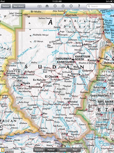
There are a number of issues that still need to be resolved to fulfill the Comprehensive Peace Agreement, but the people have called for an independent South Sudan. To help visualize this dramatic change in geography and cartography I've created an... Improvised Political Map or IPM.
A couple weeks ago, I wrote that this would be the most noticeable change on the world map since the breakup of the Soviet Union. The IPM below clearly shows that to be the case.
The folks at National Geographic asked that I prevent any confusion by including the following:
Map modified by Ryan Buck. Boundaries and names shown do not necessarily reflect the map policy of the National Geographic Society.
The CPA requires that the details of the independence referendum be worked out by July 9 of this year. National Geographic won't be out with a map showing South Sudan until well after the details have been worked out but hopefully this improvisation will hold us Sudan map and geography hobbyists until then! I have emailed Juan Valdes from National Geographic Maps to get some "industry gossip" (if there is such a thing) on portraying South Sudan. I'll let you know what I hear.
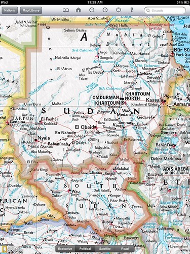
I employed some fairly "rudimentary" tools to do this. It's not perfect but it serves its purpose - to show us how different Sudan will look on a political map. The map is an edited copy of a screenshot from the National Geographic iPad app. In case my map has fooled you, National Geographic currently shows Sudan as below.
Perhaps the greatest challenge was picking a color. South Sudan will border six different countries, Sudan, Central African Republic, DRC, Uganda, Kenya and Ethiopia. National Geographic only uses six colors on their political maps which means I couldn't create a South Sudan border without copying another color. You might notice I sort of blended the border color with Kenya. That's fitting given the Ilemi Triangle issue.
I was having a hard time figuring out how National Geographic would color seven countries with six colors. It wasn't until a conversation at work that I realized the issue was my inability to change the color of the bordering countries which was the actual limiting factor. Fast fact - a Google search following that realization taught me (haha... "a Google search taught me") China borders more countries than any other.
I think it's time to email my old South Sudanese penpal Rengo Gyyw Rengo Jr!
It turns out Google is on the move to update and create maps of South Sudan
If you liked this post don't forget to check out other nerd projects.
A couple weeks ago, I wrote that this would be the most noticeable change on the world map since the breakup of the Soviet Union. The IPM below clearly shows that to be the case.
The folks at National Geographic asked that I prevent any confusion by including the following:
Map modified by Ryan Buck. Boundaries and names shown do not necessarily reflect the map policy of the National Geographic Society.
The CPA requires that the details of the independence referendum be worked out by July 9 of this year. National Geographic won't be out with a map showing South Sudan until well after the details have been worked out but hopefully this improvisation will hold us Sudan map and geography hobbyists until then! I have emailed Juan Valdes from National Geographic Maps to get some "industry gossip" (if there is such a thing) on portraying South Sudan. I'll let you know what I hear.
I employed some fairly "rudimentary" tools to do this. It's not perfect but it serves its purpose - to show us how different Sudan will look on a political map. The map is an edited copy of a screenshot from the National Geographic iPad app. In case my map has fooled you, National Geographic currently shows Sudan as below.
Perhaps the greatest challenge was picking a color. South Sudan will border six different countries, Sudan, Central African Republic, DRC, Uganda, Kenya and Ethiopia. National Geographic only uses six colors on their political maps which means I couldn't create a South Sudan border without copying another color. You might notice I sort of blended the border color with Kenya. That's fitting given the Ilemi Triangle issue.
I was having a hard time figuring out how National Geographic would color seven countries with six colors. It wasn't until a conversation at work that I realized the issue was my inability to change the color of the bordering countries which was the actual limiting factor. Fast fact - a Google search following that realization taught me (haha... "a Google search taught me") China borders more countries than any other.
I think it's time to email my old South Sudanese penpal Rengo Gyyw Rengo Jr!
It turns out Google is on the move to update and create maps of South Sudan
If you liked this post don't forget to check out other nerd projects.
Tuesday, August 31, 2010
National Geographic Responds
In the process of writing a post questioning National Geographic Map Policy I was given the name of the Director of Editorial and Research for National Geographic Maps. I emailed him with a few questions on current map policy, specifically related to the Hala'ib triangle, Bir Tawil and Somaliland.
Today I heard back from Juan. As promised, his email is below. It's nothing groundbreaking and if I'm honest, predictable, but it speaks to the map giant's ability to respond to the public. I don't totally buy the fact that the scale of the maps prevents them from displaying Somaliland in grey, then again I only buy large maps and so my view might be a bit skewed. There doesn't seem to be any problem displaying Andorra and it is about the size of a pinhead on my 110" wide world map.
Thanks go out to Juan Valdes and Kevin Lance!
Ryan:
Thank you for your email of August 25, 2010 regarding the National Geographic's portrayal of the Hala'ib Triangle, Bir Tawil trapezoid, and Somaliland in our maps.
The Society’s cartographic policy is one of portraying de facto situations; that is, to portray to the best of our judgment the reality on the ground. We consult with multiple authoritative sources on a frequent basis to determine the current political status of disputed territories and how to best represent them in our maps.
With regard to our cartographic treatment of the Hala'ib Triangle, after several military clashes between Egyptian and Sudanese forces in the 1990's, Sudan ultimately withdrew from this area in January 2000. Their forces were pulled south of the political boundary set by the Anglo-Egyptian Agreement of 1899 - the 22nd parallel. Since then, Egypt has effectively administered the area.
As for the Bir Tawil trapezoid, Egypt does not recognize sovereignty over this area on its maps; here, it claims the 22nd parallel as both its political and administrative boundary. Inversely, Sudan officially recognizes the boundary of Bir Tawil as that set by the British in 1902. However, Sudanese sources contradict this stance by cartographically portraying the Bir Tawil trapezoid as being partially administered by the states of River Nile and Red Sea.
To date, the political and military situation in the Hala'ib Triangle remains unchanged, while Egypt's and Sudan's stance on Bir Tawil has been somewhat cartographically defined. Therefore, the Society's Map Policy Committee has recognized Egypt's de facto administration of the Hala'ib Triangle and Sudan's de facto governance of the Bir Tawil trapezoid. As a point of reference, and where scale permits, the 1902 administrative boundary is delineated in our maps accompanied by a label identifying Sudan's existing claim to the Hala'ib Triangle.
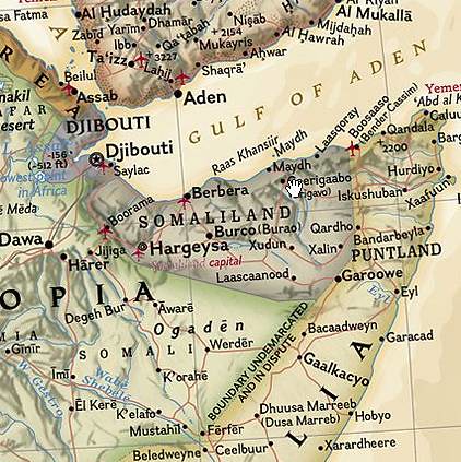
Regarding the color fill treatment of Somaliland in our Africa Wall Map, most political boundaries depicted in our maps and Atlases are stable and uncontested. Those that are disputed receive a special treatment. Depending on the map's scale, such territories or separatist states are shown in a gray fill with their administrative centers depicted by an open bull's eye symbol.
Where scale permits, explanatory notes are added to explain the current political situation of such disputed territories.The difference you have noted between our treatment of Somaliland in our World map to that of our Africa wall map is a reflection of this policy.
Finally, yes, I have been a long standing member of the Society's Map Policy Committee.
Your interest in National Geographic maps is appreciated. Thank you for taking the time to write.
Juan José Valdés
Director of Editorial and Research
National Geographic Maps
Today I heard back from Juan. As promised, his email is below. It's nothing groundbreaking and if I'm honest, predictable, but it speaks to the map giant's ability to respond to the public. I don't totally buy the fact that the scale of the maps prevents them from displaying Somaliland in grey, then again I only buy large maps and so my view might be a bit skewed. There doesn't seem to be any problem displaying Andorra and it is about the size of a pinhead on my 110" wide world map.
Thanks go out to Juan Valdes and Kevin Lance!
Ryan:
Thank you for your email of August 25, 2010 regarding the National Geographic's portrayal of the Hala'ib Triangle, Bir Tawil trapezoid, and Somaliland in our maps.
The Society’s cartographic policy is one of portraying de facto situations; that is, to portray to the best of our judgment the reality on the ground. We consult with multiple authoritative sources on a frequent basis to determine the current political status of disputed territories and how to best represent them in our maps.
With regard to our cartographic treatment of the Hala'ib Triangle, after several military clashes between Egyptian and Sudanese forces in the 1990's, Sudan ultimately withdrew from this area in January 2000. Their forces were pulled south of the political boundary set by the Anglo-Egyptian Agreement of 1899 - the 22nd parallel. Since then, Egypt has effectively administered the area.
As for the Bir Tawil trapezoid, Egypt does not recognize sovereignty over this area on its maps; here, it claims the 22nd parallel as both its political and administrative boundary. Inversely, Sudan officially recognizes the boundary of Bir Tawil as that set by the British in 1902. However, Sudanese sources contradict this stance by cartographically portraying the Bir Tawil trapezoid as being partially administered by the states of River Nile and Red Sea.
To date, the political and military situation in the Hala'ib Triangle remains unchanged, while Egypt's and Sudan's stance on Bir Tawil has been somewhat cartographically defined. Therefore, the Society's Map Policy Committee has recognized Egypt's de facto administration of the Hala'ib Triangle and Sudan's de facto governance of the Bir Tawil trapezoid. As a point of reference, and where scale permits, the 1902 administrative boundary is delineated in our maps accompanied by a label identifying Sudan's existing claim to the Hala'ib Triangle.
Regarding the color fill treatment of Somaliland in our Africa Wall Map, most political boundaries depicted in our maps and Atlases are stable and uncontested. Those that are disputed receive a special treatment. Depending on the map's scale, such territories or separatist states are shown in a gray fill with their administrative centers depicted by an open bull's eye symbol.
Where scale permits, explanatory notes are added to explain the current political situation of such disputed territories.The difference you have noted between our treatment of Somaliland in our World map to that of our Africa wall map is a reflection of this policy.
Finally, yes, I have been a long standing member of the Society's Map Policy Committee.
Your interest in National Geographic maps is appreciated. Thank you for taking the time to write.
Juan José Valdés
Director of Editorial and Research
National Geographic Maps
Monday, August 30, 2010
Is that a Dam typo?
One of things I enjoy most about maps is to immerse myself in thoughts of the physical places I'm peering at through the looking glass. My imagination runs wild thinking about all the locations on a world map. For me, this wanderlust and mapgazing is a daily activity. In doing so, occasionally I'll run into a map feature that is a real head-scratcher.
Last week I was searching in the area around the Okavango Delta in Botswana and Lake Kariba between Zambia and Zimbabwe when I came across what looked to be a phantom "l" on the map.
I was quite pleased with myself as I thought I had discovered an error on the National Geographic 2007 Africa map. I became puzzled when I found a similar "l" to the east at the eastern edge of Lake de Cahora Bassa in Mozambique. While it was hard to believe National Geographic made a mistake, two mistakes right next to each other was a laughable notion.
The image below shows the area in question and both lines. One is to the southwest of the City of Kariba, the second is on the eastern end of Lake Cahora Bassa.

I scoured the legend on all my National Geographic maps but couldn't find anything that matched the symbol. It most closely matched that of passenger railroad but both the size and logic of placement was off. Why would someone build a railroad bridge across a large body of water if it didn't connect to anything on either side?
Time to search Google Earth and put the mystery to bed!
It turns out that the mysterious line represents a dam. With the help of a friend we quickly discovered another dam in Turkey. They are only visible in the continent blow up maps from National Geographic.
Below, in this week's Google image of the week, we see the Cahora Bassa dam in Mozambique.

Remember, clicking on the images will take you to a full sized image.
Last week I was searching in the area around the Okavango Delta in Botswana and Lake Kariba between Zambia and Zimbabwe when I came across what looked to be a phantom "l" on the map.
I was quite pleased with myself as I thought I had discovered an error on the National Geographic 2007 Africa map. I became puzzled when I found a similar "l" to the east at the eastern edge of Lake de Cahora Bassa in Mozambique. While it was hard to believe National Geographic made a mistake, two mistakes right next to each other was a laughable notion.
The image below shows the area in question and both lines. One is to the southwest of the City of Kariba, the second is on the eastern end of Lake Cahora Bassa.

I scoured the legend on all my National Geographic maps but couldn't find anything that matched the symbol. It most closely matched that of passenger railroad but both the size and logic of placement was off. Why would someone build a railroad bridge across a large body of water if it didn't connect to anything on either side?
Time to search Google Earth and put the mystery to bed!
It turns out that the mysterious line represents a dam. With the help of a friend we quickly discovered another dam in Turkey. They are only visible in the continent blow up maps from National Geographic.
Below, in this week's Google image of the week, we see the Cahora Bassa dam in Mozambique.
The image can be found at 15° 35' 7" S 32° 42'18" E

Remember, clicking on the images will take you to a full sized image.
Wednesday, August 25, 2010
Update: National Geographic Maps
A few recent posts have called into question the actions of the National Geographic Map Policy Committee.
Thanks to the helpful Kevin Lance of National Geographic Maps, I have the contact info for the Editorial and Research head in the Nat Geo Maps department, Juan Valdes. Yes, the coffee guy does maps too!
So far Nat Geo has been extremely accommodating. A big thumbs up to them! I'm excited to hear back from them.
After playing phone tag with Juan I sent him the following email:
Hi, Juan,
Thank you very much for your prompt response.
Kevin Lance referred me to you to answer a few questions regarding the reasoning/research behind a few areas on the National Geographic political maps.
1. What happened (on the ground) between 2001 (based on the world map) and 2007 (based on the Africa map) that changed ownership of the Hala'ib triangle from Sudan to Egypt? Also, why is Bir Tawil now shown as part of Sudan?
It appears the change now recognizes the 1899 border established by the 22nd parallel in place of the 1902 agreement the British put in place.
I know the Sudanese have pulled troops from the area and that Egypt has invested in the area.
In summary of question 1 - Why is the Hala'ib triangle now shown as part of Egypt and why is Bir Tawil shown as part of Sudan?
Question 2 - Why is Somaliland shown in grey on the continent political maps but not delineated at all on the world map?
National Geographic often discusses its desire to reflect what is on the ground and remain a-political. Somaliland recently elected a new president in a free and fare election as an opposition candidate. It seems the reality on the ground is that Somaliland is very much an autonomous State. The same cannot be said for Somalia. It seems that the only issue for showing Somaliland as part of Somalia is the lack of international recognition. Isn't recognition by other countries a political decision in itself?
In summary of question 2 - What is the research and reasoning for showing Somaliland in grey on Africa political maps and not at all on world maps?
I'll post Juan's response as soon as I get it.
To pass the time, why not take a peak at some of my pictures from Namibia.
Wednesday, August 18, 2010
Changing the Looking Glass: Radical Geography
Shape! Size! Distance!
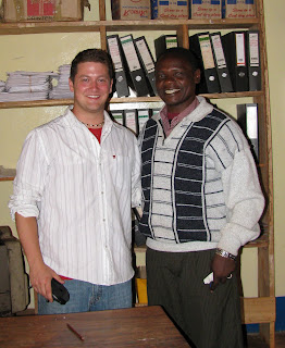
The form 3 students in the tiny village of Pommern, Tanzania outside of Iringa repeated the mantra over and over. Edward, my favorite teacher (pictured with me below right) at the school reminded me that repetition was key to drilling anything new into the kids' heads.
Their exclamation was in response to my question. What are the main types of map distortions?!
Shape! Size! Distance!
Before the class started I found a scuffed up old soccer ball, still smelling of the cow dung it had rolled through the day before on the soccer field- excuse me-pitch!
I've always felt the best demonstration of map distortion was to use a ball and a piece of paper. I folded the paper around the ball to show how the page itself became distorted then highlighted those areas by rubbing pencil lead on the folds.
I straightened the paper to show the distortions when the sphere is projected in two dimensions. Some of the students understood but map projections can be one of the most difficult spatial issues to grasp; But it is paramount to understanding ones place and relative placement on the earth.
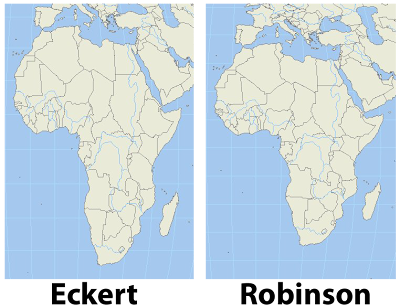 I remember as a child certain world maps making Africa look tall and skinny. Something didn't sit right with me when I saw that particular projection. It turns out that projection was an equal area projection like the Eckert IV shown in contrast with a Robinson projection in the image, left. The Robinson projection is easy on the eyes and just feels right.
Wouldn't you agree?
After a heads up from Matt Rosenberg in his post on the about.com site, I found a great website which uses radical map projections to view data in a new and exciting way.
Projections help us display the spheroid earth on a two dimensional surface. My favorite projection for world maps and the one used by the greats at national geographic is the Winkel tripel projection, a variation on the Robinson projection.
In one post ten projections are layered on each other to show the variations.
Since I mentioned National Geographic I'm excited to tell you that I have received an initial response from the company regarding my inquiries to the map policy committee as well as the Hala'ib triangle. I'll be sure to update you on what I ultimately discover.
I really hope you check out some of the amazing maps at radicalgeography.com.
The form 3 students in the tiny village of Pommern, Tanzania outside of Iringa repeated the mantra over and over. Edward, my favorite teacher (pictured with me below right) at the school reminded me that repetition was key to drilling anything new into the kids' heads.
Their exclamation was in response to my question. What are the main types of map distortions?!
Shape! Size! Distance!

Before the class started I found a scuffed up old soccer ball, still smelling of the cow dung it had rolled through the day before on the soccer field- excuse me-pitch!
I've always felt the best demonstration of map distortion was to use a ball and a piece of paper. I folded the paper around the ball to show how the page itself became distorted then highlighted those areas by rubbing pencil lead on the folds.
I straightened the paper to show the distortions when the sphere is projected in two dimensions. Some of the students understood but map projections can be one of the most difficult spatial issues to grasp; But it is paramount to understanding ones place and relative placement on the earth.
 I remember as a child certain world maps making Africa look tall and skinny. Something didn't sit right with me when I saw that particular projection. It turns out that projection was an equal area projection like the Eckert IV shown in contrast with a Robinson projection in the image, left. The Robinson projection is easy on the eyes and just feels right.
 Wouldn't you agree?
After a heads up from Matt Rosenberg in his post on the about.com site, I found a great website which uses radical map projections to view data in a new and exciting way.
Projections help us display the spheroid earth on a two dimensional surface. My favorite projection for world maps and the one used by the greats at national geographic is the Winkel tripel projection, a variation on the Robinson projection.
In one post ten projections are layered on each other to show the variations.
Since I mentioned National Geographic I'm excited to tell you that I have received an initial response from the company regarding my inquiries to the map policy committee as well as the Hala'ib triangle. I'll be sure to update you on what I ultimately discover.
I really hope you check out some of the amazing maps at radicalgeography.com.
Friday, August 6, 2010
The Hala'ib Triangle and why National Geographic has it Wrong
 The Hala'ib triangle is a division of land in northeast Africa. The area is a disputed region, a result of two different borders being set between Sudan and Egypt, both of whom claim the Hala'ib triangle.
 In 1899, Egypt and the United Kingdom agreed on the 22nd parallel as the border between the two countries. Three years later in 1902 the British created a new dividing line, granting administration of the area to Sudan because of its proximity and access from Khartoum. The administrative boundary created the Hala'ib triangle north of the 22nd parallel and a small area, the Bir Tawil south of the parallel. The 1902 agreement ceded administrative control of Bir Tawil to Egypt (which was really the British anyway) Both can be seen on the map above.
While both countries still claim the Hala'ib triangle, neither claims Bir Tawil, the "lonely little triangle" to the south of the 22nd parallel. So what would cause two countries to claim one 20,000 square kilometer piece of land but both reject claims to a 2,000 square kilometer parcel adjacent to it?
If you guessed natural resources, you're probably right! But that is only part of the story.
While Sudan held troops in the area for years it was Sudan granting exlploration rights to the Canadian oil company, Canadian International Petroleum Corporation, that finally made Egypt take note.
In 2000, Sudan pulled troops from the area, ceding de facto control to Egypt. However, Omar al-Bashir remains firm in Sudan's claim to the land, stating earlier this year "Halayeb is Sudanese and will stay Sudanese".
I found a FANTASTIC article on the issue in the Sudan Tribune.
In my daily routine of mapgazing I discovered that National Geographic, who I see as THE authority on political maps, now uses the 22nd parallel as the border. This shows all the land to the north as Egypt and all to the South as Sudan. This is a significant change from the 2000 world map which shows the 1899 Anglo-Egyptian political division - complete with Egpyt control over Bir Tawil. What's not clear is what happened that made them switch how the area is displayed.
I thought that it must have been Sudan removing their armed presence in the area and the desire to show de facto control. But that doesn't explain why they show Bir Tawil as Sudan. If it was the removal of troops that prompted the change, that should only be reflected in the Halai'ib traingle, not Bir Tawil. Until I get a better reason or explanation, I think National Geographic has this one wrong.
I emailed National Geographic for an answer on what prompted the Map Policy Committee change from the 1899 political boundary to the 1902 administrative boundary. I'll probably only receive a generic email but I am going to stick with this, look for individual contact information and see if I can get official word from a spokesperson. Perhaps I should have inquired through their press inquiry e-mail. Whatever I find out I'll let you know.
How do you think the Hala'ib triangle and Bir Tawil should be displayed?
Tuesday, July 6, 2010
The Fight for International Recognition by Forgotten Countries
I think most people believe statehood is granted by some divine authoritative body, or perhaps by a pencil-pushing bureaucrat on the third floor of some office building in New York. The question "What makes a country a country?" is a fascinating one with a wide variety of vague and non-specific answers.
We toss around terms like international community, sovereignty, constitutive and declarative theories of statehood and recognition to help us define country status, but these terms are vague themselves. Even recognition and inclusion by the UN can't be used as a determining factor for statehood, unless it is being used to validate the actions of it's own members as those who can "grant" that status.
The Montevideo Convention put forth basic criteria for country status but many will tell you the Montevideo Convention is virtually useless by itself and promotes absurd claims of statehood. These people subscribe to the more declarative theory, relying on the diplomatic action of the big boys. It's hard to think of promoting independence, sovereignty or statehood as a bad thing. However, the international community seems hesitant to recognize new countries, despite many having met (arguably) all criteria set forth by deterministic conventions (I'm using the other definition of convention here) with the exception of multilateral diplomatic relations.
Countries who, to this point have legitimized each other, seem to have a greater desire to keep the group exclusive than to stick to the more common considerations for country status i.e. Matt Rosenburg's list and the Montevideo Convention, external recognition excepted. When you think of it that way, external recognition, in reality, is the only criteria that really matters.
I don't like to think that way.
Why does the international community stonewall legitimate claims to independence, such as Somaliland, Kosovo and Taiwan? I recently asked about.com's Geography editor, Matt Rosenberg WHY Somaliland and other countries in waiting are having so much difficulty. He is scheduled to have a blog post answering the question later this week.
The point is that there is so much gray area for places like, Israel, Palestine, Somaliland, Kosovo, Tibet, Abkhazia, South Ossetia, North Korea, South Korea, etcetera that perhaps there is a need to consider a different source for country status. For most of us the biggest consideration in whether or not a country is a country is if we can find it on a map. As a whole, we don't care about Pakistan's refusal to recognize Armenia; We care if Armenia is on a map.
Who better to entrust country status than the a-political map geniuses at the National Geographic Society? Nat Geo takes this issue very seriously, citing several sources in their Maps Policy including "the United Nations, the European Community (apparently Nat Geo needs to UPDATE it's map policy as the EC has been disbanded), as well as the policies of individual governmental entities; the Board on Geographic Names; recognized reference books such as encyclopedias, dictionaries, geographical dictionaries, atlases, independent academic texts and other similar sources".
At least their process feels analytical and not quantitative or arbitrary. However, Nat Geo has also shown their ability to quickly adapt (or bend), exemplified by the Map Committee's recent ruling on the Paracell "Don't call me China" Islands, following an online petition signed by more than 10,000.
David Miller, a map editor for National Geographic Maps provides a more simplistic explanation: "for independence bids to ultimately succeed, the government must control its territory, have the support of the people, and show stability over a certain period of time." Of course, if we went by THAT definition we wouldn't have many countries to map!
Citing the Kosovo example, Mr. Miller goes on to say in the National Geographic News article "We're preparing our digital maps and databases … to start showing [Kosovo] as an independent country..." However, that change has yet to show up on their maps.
Interestingly enough, National Geographic seems to be wavering on the Somaliland issue. On continent maps Somaliland is delineated but not given a standard color, making clear the distinction that the "world" still sees Somaliland as an autonomous region of Somalia and not an independent country. On world maps, however, Somaliland is not delineated, only displayed similar to other states, such as Fezzan and Cyrenaica in Libya.
The discussion of country status is circular AT BEST. Really, when it comes down to it, there is no "official list", only opinions. A state's independence is real to anyone or anything who gives credence to it's existence.
Sunday, June 27, 2010
Our Wonderful World
A few years ago, the general lack of geographic mastery of many Americans became front page news after this now famous answer regarding Americans' inability to locate the US on a world map.
Notwithstanding the hilarity of the poor girl's misfortunate answer, we should remind ourselves of the question. "Recent polls show 1/5 of Americans can't find the US on a world map. Why do you think this is?"
In many ways, Ms. Teen South Carolina might not have been too far off with her main point - we need more MAPS.
Realizing that this is a serious issue, I wanted to learn about groups promoting geography as a discipline and not just a map quiz (as much as I enjoy those). Geography is so much more than being able to find Mauritania on a map and we need to promote it as such! A web search brought me to an amazing initiative from National Geographic (who else?) called my wonderful world.
The site is full of shocking statistics from the Roper study about our (Americans) lack of geographic knowledge. Did you know only 19% of kids have a world map? (It's no wonder nobody knows about Eritrea.) Half of young Americans can't find New York on a map and half of high school principals think their geography tools are inadequate (although I haven't heard a kid mention French West Africa myself) and only 37% of young Americans can find Iraq on a world map. These stats are staggering! I know it's easy to make these results worse than they really are by tweaking the questions and the way they are asked but the underlying issue remains clear: Geography is not our strong suit and to a great extent we think we are alone in the world.
I'd be very interested to see the Roper study, which was the basis for the epic Ms. Teen USA question, administered in other countries around the world. I think we'd find an extremely high correlation between investment and achievement but I bet there are very few countries who adequately invest in their geography curriculums. That's a problem. It's time for "US Americans" to step up the plate. Help spread the word. Go to My Wonderful World and pledge your support today.
Remember, as the Discovery Channel taught us, the world is just awesome!
Boom-de-a-da, boom-de-a-da, boom-de-a-da...I love that song!
Subscribe to:
Posts (Atom)


