Monday, December 27, 2010

Morogoro

As I mentioned before, making a lot of corrections in Google Map Maker can be a frustrating and tedious process. Despite that I still find myself going in and doing an edit here or there regularly.

I scrolled around the Tanzania base map and came across the City of Morogoro. Morogoro is situated at the base of a small mountain in Eastern Tanzania. I had lunch there a few years ago on the road between Iringa and Dar es Salaam.

I'm not sure when the imagery was updated, but about half the City now has clear imagery in Google Earth. Because the imagery is so clear, I was surprised to see that the only roads that have been added to Morogoro are the major highways. Nobody has worked on the area in Map Maker. For a project a bit more rewarding than realigning intersections in the generally well mapped Iringa, I started adding new roads, local roads, in Morogoro.

I've posted on the Google Map Maker forum my frustration that the majority of roads in Africa are classified incorrectly as paved. I'm using this opportunity to create a city and also try to do it the right way, with local roads classified as unpaved.

If you're interested in trying Google Map Maker out, I encourage you to participate in mapping the City of Morogoro in Tanzania. You can access the area on here on map maker.

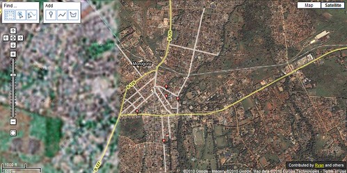
There are plenty of roads to add and railroads to correctly align! Here is a snapshot of what I've worked on so far.

Morogoro, Tanzania

If you are working on mapping another area, leave a comment, let me know and I'll drop by and help!

Monday, December 20, 2010

Ten Months Until the 91st Anniversary of the Traffic Signal

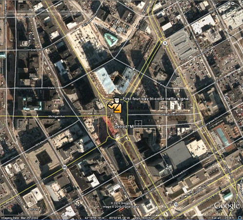
A tid-bit came across facebook this morning saying that today was the anniversary of the first traffic light. It turns out that the statement was perhaps a bit of an exaggeration. Apparently there were traffic lights, at least of some form, even if they required a police operator, back in the 1860's. Today, December 20th, is the anniversary of the first, modern traffic signal, one designed for a full intersection and with the familiar green, amber, red tri-color configuration. Since that first modern traffic signal was installed in Detroit, I thought I'd share it with you.

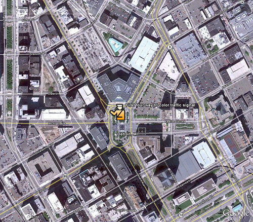
The intersection of Michigan Ave and Woodward is marked by the policeman I added. In the first pic, from 2002, the streets still intersect with four corners.

Detroit 2002

A couple years later, however, the City redesigned the intersection which now circles around Campus Martius park.

Detroit 2010

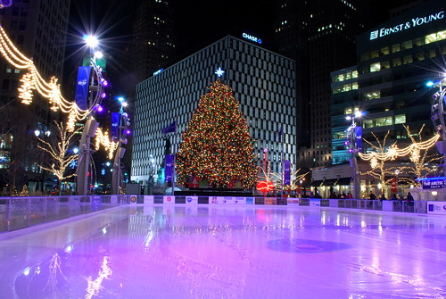
And now the area where Michigan Ave and Woodward connect is Campus Martius. In the winter months, the City turns a portion of the park into a skating rink. Very New Yorkesque.

Campus Martius Park

Of course, as it turns out, facebook lied. Today is not the anniversary of the first tri-color signal. Apparently it was in October of 1920, not December 1920.

:)

Oh well. It's still cool to look back at pictures of the area before Campus Martius, even if we didn't learn anything new today.

Monday, December 13, 2010

Crowdsourced: Google Map Maker

Google encourages us all to become citizen cartographers and help map our world with Google Map Maker! Count me in! Truth be told, I've come across it several times before but was never able to make it function. Naturally, with a new tool called Map Maker I figured I was best suited to help update and verify information in the area I know most. As a default I would be zoomed in to an area I recognized based on the water features (near my home) but I couldn't add anything to the map. No matter what I tried, I couldn't add a restaurant, a road, a bike path...nothing.

I don't recall exactly what brought me to the Google Map Maker tool most recently but I ended up editing a map of Iringa, Tanzania. If I can't do it for home, Iringa is one of my first "go-tos" for creating things geography and google related, and lets face it, Google map maker is about as close a match for that criteria as I'll ever find.

It might seem that the community maps in Africa as part of Google's effort to map Africa would need a lot of work, particularly outside of capital cities but several efforts by google have extended the accuracy of these user generated maps to much more rural areas. Well, perhaps smaller cities is more accurate. The Google Africa Blog talks about one of these efforts:Official Google Africa Blog: Mapping Korogocho. While there is some educational benefit that comes with trainings like this, in the end, Google is the big winner.

I was impressed by the accuracy of most of the roads in Iringa. All but a few outlying dirt roads were included and for the most part the accuracy matched up well with the satellite imagery.

While not as intuitive and arguably not as simple as Google's Building Maker, Map Maker offers much of the same fun factor. It is rewarding to know that you are contributing to a more completely and accurately mapped world that is more accessible to the masses than ever before.

That's the good.

As I moved away from the center of Iringa I noticed that many of the roads are misaligned by 30-100 feet. Map maker does not let you do multi-editing which prevents you from aligning a segment of road. This means, you can fix the location of an intersection or you can fix the alignment of a road but you can't do both. Since there is no easy way to track a large number of edits in an area it becomes a fools errand (I'm not actually sure I'm using that idiom correctly, but it seems to fit) to try to fix misaligned roads- and there are a lot of them! So here I am complaining that I can't help Google for free, faster.

Here is an example where I fixed two intersections but was not able to fix the road (segment) connecting them because the segment had adjacent edits pending review. The two small red edit points are my approved edits. Noticed I arranged them based on the imagery. I could not edit the segment of road between these two edits at the same time.
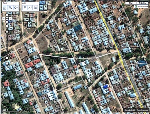
map Maker

In order to complete the edit, I need to now fix the two remaining intersections...one at a time.
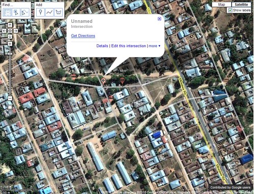
map maker edit

I have to hand it to Google. Much like building maker, they have crowdsourced some of the most detailed grunt-work to the world for no cost. Those U of M grads are really on to something with this Google thing.

As frustrating as actually making a lot of edits can be, I see myself doing a lot more with map maker, especially in Africa.

Monday, December 6, 2010

Carving Away the Dangerous Mountain

I have a few "go to" search phrases when I'm looking to get a good Youtube.com fix. While my favorite is probably "TV Bloopers", another that gets a frequent search from me is "Crazy Airport Landing". It's a good way to familiarize oneself with some famous, or rather infamous international airports.

This past weekend the History Channel replayed a show they produced called Most Extreme Airports which ranked the top 10 "MOST EXTREME" airports.

It was a fascinating show and I recognized several of the airports from youtube, most notably St. Maarten and Toncontin in Tegucigalpa.

I've included my favorite video from St. Maarten and Toncontin below.

St. Maarten


Toncontin


For reference, here is the list of the ten most extreme airports as ranked by the History Channel.

10. KSAN - San Diego, CA
9. LPMA - Madeira, Portugal
8. KEGE - Vail, CO
7. LFLJ - Courchevel, France
6. VHHH - Hong Kong Kai Tak
5. LXGB - Gibraltar
4. TNCM - St. Maarten
3. TFFJ - St. Barth's
2. MHTG - Tegucigalpa, Honduras
1. VNLK - Lukla, Nepal

I had read that improvements had been made at Toncontin which extended the runway and carved out a piece of the mountain for approaches from the south. I took to Google Earth to look at the change over time. It's pretty cool to see the south west portion of the landing stip before and after the safety improvements.

Toncontin before


Toncontin after


Time to add Tegucigalpa to the ever growing vacation list!

Monday, November 29, 2010

Gone for a Walk to the Supermarket

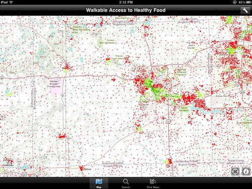
I was pretty disappointed after downloading the Esri ArcGIS app for the iPad a while back. It didn't seem to offer much of anything. Quite honestly, I haven't opened the app prior to today in a couple months. My big complaint was that the available maps or layers were arranged haphazardly and not easy to surf. Perhaps just by luck, when I searched for popular maps today I came across a layer showing walkable access to fresh food.

This is a topic that interests me personally but also has applications in my job. We've completed a similar analysis but the maps we created look comical compared to this one.

Walking access to supermarkets

At first it looked extremely detailed and like it took a LOT of work to get all the data but on closer inspection it's not all that complicated.

With so many dots it's easy to think that each represents a household. It turns out that the dots actually represent areas. These points are called centroids and contain data for an area or polygon but are displayed as points. In this instance, the centroid represents census blocks. The census is notorious for suppressing all of the interesting information. Also, I don't recall a "can you walk to a supermarket from your house" question on the census form. So we know that none of the data came from the census, only the geography of the blocks, in this case, centroids. Fortunately, a layer of supermarkets is pretty easy to come by. Just like that we can easily account for two-thirds of the equation, census block centroids and the locations of supermarkets. A simple GIS selection will show the census blocks within a mile of a supermarket.

Now it gets tricky, and this is where I've struggled at work. How can you determine if residents of a particular household can walk to a supermarket? You can't. At least not on a large scale, like the entire US, you can't. The biggest factor is whether or not a sidewalk is available but it's impossible to trace a walking path from every house to the nearest supermarket. From a GIS standpoint the easiest layer to add in to this equation is sidewalks. A reasonable corner to cut to estimate walkability is to assume that if a census block has a sidewalk in it, you count it as being walkable. There are lots of exceptions but that is how I would do it.

However, I think this map cuts even more corners. I can tell you that no one has sidewalk data for the entire country...not even Google! It looks like the cartographer has assumed that urban areas, namely cities and villages, all have sidewalks.

So while this map implies amazing detail it is really a huge collection of assumptions and estimations. That's really ok, it gives a great snap shot of "walk access" for an area. The problem is, when you are trying to determine where to fill sidewalk gaps to allow more people walk access to fresh foods, you need to know if they actually have a place to walk, not just whether they live in a city and if there is a sidewalk somewhere near there home.

Still, it's an excellent point of departure for a more detailed analysis and map. I'm definitely a fan of the use of centroids for census blocks.

Kudos to Esri for creating an app that is more than I initially thought. If you have an iPad go get it, it's free!

Monday, November 22, 2010

A Thanksgiving Tradition and a Map to Boot

One of the things that I find relaxing about the holidays is a standard routine. Knowing where and when the family will get together and that I have four days of leftovers coming my way is a great feeling. Even the fact that no matter what happens, the four-day thanksgiving weekend will seem shorter than any other two-day weekend offers an element of comfort along with the frustration it brings.

Despite this desire to do things exactly as they have been done before I am looking for a new tradition to add to the holiday routine. I think I've found one in the Fifth Third (that's the sponsor not numeric description) Detroit Turkey Trot, a 10 kilometer run that starts at the Spirit of Detroit statue in the heart of the city.

I've found that in addition to being a great way to stay in shape and relieve stress, running is also a great way to see an area. Whether it's gaining a new perspective on a place you see frequently or a way to see a new place as you travel, running is a great way to witness the world.

While I've spent lots of time in the City of Detroit I'm looking forward to seeing and experiencing it in a new way, all while starting a new tradition to bolster my routine.

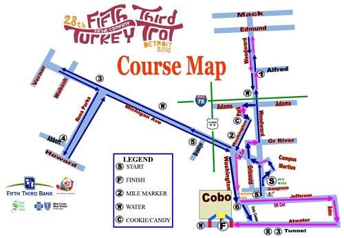
Ive included two pictures below, the first is an image of the Spirit of Detroit as seen in Google Earth, the second is the 10k race route.

Happy running and enjoy that tryptophan.

Spirit of Detroit

2010 detroit turkey trot course map