
Last June I wrote a post defending National Geographic's World Atlas app for iPad and iPhone. The reviews in the app store were abysmal, climbing to a high of three and a half stars (a number that wouldn't even impress Ed McMahon).
After nearly a year, the wait is over, World Atlas 2.0 is here. Too bad they didn't listen to any of our concerns, instead, opting for improvements that do little to improve its functionality. But, in the words of Levar Burton, you don't have to take MY word for it...actually you do, see my video review below.
Well National Geographic, thanks for trying...I guess.
Monday, March 21, 2011
Monday, March 14, 2011
Corktown and My Tracks
You know how I love Google. Google and Apple. While I was disappointed in some respects when I switched from an iPhone to an EVO 4G running Android, the Google "My Tracks" app has been a great tool. I immediately thought of recording runs when my coworker introduced me to the app. This past Sunday was the Corktown 5k run in Detroit- a perfect opportunity. I used the "My Tracks" app to record the low-key run. Despite being a battery hog, the likes of which I’ve never seen, I managed to record the whole run on as little as 25 % of my battery (note the sarcasm). Corktown is a fascinating neighborhood with a rich history- so check out the link. Its roots make for a perfect celebration of St. Patrick’s Day while the Corktown run and parade provide a great opportunity for EVERYONE to pretend they are Irish, if only for a day.
I uploaded the recorded run track from my phone and emailed it to myself as a kml file with a few quick commands. As I reviewed the track for accuracy, or at least consistency of the altitude, I was amazed at how closely the hills matched up, especially since this is only dealing with about ten feet of variation.
While I foolishly allowed myself to think this was a sign my phone's GPS was amazingly accurate, I quickly figured out it was, in fact, just another clever use of other Google data, the terrain model data from Google Earth.
Notice the terrain map of the out-n-back race format is almost a mirror image. My GPS might not be state of the art, but the Google terrain data fills in with a great dataset that will suffice for almost any project!
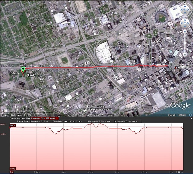
It's just another example of how easy Google is making things for us by making their products interact seamlessly.
I uploaded the recorded run track from my phone and emailed it to myself as a kml file with a few quick commands. As I reviewed the track for accuracy, or at least consistency of the altitude, I was amazed at how closely the hills matched up, especially since this is only dealing with about ten feet of variation.
While I foolishly allowed myself to think this was a sign my phone's GPS was amazingly accurate, I quickly figured out it was, in fact, just another clever use of other Google data, the terrain model data from Google Earth.
Notice the terrain map of the out-n-back race format is almost a mirror image. My GPS might not be state of the art, but the Google terrain data fills in with a great dataset that will suffice for almost any project!
It's just another example of how easy Google is making things for us by making their products interact seamlessly.
Monday, March 7, 2011
Rebuttal: Oil Consumption by Country
My post last week on oil production by country was a bit of an eye opener for me regarding perception. I had always thought of OPEC as a block of countries who had a near monopoly on the global oil market. The big surprise from last week was how much oil the US produces. Rather than revealing another misconception, the map this week, confirms the perception (I guess that means we can call it reality) of the US as the oil pig.
How can a country that produces as much oil as any other country be so dependent on others to fulfill its energy lust? By consuming near 19 million barrels per day. Yes "million", and "diem".
I'll now casually evade discussion of current ecogeopolitics by instead focusing on some map commentary.
I was pretty pleased with my map last week. The color scheme worked and a quick wiz-bang in Photoshop created one of my better looking nerd project maps. Additionally, I've found I really like world maps that don't color borders. This isn't a "we are the world moment" or have anything to do with "breaking down the walls between us" (a quote from the Olympic opening ceremony song in Seoul, 1988), I just like how they look. For today's map I eliminated borders and instead included data for all countries. I stuck with a reddish theme, the darkest of which shows those countries that consume the most oil per day. I only used...I think it was eight colors, but note (full data on countries consuming more than 100k barrels per day listed below the map) the US uses more than twice as much as the next most glutinous consumer, China.
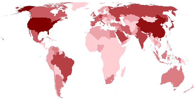
Remember, clicking on a map will always take you to a larger, higher resolution version.
Here is the list of countries by rank of oil consumption
1 United States 18,690,000
2 European Union 13,630,000
3 China 8,200,000
4 Japan 4,363,000
5 India 2,980,000
6 Russia 2,740,000
7 Brazil 2,460,000
8 Germany 2,437,000
9 Saudi Arabia 2,430,000
10 Korea, South 2,185,000
11 Canada 2,151,000
12 Mexico 2,078,000
13 France 1,875,000
14 Iran 1,809,000
15 United Kingdom 1,669,000
16 Italy 1,537,000
17 Spain 1,482,000
18 Indonesia 1,115,000
19 Australia 946,300
20 Singapore 927,000
21 Netherlands 922,800
22 Taiwan 834,000
23 Venezuela 740,000
24 Iraq 687,000
25 Egypt 683,000
26 Argentina 622,000
27 Belgium 608,200
28 Turkey 579,500
29 South Africa 579,000
30 Poland 545,400
31 Malaysia 536,000
32 United Arab Emirates 435,000
33 Greece 414,400
34 Pakistan 373,000
35 Hong Kong 359,000
36 Thailand 356,000
37 Ukraine 348,000
38 Sweden 328,100
39 Algeria 325,000
40 Kuwait 320,000
41 Vietnam 311,400
42 Philippines 307,200
43 Colombia 288,000
44 Libya 280,000
45 Nigeria 280,000
46 Switzerland 280,000
47 Chile 277,000
48 Portugal 272,200
49 Syria 252,000
50 Austria 247,700
51 Kazakhstan 241,000
52 Israel 231,000
53 Romania 214,000
54 Czech Republic 207,600
55 Finland 206,200
56 Norway 204,100
57 Morocco 187,000
58 Ecuador 181,000
59 Belarus 173,000
60 Cuba 169,000
61 Denmark 166,500
62 Puerto Rico 164,100
63 Ireland 160,900
64 Peru 157,000
65 Yemen 155,000
66 New Zealand 154,100
67 Uzbekistan 145,000
68 Qatar 142,000
69 Hungary 137,300
70 Azerbaijan 136,000
71 Bulgaria 125,000
72 Turkmenistan 120,000
73 Dominican Republic 118,000
74 Jordan 108,000
75 Croatia 106,000
How can a country that produces as much oil as any other country be so dependent on others to fulfill its energy lust? By consuming near 19 million barrels per day. Yes "million", and "diem".
I'll now casually evade discussion of current ecogeopolitics by instead focusing on some map commentary.
I was pretty pleased with my map last week. The color scheme worked and a quick wiz-bang in Photoshop created one of my better looking nerd project maps. Additionally, I've found I really like world maps that don't color borders. This isn't a "we are the world moment" or have anything to do with "breaking down the walls between us" (a quote from the Olympic opening ceremony song in Seoul, 1988), I just like how they look. For today's map I eliminated borders and instead included data for all countries. I stuck with a reddish theme, the darkest of which shows those countries that consume the most oil per day. I only used...I think it was eight colors, but note (full data on countries consuming more than 100k barrels per day listed below the map) the US uses more than twice as much as the next most glutinous consumer, China.
Remember, clicking on a map will always take you to a larger, higher resolution version.
Here is the list of countries by rank of oil consumption
1 United States 18,690,000
2 European Union 13,630,000
3 China 8,200,000
4 Japan 4,363,000
5 India 2,980,000
6 Russia 2,740,000
7 Brazil 2,460,000
8 Germany 2,437,000
9 Saudi Arabia 2,430,000
10 Korea, South 2,185,000
11 Canada 2,151,000
12 Mexico 2,078,000
13 France 1,875,000
14 Iran 1,809,000
15 United Kingdom 1,669,000
16 Italy 1,537,000
17 Spain 1,482,000
18 Indonesia 1,115,000
19 Australia 946,300
20 Singapore 927,000
21 Netherlands 922,800
22 Taiwan 834,000
23 Venezuela 740,000
24 Iraq 687,000
25 Egypt 683,000
26 Argentina 622,000
27 Belgium 608,200
28 Turkey 579,500
29 South Africa 579,000
30 Poland 545,400
31 Malaysia 536,000
32 United Arab Emirates 435,000
33 Greece 414,400
34 Pakistan 373,000
35 Hong Kong 359,000
36 Thailand 356,000
37 Ukraine 348,000
38 Sweden 328,100
39 Algeria 325,000
40 Kuwait 320,000
41 Vietnam 311,400
42 Philippines 307,200
43 Colombia 288,000
44 Libya 280,000
45 Nigeria 280,000
46 Switzerland 280,000
47 Chile 277,000
48 Portugal 272,200
49 Syria 252,000
50 Austria 247,700
51 Kazakhstan 241,000
52 Israel 231,000
53 Romania 214,000
54 Czech Republic 207,600
55 Finland 206,200
56 Norway 204,100
57 Morocco 187,000
58 Ecuador 181,000
59 Belarus 173,000
60 Cuba 169,000
61 Denmark 166,500
62 Puerto Rico 164,100
63 Ireland 160,900
64 Peru 157,000
65 Yemen 155,000
66 New Zealand 154,100
67 Uzbekistan 145,000
68 Qatar 142,000
69 Hungary 137,300
70 Azerbaijan 136,000
71 Bulgaria 125,000
72 Turkmenistan 120,000
73 Dominican Republic 118,000
74 Jordan 108,000
75 Croatia 106,000
Monday, February 28, 2011
Map of Oil Production by Country and my OPEC Misconception
With all this "Mess O' The Whole Potamia" stuff gong on (not to mention $3.50 per gallon gas) I decided to look up information on oil production by country. While the data was easily accessible (thank you Central Intelligence Agency), I couldn't find a good map showing oil production levels. Since my inquiring mind wanted to know, I put together a monochormatic map showing daily oil production by country for countries that produce at least 100,000 barrels per day.
I'm sure the data on oil production has a lot of caveats that come with it, but I'm not interested in those details. I'm interested in how far off my perception of oil production is from reality.
A few things really jumped out at me. I knew the US produced a lot of oil but had no idea it produced 9 million barrels per day. I've always thought OPEC were THE big ones. However, that doesn't seem to be the case - or at least to a lesser extent than I thought.
The map of oil production by country is below. I haven't included a legend but I have included the list (ranking) of countries at the bottom of this post. The darker the color the more oil the country produces. I've highlighted the 12 OPEC countries with a gold line and a shadow. In this map, OPEC countries don't appear all that special, just a random group of countries that produce significant amounts of oil.
But gas is still $3.50 a gallon. That's a lot of Ethiopian Birr.
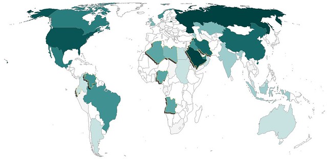
Oil Production and Rank (2009)
1 Russia 9,932,000
2 Saudi Arabia 9,764,000
3 United States 9,056,000
4 Iran 4,172,000
5 China 3,991,000
6 Canada 3,289,000
7 Mexico 3,001,000
8 United Arab Emirates 2,798,000
9 Brazil 2,572,000
10 Kuwait 2,494,000
11 Venezuela 2,472,000
12 Iraq 2,399,000
13 Norway 2,350,000
14 Nigeria 2,211,000
15 Algeria 2,125,000
16 Angola 1,948,000
17 Libya 1,790,000
18 Kazakhstan 1,540,000
19 United Kingdom 1,502,000
20 Qatar 1,213,000
21 Indonesia 1,023,000
22 Azerbaijan 1,011,000
23 India 878,700
24 Oman 816,000
25 Argentina 796,300
26 Malaysia 693,700
27 Colombia 686,600
28 Egypt 680,500
29 Australia 589,200
30 Sudan 486,700
31 Ecuador 485,700
32 Syria 400,400
33 Equatorial Guinea 346,000
34 Thailand 340,900
35 Vietnam 338,400
36 Yemen 288,400
37 Taiwan 276,800
38 Republic of the Congo 274,400
39 Denmark 262,100
40 Gabon 241,700
41 Turkmenistan 197,700
42 South Africa 191,000
43 Germany 156,800
44 Trinidad and Tobago 151,600
45 Peru 148,000
46 Italy 146,500
47 Brunei 146,000
48 Japan 132,700
49 Romania 117,000
50 Chad 115,000
I'm sure the data on oil production has a lot of caveats that come with it, but I'm not interested in those details. I'm interested in how far off my perception of oil production is from reality.
A few things really jumped out at me. I knew the US produced a lot of oil but had no idea it produced 9 million barrels per day. I've always thought OPEC were THE big ones. However, that doesn't seem to be the case - or at least to a lesser extent than I thought.
The map of oil production by country is below. I haven't included a legend but I have included the list (ranking) of countries at the bottom of this post. The darker the color the more oil the country produces. I've highlighted the 12 OPEC countries with a gold line and a shadow. In this map, OPEC countries don't appear all that special, just a random group of countries that produce significant amounts of oil.
But gas is still $3.50 a gallon. That's a lot of Ethiopian Birr.
Oil Production and Rank (2009)
1 Russia 9,932,000
2 Saudi Arabia 9,764,000
3 United States 9,056,000
4 Iran 4,172,000
5 China 3,991,000
6 Canada 3,289,000
7 Mexico 3,001,000
8 United Arab Emirates 2,798,000
9 Brazil 2,572,000
10 Kuwait 2,494,000
11 Venezuela 2,472,000
12 Iraq 2,399,000
13 Norway 2,350,000
14 Nigeria 2,211,000
15 Algeria 2,125,000
16 Angola 1,948,000
17 Libya 1,790,000
18 Kazakhstan 1,540,000
19 United Kingdom 1,502,000
20 Qatar 1,213,000
21 Indonesia 1,023,000
22 Azerbaijan 1,011,000
23 India 878,700
24 Oman 816,000
25 Argentina 796,300
26 Malaysia 693,700
27 Colombia 686,600
28 Egypt 680,500
29 Australia 589,200
30 Sudan 486,700
31 Ecuador 485,700
32 Syria 400,400
33 Equatorial Guinea 346,000
34 Thailand 340,900
35 Vietnam 338,400
36 Yemen 288,400
37 Taiwan 276,800
38 Republic of the Congo 274,400
39 Denmark 262,100
40 Gabon 241,700
41 Turkmenistan 197,700
42 South Africa 191,000
43 Germany 156,800
44 Trinidad and Tobago 151,600
45 Peru 148,000
46 Italy 146,500
47 Brunei 146,000
48 Japan 132,700
49 Romania 117,000
50 Chad 115,000
Monday, February 21, 2011
Bedside Report
Today was supposed to be a relaxing Presidents Day. While I was able to spend some time watching The History Channel's documentary on the Presidents, today, like the last 5 days has been miserable.
I suppose it's that time of year. I always seem to get sick around this time of year for some reason, and mother nature decided to add insult to injury (or illness) by dumping not far off of a foot of snow.
After I spent what seemed like much more than an hour shoveling my car out from the snow I decided to look up a map to visualize areas of the country who have the greatest number of people spending their Presidents Day miserably waiting for good health.
At first, the fact that it was widespread nearly all over the country made me feel a little bit comforted...no, I just feel like crap.

Monday, February 14, 2011
Mapping Readers Around The World
I love maps, I love data and I love blogging. Perhaps the most rewarding part of blogging is when maps and data come together with Google Analytics enabling me to see all the different places from which people access my blog.
Using Google Analytics to track new blog readership starts out very slowly, with a few visits from your own area, probably because you forgot to block your IP address. After a few days and a few posts you might add a couple extra page views, this time it's usually a relative or friend. In time, you might even get someone to subscribe after you send out a tweet with a link to your blog. At some point, your blog becomes well indexed by Google and you start getting readers from all over the world, resulting from all sorts of strange search terms. This is when the blog begins to grow organically, and it is at this point where the readership maps become interesting.
Perhaps due to the world focus of this blog, I've been able to attract readers from all over the world.
I've included a map showing the location of World Geo Blog readers over the last several weeks. I've also added a new page called 'Who reads WGB?" (because I couldn't think of anything clever) up top. I'll be updating that page with various maps and metrics furnished by Google Analytics.
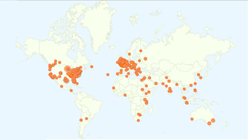
Sweet!
Fun fact: This blog is accessed more in London than any other place in the world. That leads me to believe that I have some loyal Londoners (had to Google that demonym) as readers. To be completely honest, with regard to "demonym", I had to use Google to figure out which word I was looking for in the first place. Fun fact number two, you get some unexpected results when you google "what do you call people from a particular place". :)
So, where are YOU? I encourage you to leave a comment and let me know which city or country you are writing from. How's the weather in your neck of the woods?
Using Google Analytics to track new blog readership starts out very slowly, with a few visits from your own area, probably because you forgot to block your IP address. After a few days and a few posts you might add a couple extra page views, this time it's usually a relative or friend. In time, you might even get someone to subscribe after you send out a tweet with a link to your blog. At some point, your blog becomes well indexed by Google and you start getting readers from all over the world, resulting from all sorts of strange search terms. This is when the blog begins to grow organically, and it is at this point where the readership maps become interesting.
Perhaps due to the world focus of this blog, I've been able to attract readers from all over the world.
I've included a map showing the location of World Geo Blog readers over the last several weeks. I've also added a new page called 'Who reads WGB?" (because I couldn't think of anything clever) up top. I'll be updating that page with various maps and metrics furnished by Google Analytics.
Sweet!
Fun fact: This blog is accessed more in London than any other place in the world. That leads me to believe that I have some loyal Londoners (had to Google that demonym) as readers. To be completely honest, with regard to "demonym", I had to use Google to figure out which word I was looking for in the first place. Fun fact number two, you get some unexpected results when you google "what do you call people from a particular place". :)
So, where are YOU? I encourage you to leave a comment and let me know which city or country you are writing from. How's the weather in your neck of the woods?
Subscribe to:
Posts (Atom)


