Sunday, September 5, 2010

South American Economic Gem: Chile and its Mines

With the juxtaposition of deep water trenches to the west and the Andes mountains on the east, Chile is one of the most geographically and geologically enigmatic places in South America. Spanning nearly 40 degrees of latitude, the country is ten times longer than its widest east to west point. What really makes it shine is its rare display of economic prowess outside of North America and Europe, oil powers like Equatorial Guinea excepted. Chile has forged strong foreign ties all over the earth strengthening its status as a South American economic gem. I myself contribute to its economy through frequent purchases of Chilean wine!

This success is related to its natural resources and ability to mine, process export and responsibly trade. Chile is truly the copper capital of the world, producing about a third of the earth's copper. Just more than a month ago, the world saw some of the forgotten costs of mining when a mine collapsed in Copiapó trapping 33 miners. Those miners remain trapped and it could be months before they are rescued. Today I learned that the mining company that owns the San Jose gold and copper mine is filing papers for bankruptcy. Let's hope the actions of the owners are not as sinister as they appear.

US news agencies widely reports the location of the San Jose mine as "north of Copiapó" or in "northern Chile". I wanted to see what a large gold and copper mine looked like from above. My first search on Google Earth was fruitless but falling back on the good old Google search engine I was able to find the location of the mine at GoGeometry.

The first image is a close up of the San Jose mine. The second shows its location relative to the City of Copiapó.


I find it interesting that the mine, which extracts tons of resources from inside the earth, resembles a scar on the earth's crust.


This isn't Chile's first experience with a long-term rescue. The Associated Press published a great story on survivors of the 1972 plane crash in the Andes carrying the Uruguay rugby team speaking to the trapped miners. While the circumstances are quite different, I think that hearing from someone who has been through such a strenuous ordeal will help.

Tuesday, August 31, 2010

National Geographic Responds

In the process of writing a post questioning National Geographic Map Policy I was given the name of the Director of Editorial and Research for National Geographic Maps. I emailed him with a few questions on current map policy, specifically related to the Hala'ib triangle, Bir Tawil and Somaliland.

Today I heard back from Juan. As promised, his email is below. It's nothing groundbreaking and if I'm honest, predictable, but it speaks to the map giant's ability to respond to the public. I don't totally buy the fact that the scale of the maps prevents them from displaying Somaliland in grey, then again I only buy large maps and so my view might be a bit skewed. There doesn't seem to be any problem displaying Andorra and it is about the size of a pinhead on my 110" wide world map.

Thanks go out to Juan Valdes and Kevin Lance!

Ryan:

Thank you for your email of August 25, 2010 regarding the National Geographic's portrayal of the Hala'ib Triangle, Bir Tawil trapezoid, and Somaliland in our maps.

The Society’s cartographic policy is one of portraying de facto situations; that is, to portray to the best of our judgment the reality on the ground. We consult with multiple authoritative sources on a frequent basis to determine the current political status of disputed territories and how to best represent them in our maps.

With regard to our cartographic treatment of the Hala'ib Triangle, after several military clashes between Egyptian and Sudanese forces in the 1990's, Sudan ultimately withdrew from this area in January 2000. Their forces were pulled south of the political boundary set by the Anglo-Egyptian Agreement of 1899 - the 22nd parallel. Since then, Egypt has effectively administered the area.

As for the Bir Tawil trapezoid, Egypt does not recognize sovereignty over this area on its maps; here, it claims the 22nd parallel as both its political and administrative boundary. Inversely, Sudan officially recognizes the boundary of Bir Tawil as that set by the British in 1902. However, Sudanese sources contradict this stance by cartographically portraying the Bir Tawil trapezoid as being partially administered by the states of River Nile and Red Sea.

To date, the political and military situation in the Hala'ib Triangle remains unchanged, while Egypt's and Sudan's stance on Bir Tawil has been somewhat cartographically defined. Therefore, the Society's Map Policy Committee has recognized Egypt's de facto administration of the Hala'ib Triangle and Sudan's de facto governance of the Bir Tawil trapezoid. As a point of reference, and where scale permits, the 1902 administrative boundary is delineated in our maps accompanied by a label identifying Sudan's existing claim to the Hala'ib Triangle.

Regarding the color fill treatment of Somaliland in our Africa Wall Map, most political boundaries depicted in our maps and Atlases are stable and uncontested. Those that are disputed receive a special treatment. Depending on the map's scale, such territories or separatist states are shown in a gray fill with their administrative centers depicted by an open bull's eye symbol.
Where scale permits, explanatory notes are added to explain the current political situation of such disputed territories.The difference you have noted between our treatment of Somaliland in our World map to that of our Africa wall map is a reflection of this policy.


Finally, yes, I have been a long standing member of the Society's Map Policy Committee.


Your interest in National Geographic maps is appreciated. Thank you for taking the time to write.


Juan José Valdés
Director of Editorial and Research
National Geographic Maps

Monday, August 30, 2010

Is that a Dam typo?

One of things I enjoy most about maps is to immerse myself in thoughts of the physical places I'm peering at through the looking glass. My imagination runs wild thinking about all the locations on a world map. For me, this wanderlust and mapgazing is a daily activity. In doing so, occasionally I'll run into a map feature that is a real head-scratcher.

Last week I was searching in the area around the Okavango Delta in Botswana and Lake Kariba between Zambia and Zimbabwe when I came across what looked to be a phantom "l" on the map.

I was quite pleased with myself as I thought I had discovered an error on the National Geographic 2007 Africa map. I became puzzled when I found a similar "l" to the east at the eastern edge of Lake de Cahora Bassa in Mozambique. While it was hard to believe National Geographic made a mistake, two mistakes right next to each other was a laughable notion.

The image below shows the area in question and both lines. One is to the southwest of the City of Kariba, the second is on the eastern end of Lake Cahora Bassa.


I scoured the legend on all my National Geographic maps but couldn't find anything that matched the symbol. It most closely matched that of passenger railroad but both the size and logic of placement was off. Why would someone build a railroad bridge across a large body of water if it didn't connect to anything on either side?

Time to search Google Earth and put the mystery to bed!

It turns out that the mysterious line represents a dam. With the help of a friend we quickly discovered another dam in Turkey. They are only visible in the continent blow up maps from National Geographic.

Below, in this week's Google image of the week, we see the Cahora Bassa dam in Mozambique.

The image can be found at 15° 35' 7" S 32° 42'18" E


Remember, clicking on the images will take you to a full sized image.

Friday, August 27, 2010

Military Might Map of the World

A personal indulgence of mine is to kick back with a glass of scotch and read about foreign affairs, particularly in Foreign Affairs and Foreign Policy magazines. The article "Africa's North Korea: Inside Eritrea's Open Air Prison" in the July/August Foreign Policy issue, written by Nathaniel Myers, really caught my attention.

I knew Eritrea has its share of political instability. It's also had a tumultuous history with its neighboring States, Ethiopia in particular. I did not, however, know the extent of the Eritrean army. The army is immense for, as Myers puts it, "one of Africa's most enchanting and unpredictable countries."

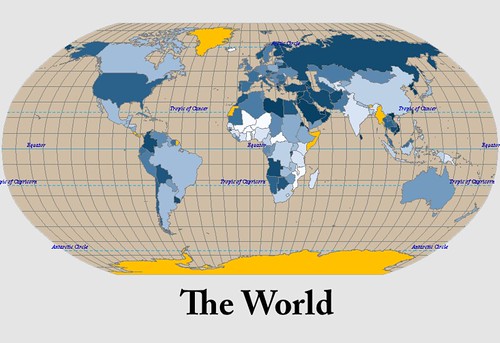
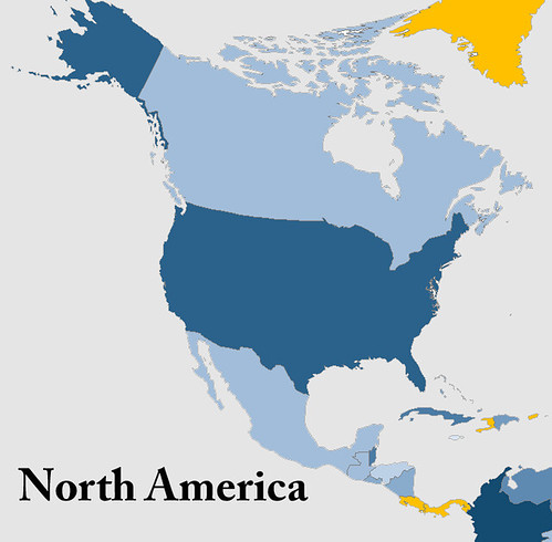
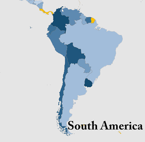
After some googling inspired by Myers' article, I found an interesting visualization of percentage of GDP spent on military. Cool, yes, but not quite what I was looking for. I wanted a map to compare the rate of active duty troops (per 1000 capita) in the countries of the world. Where does military might exude itself most in the fabric of the world's societies? To find out, I went ahead and made a map myself.

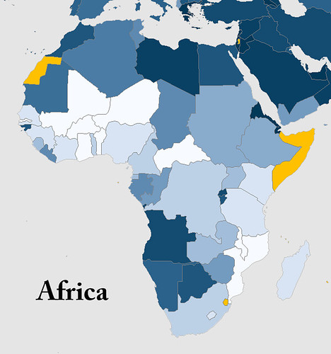
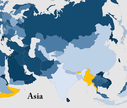
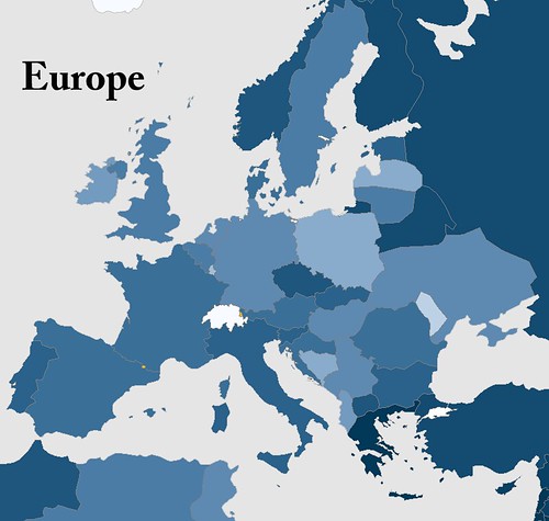
Below is a complete world map, a Robinson projection of course! Five continent maps follow to provide you with more detail on active duty troops per 1000 capita. The population was a 2009 estimate by Caliper Corporation and the military data came from a variety of sources, a list of which can be found here.

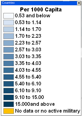
I've chosen to put the legend at the bottom of all the maps. I wanted to leave the maps free from clutter and the actual number (per 1000 capita) isn't as important as how a country relates to its neighbors and the rest of the world.

The world military map

Africa Military map

Asia military

Europe military

North America Military

South America military

World Military legend

Here is a list of the top ten military countries by active duty troops per 1000 people.

1. Eritrea
2. North Korea
3. Israel
4. Vietnam
5. Singapore
6. United Arab Emirates
7. Lebanon
8. Brunei
9. Djibouti
10. Jordan

Eritrea is the big surprise and unquestionably the real story, but I already knew that thanks to Mr. Myers. I've listed a few notables that stood out for me below. What do you think? Is there a country you expected to have a high per capita military but does not?

Other Notables (out of 161)

29. Russia
50. USA
73. Pakistan
139. India
143. Tajikistan (I expected this to be much higher)

As much as I try to keep an eye on the events occurring across Africa and other developing countries, the information available is barely a trickle compared to the barrage of domestic news thrown at me. I'm always searching for a different side of the story and the lesser-known yet just as important happenings in the world. I ask you to help me find those lesser-known news sources, books and blogs! Your comments are appreciated.

And for those of you who would like another reason to indulge in a drink and a good read, might I suggest Laphroaig scotch whiskey.

Wednesday, August 25, 2010

Update: National Geographic Maps

A few recent posts have called into question the actions of the National Geographic Map Policy Committee.

Thanks to the helpful Kevin Lance of National Geographic Maps, I have the contact info for the Editorial and Research head in the Nat Geo Maps department, Juan Valdes. Yes, the coffee guy does maps too!

So far Nat Geo has been extremely accommodating. A big thumbs up to them! I'm excited to hear back from them.

After playing phone tag with Juan I sent him the following email:

Hi, Juan,

Thank you very much for your prompt response.

Kevin Lance referred me to you to answer a few questions regarding the reasoning/research behind a few areas on the National Geographic political maps.

1. What happened (on the ground) between 2001 (based on the world map) and 2007 (based on the Africa map) that changed ownership of the Hala'ib triangle from Sudan to Egypt? Also, why is Bir Tawil now shown as part of Sudan?

It appears the change now recognizes the 1899 border established by the 22nd parallel in place of the 1902 agreement the British put in place.

I know the Sudanese have pulled troops from the area and that Egypt has invested in the area.

In summary of question 1 - Why is the Hala'ib triangle now shown as part of Egypt and why is Bir Tawil shown as part of Sudan?

Question 2 - Why is Somaliland shown in grey on the continent political maps but not delineated at all on the world map?

National Geographic often discusses its desire to reflect what is on the ground and remain a-political. Somaliland recently elected a new president in a free and fare election as an opposition candidate. It seems the reality on the ground is that Somaliland is very much an autonomous State. The same cannot be said for Somalia. It seems that the only issue for showing Somaliland as part of Somalia is the lack of international recognition. Isn't recognition by other countries a political decision in itself?

In summary of question 2 - What is the research and reasoning for showing Somaliland in grey on Africa political maps and not at all on world maps?


I'll post Juan's response as soon as I get it.

To pass the time, why not take a peak at some of my pictures from Namibia.

Monday, August 23, 2010

Where in the World is the Mosque Near Ground-Zero?

In the last two weeks the "Ground-zero mosque" aka the "cultural center near ground-zero" has grown into one of the most divisive topics on American news shows in recent memory.

Before we get into my commentary, lets get to the point (and the fun part) of this post and take a gander at the area in question in this Google image of the week, the area around ground-zero in New York.

You can navigate to this site by searching the following coordinates 40°42'46"N 74°00'36"W

It's clearly not AT ground zero but it certainly is close and considering the circumstances opposition is certainly understood.

I, like most, support the first amendment, protecting freedom of religion. I appreciate the argument that a mosque should not be built "at ground zero" but do not approve of the fear-mongering hate speech tactics being used by some.

What has become almost as big a story as the debate on the mosque is the discussion about the naming conventions of this story as highlighted in this NPR blog.

The blogosphere is all over this controvery, here is one example opposed to the mosque. Notice all the American flags plastered across the site - purposefully sending the message that to be for the development is somehow anti-American. There are also several images from 9-11. This does not have anything to do with honor for the site or the tragedy but a deliberate attempt to tie main stream Islam to the atrocities of the extremists. John Wayne Gacy's acts should not represent the beliefs of the Catholic community. Just like the actions of pro-life terrorist bombers should not be representative of all pro-lifers.

I do believe that some of those opposed to the development jumped on the opportunity to trick the public into thinking that this mosque was in the footprint of the WTC and I think it's an attempt to feed the perception of the uneducated that Obama is a Muslim. The same uneducated probably don't understand we're not the United States of Christianity.

Here's an interesting excerpt from the Israpundit blog - "If the ground zero mosque is tied to terror regimes and groups financially or otherwise, and we know that it is..." What a good looking argument "and we know that it is". Geesh.

The inability to separate the world's Muslim community from Muslim extremists is disheartening. However, just as it is their right to practice their religion in the shadow of the worst domestic terrorist attacks, everyone has the right to voice their opposition. Another reason, this country IS so great.

Cracked.com has an fascinating opposition piece to those opposing the mosque/cultural center. Click here to read the article.

It's a fascinating debate and while I fall on the pro side of the argument I do enjoy hearing intelligent points on the other side of the debate. I'd encourage you to leave a comment with your thoughts on the issue - regardless of your opinion!

I'd like to end this somewhat serious post with a little light hearted "news". I see Jon Stewart as the balance to Fox news as Fox sees itself as a balance to the "drive-by media".

Enjoy!


The Daily Show With Jon StewartMon - Thurs 11p / 10c
Recap - Week of 8/10/10
http://www.thedailyshow.com/
Daily Show Full EpisodesPolitical HumorTea Party


Thanks to the Geography Lady for the inspiration!